
The Philadelphia Phillies, in collaboration with Nike and MLB, unveiled their City Connect uniforms in mid-April, causing quite a stir among fans – perhaps even enough to register on the Richter scale, coinciding with a local earthquake that day. While we can’t definitively blame the seismic activity on the uniform’s design, the reaction to the “Phillies New Uniform” has been anything but subtle.
Since 2021, Major League Baseball has rolled out the City Connect series, a Nike initiative aiming to give each team, excluding the New York Yankees and Oakland Athletics, an alternate home uniform that reflects the city’s unique character. Some teams have hit a home run with their designs, like Miami’s vibrant look, while others have left fans scratching their heads. The Mets’ gray-on-gray uniform concept, for instance, raises practical questions about on-field visibility.
But let’s get back to the point – the “phillies new uniform.” The Phillies organization presented the new attire as:
An ode to Philly’s past, present & future.
➡️ https://t.co/5ZsDu5BBDu pic.twitter.com/RGnXRnl3zC
— Philadelphia Phillies (@Phillies) April 5, 2024
However, initial reactions from fans and critics alike have been less than celebratory. The design incorporates Philadelphia city flag colors, a blue collar, and lettering inspired by historical documents. While the concept aims to blend history and modernity, the execution, particularly the jersey typography, has been widely criticized. The number 7 on Trea Turner’s jersey, for example, has been likened to a question mark due to its stylized, somewhat illegible design. In an era of evolved typography, the choice to emulate 18th-century fonts has been questioned, especially concerning readability.
One design element that has garnered some appreciation is the hat. Despite the color scheme remaining a point of contention for some, the incorporation of the city skyline within the Liberty Bell—a long-standing Phillies symbol—is a clever and well-received detail. Nevertheless, for many, the overall impression of the “phillies new uniform” falls short of expectations, with some even comparing it to a beer league uniform.
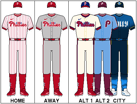 Phillies City Connect Uniform
Source: Wikipedia. Logos and wordmarks displayed on the uniform are owned by the Philadelphia Phillies, Major League Baseball, The New Era Cap Company, Nike, Inc., and Stance. Design of the elements of the uniform are owned by Majestic Athletic, The New Era Cap Company, Nike, Inc., and Stance.
Many feel that Nike missed an opportunity to tap into the rich visual history of the Phillies. Ideas for alternative designs have circulated among fans, including a modern take on the retro maroon uniforms from the 1970s or a green-based design inspired by the beloved Phillie Phanatic mascot. Nike’s successful City Edition jerseys for the Philadelphia 76ers basketball team further fuels the sentiment that a more impactful design was achievable for the “phillies new uniform.”
Predictably, pleasing the passionate Philadelphia fanbase with any uniform change was always going to be a challenge. The Phillies’ classic pinstripe home uniforms are widely regarded as among the best in baseball. This existing high standard set a difficult bar for the City Connect design to surpass. Philadelphia sports fans are known for their fervent opinions and quick wit, especially on platforms like X/Twitter, and the “phillies new uniform” release was no exception.
Fan Reactions Range from Shock to Humor
The debut of the “phillies new uniform” on the field, particularly when paired with J.T. Realmuto’s yellow catcher’s gear, amplified the online commentary:
OH MY GOD
OH NO
WHO GREEN LIT THIS
WHY https://t.co/VsG9dtQi5N pic.twitter.com/x5xfDsJ3Wo
— Philly Sports Sufferer (@mccrystal_alex) April 19, 2024
https://t.co/B4Mj1IL9lB pic.twitter.com/8cbqnfMSus
— UK Phillies (@UKPhillies) April 19, 2024
The initial release day also saw a flurry of humorous and critical posts:
sixth most popular energy drink in the wawa fridge ass jerseys https://t.co/wAOAK6Nayy
— Bobby Wagner (@bwags) April 5, 2024
the city connects are fine but we could have had it all pic.twitter.com/AADwbflMDd
— noah 🍉 (@stottbohmmarsh) April 5, 2024
I hate them, but I’m sure once Castellanos ignores the top few buttons we’ll collectively stop caring. https://t.co/5oh7QDUSDz
— Absolutely Hammered (@ah_pod) April 5, 2024
10 am: “Sure the leaks for the Phillies’ city connect weren’t great, but how bad could they really be?”
10:25 am: god shatters the earth.
— all my teams want me dead (@PanasonicDX4500) April 5, 2024
That earthquake was God telling us how much he hates the Phillies city connect jerseys
— Fink Von Bro Dude (@ericjfink) April 5, 2024
The overarching sentiment seems to be that the “phillies new uniform,” while not universally despised, is simply unremarkable. It’s a design that may neither offend nor excite, landing squarely in the realm of “average.” While some fans may eventually warm up to them, many anticipate these uniforms having a limited lifespan, perhaps paving the way for the return of more favored alternate designs in the future.
Ultimately, for a fanbase with World Series aspirations, average isn’t enough. Phillies fans crave excellence, and when the team’s on-field appearance doesn’t reflect that ambition, it can be difficult to fully embrace the new look. While time may soften opinions on the “phillies new uniform,” for now, many fans are unlikely to rush out to purchase the City Connect collection. #RingTheBell