
In the whirlwind of mid-April, amidst the tremors of an unexpected earthquake that rattled Philadelphia, the Philadelphia Phillies unveiled their City Connect uniforms. While we can’t definitively blame the seismic event on the uniform’s aesthetics, the timing was certainly… noteworthy.
Since 2021, Major League Baseball (MLB) and Nike have collaborated on the City Connect series, aiming to create unique alternate uniforms that celebrate each team’s city beyond their traditional branding. With the New York Yankees and Oakland Athletics as the only exceptions, every MLB team will sport these City Connect jerseys as a home alternate by the end of the 2024 season. The goal is to capture the essence of the city in a fresh way, and some teams have truly hit it out of the park with their designs, like the vibrant Miami Marlins. However, others have seemed to miss the mark, such as the New York Mets’ gray-dominant City Connect uniforms, which could lead to visual confusion when they wear gray at home against teams in their gray road uniforms. But let’s set aside broader MLB uniform critiques and focus on the matter at hand: the Philadelphia Phillies’ new look.
An ode to Philly’s past, present & future.
➡️ https://t.co/5ZsDu5BBDu pic.twitter.com/RGnXRnl3zC
— Philadelphia Phillies (@Phillies) April 5, 2024
Let’s be blunt: these Phillies City Connect uniforms are not a home run in the design department. While the intention is clear – to honor Philadelphia’s history and spirit – the execution leaves much to be desired. The uniform incorporates a blue collar and the city’s flag colors, along with lettering inspired by historical documents. However, the typography choice, particularly the number 7 on Trea Turner’s jersey, resembles a question mark more than a numeral, lacking the dot and readability. While referencing 1776 is thematic, typography has advanced significantly since then, and a more contemporary and legible font would have greatly improved the design. The current font choice makes the jerseys appear cluttered and difficult to read, a significant drawback for on-field uniforms and fan merchandise alike.
Despite the overall disappointment, there is a glimmer of design success in the hat. The concept of embedding the city skyline within the Liberty Bell, a long-standing symbol for the team, is a clever and visually appealing motif for a baseball cap. However, even this positive aspect is somewhat overshadowed by the overall color scheme and jersey design, which unfortunately evoke more of a beer league softball team aesthetic rather than a Major League Baseball franchise with the rich history of the Phillies.
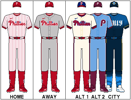
Image alt text: Philadelphia Phillies City Connect uniform full view, featuring blue jersey with stylized numbers, city skyline hat, and white pants.
Nike had numerous avenues to explore for these Phillies Baseball Uniforms. Imagine an updated rendition of the classic 1970s maroon Phillies uniforms, a beloved retro look. Or perhaps a bold move incorporating green, inspired by the iconic Phillie Phanatic mascot, arguably the best mascot in all of sports. Nike’s successful City Edition jerseys for the Philadelphia 76ers basketball team demonstrate their capacity for innovative Philadelphia-themed designs. It seems, in this instance, they aimed for “different” for the Phillies, and indeed, the City Connect uniforms are certainly that.
Predictably, pleasing the passionate Philadelphia Phillies fanbase with any uniform change, let alone a drastic one like the City Connect series, was always going to be a challenge. The Phillies’ traditional pinstripe home uniforms are widely regarded as one of the best in baseball, a timeless and iconic design. To surpass such a classic was a tall order. Philadelphia sports fans are known for their fervent opinions, their love of playful criticism, and their active presence on social media platforms like X/Twitter. The unveiling of these new uniforms was no exception, sparking a wave of reactions, primarily humorous and critical.
The initial wave of jokes often centered on J.T. Realmuto’s yellow catcher’s gear, which debuted alongside the City Connect uniforms:
OH MY GOD
OH NO
WHO GREEN LIT THIS
WHY https://t.co/VsG9dtQi5N pic.twitter.com/x5xfDsJ3Wo
— Philly Sports Sufferer (@mccrystal_alex) April 19, 2024
https://t.co/B4Mj1IL9lB pic.twitter.com/8cbqnfMSus
— UK Phillies (@UKPhillies) April 19, 2024
And the reactions from the uniform release day itself were equally candid:
sixth most popular energy drink in the wawa fridge ass jerseys https://t.co/wAOAK6Nayy
— Bobby Wagner (@bwags) April 5, 2024
the city connects are fine but we could have had it all pic.twitter.com/AADwbflMDd
— noah 🍉 (@stottbohmmarsh) April 5, 2024
I hate them, but I’m sure once Castellanos ignores the top few buttons we’ll collectively stop caring. https://t.co/5oh7QDUSDz
— Absolutely Hammered (@ah_pod) April 5, 2024
10 am: “Sure the leaks for the Phillies’ city connect weren’t great, but how bad could they really be?”
10:25 am: god shatters the earth.
— all my teams want me dead (@PanasonicDX4500) April 5, 2024
That earthquake was God telling us how much he hates the Phillies city connect jerseys
— Fink Von Bro Dude (@ericjfink) April 5, 2024
Perhaps the most significant issue with these Phillies City Connect uniforms is their mediocrity. They aren’t overwhelmingly offensive, but they also fail to excite. Some fans may grow to appreciate them, and history suggests these uniforms may be retired in a few years, potentially paving the way for the return of popular spring training red alternates. However, Philadelphia Phillies fans hold their team to a higher standard than “average.” The city and its fans are hungry for a World Series championship, a pennant that has felt within reach in recent seasons. When the team takes the field in uniforms that don’t project a winning, top-tier image, it can dampen the collective spirit.
While time might soften the initial negative reaction to the Phillies City Connect collection, it’s safe to say that many fans, including this author, won’t be rushing to purchase these jerseys. The hope remains that future uniform designs will better capture the essence of the Philadelphia Phillies and resonate more positively with the team’s passionate and discerning fanbase. #RingTheBell