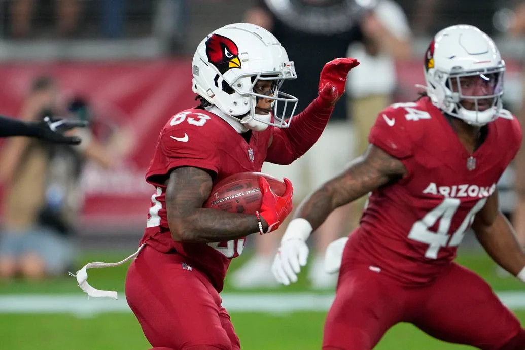
The Arizona Cardinals recently unveiled their new uniforms, and the reaction has been… less than stellar. While new uniform reveals often warrant a wait-and-see approach on the field, the Cardinals’ mono-red debut against the Denver Broncos strongly suggests a significant misstep in design. Following the initial unveiling and expert analysis, the on-field appearance only solidified the impression: the Cardinals might have unfortunately cemented their position with the worst uniforms in the NFL. This is no small feat, considering their previous uniform iterations were already heavily criticized.
Seeing the uniforms in action confirmed many initial negative assessments. While uniform opinions are subjective, there’s a strong consensus that these new designs miss the mark, and perhaps by a wide margin.
Let’s examine some key visuals from the game:
 Arizona Cardinals in mono-red uniforms with white helmets during a preseason game against the Denver Broncos.
One immediate visual disconnect is the combination of white helmets with mono-dark uniforms below the neck. Generally, teams with white helmets should avoid going completely dark from the neck down. Dark helmets paired with all-white uniforms often work, but the reverse is rarely as successful. Historically, the Cardinals have sported white over mono-red combinations, which offered some visual relief through color breaks, even if those previous designs included elements like black piping and white accents. However, these new uniforms lack any such contrasting elements. For teams with white helmets, there are very few exceptions to the rule that white pants are almost always a better choice beneath a dark jersey.
[ Close-up of Arizona Cardinals helmet showing the silver-gray facemask and cardinal head logo detail.
Another prominent design choice is the large “ARIZONA” wordmark emblazoned across the chest. Assuming these are intended as the home uniforms, the decision to feature “Arizona” instead of “Cardinals” is questionable. Even with the flaws of their previous uniforms, they at least displayed “Cardinals” in a smaller, arguably more traditional font. This shift to “ARIZONA” feels less connected to team identity and more generic.
Turning to the back of the jersey, while the font choices for the name and number are acceptable, the placement of the mono-white cardinal head logo below the neckline appears out of place. It seems to be yearning for the team’s traditional black and yellow colors to provide better visual harmony. Furthermore, the logo placement pushes the player’s nameplate (NOB) too low on the jersey back, creating an unbalanced look.
If there’s a positive aspect to be found in this uniform redesign, it’s the helmet. In isolation, the Arizona Cardinals helmet remains one of the stronger helmets in the NFL. The updated facemask, transitioning from gray to a silver-gray, and the larger, seemingly metallic cardinal head logo are both improvements. The helmet itself avoids the design issues plaguing the rest of the uniform.

In a twist of irony, the Cardinals’ debut game, albeit preseason, was against the Denver Broncos, a team often considered to have the second-worst uniforms in the league. It’s a telling sign when uniforms nearly three decades old, using an outdated template from their release era, still appear superior to the newly designed Cardinals Uniforms.
 Arizona Cardinals in mono-red uniforms with white helmets during a preseason game against the Denver Broncos.
There was initial hope that the Cardinals might adopt a mix-and-match approach, combining the white jersey or pants with the red elements. The white uniform option does feature some more traditional striping and is generally considered a better-looking alternative to the mono-red. Pairing the red jersey with white pants could potentially alleviate some of the visual monotony of the all-red look.
In recent years, a trend has emerged with many teams reverting to more classic uniform designs. However, the Falcons and Cardinals seem to have moved against this current, opting for more modern, and in this case, arguably less appealing directions. Hopefully, the Cardinals organization will reconsider these designs and initiate a redesign as soon as the mandatory five-year period allows, following the examples of teams like the Jaguars, Buccaneers, and Browns who course-corrected after initial uniform missteps. The “bloodclot look,” as some have described the mono-red, might quickly lose its appeal for fans and viewers alike.
For those brave enough, more game photos are available online, offering further perspectives on the Arizona Cardinals’ new uniform set. Ultimately, the new Cardinals uniforms raise questions about modern NFL uniform design trends and whether prioritizing a contemporary aesthetic sometimes overshadows classic, visually appealing, and team-identifiable looks.
