
The New York Mets have recently introduced their new alternate blue jersey, adding a fresh twist to their on-field apparel. As part of the anticipated 2025 lineup, this new Mets Uniform has sparked conversations among fans and uniform enthusiasts alike. Initial reactions, however, reveal a potential design challenge: visibility.
As predicted, the jersey showcases a design that revisits the 1987 road script, but with a modern stealth aesthetic. This mets uniform features a pullover style with a V-neck, a departure from the traditional button-front baseball jerseys preferred by some. While the pullover and wishbone collar might appeal to contemporary tastes, the core issue lies in the stealth application of the script, numbers, and player names on the back (NOB).
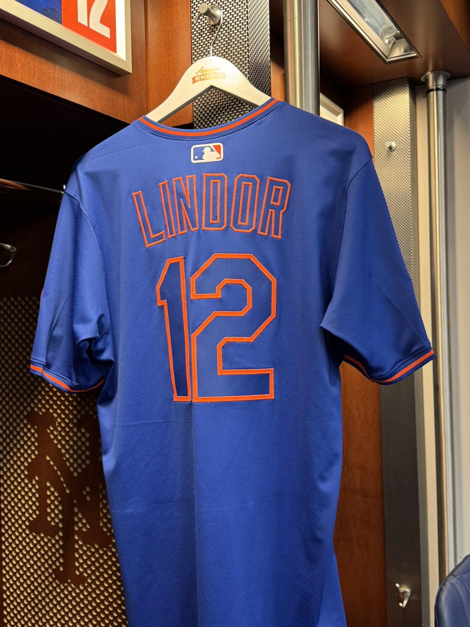 Close-up of the new stealth Mets jersey script and numbers showing potential visibility issues
The concern isn’t about the color itself, but rather how the blue script on a blue jersey risks becoming illegible, especially from a distance. Stealth wordmarks, while potentially stylish up close, often compromise the primary function of a sports uniform: quick and easy identification of team and players.
Comparing this mets uniform to the Pittsburgh Pirates’ stealth jersey highlights the issue. While the Pirates also employ a stealth wordmark, their jersey maintains contrasting colors for the front number, NOB, and rear number, ensuring visibility where it matters most. The Mets jersey, in contrast, risks appearing as a solid blue mass with orange accents from afar, potentially obscuring player identification.
 Comparison image of the Mets stealth wordmark jersey alongside the Pittsburgh Pirates stealth wordmark jersey, highlighting differences in number and lettering visibility
Several potential fixes could enhance the legibility of this mets uniform without drastically altering its design. One simple solution would be to fill the outlined script with white, creating a stronger contrast against the blue background. Another option, aligning with past Mets road blue jerseys, would be to use silver or gray fill, although a lighter shade of gray might be necessary to truly make the lettering pop.
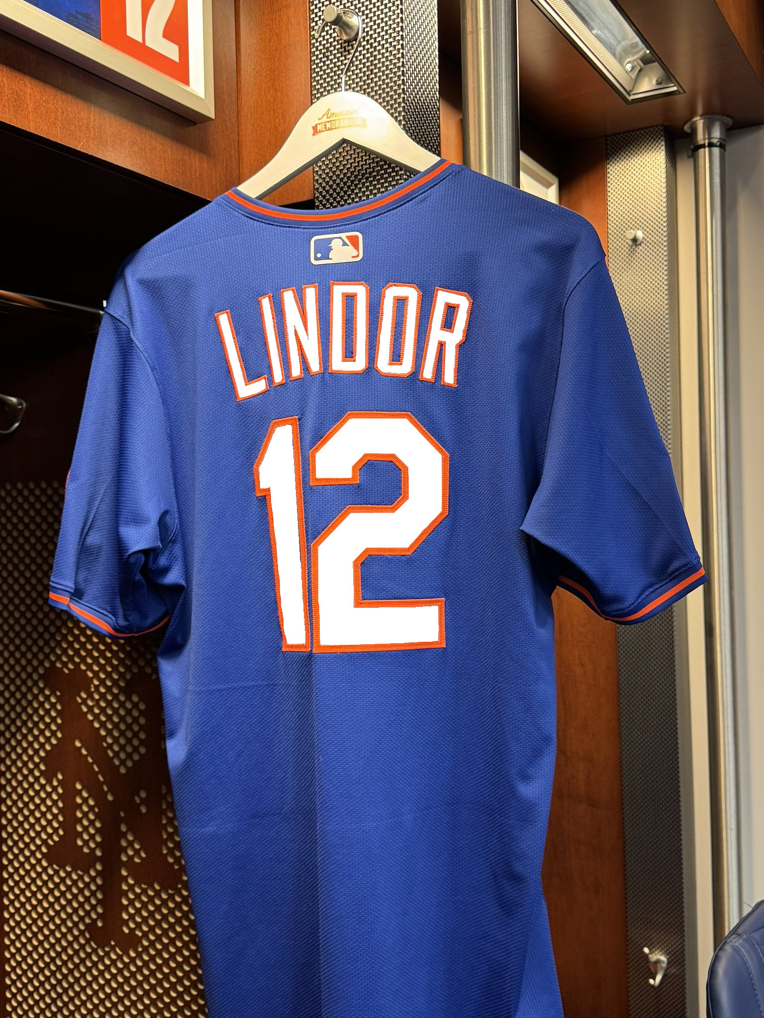 Mockup of the Mets stealth jersey with white fill in the lettering and numbers for improved visibility
Alternatively, the “New York” script and front numbers could be rendered in orange with a white outline, or even fully in orange with a white outline for maximum impact. A more subtle approach, maintaining the gray accents often seen in Mets road uniforms, could involve an orange script and number with a silver-gray outline.
 Mockup of the Mets stealth jersey with orange lettering and numbers, outlined in white for maximum contrast and visibility
Social media reactions to the unveiled mets uniform have been mixed. While some fans appreciate the pullover style and the return of the 1987 script to a road jersey, a recurring concern is the legibility of the lettering. Many comments echo the sentiment that the stealth design compromises the practicality of the uniform.
Despite the aesthetic appeal, the core function of a baseball uniform—identifying players—should not be overshadowed. Past MLB City Connect jersey designs have faced similar criticisms regarding visibility, serving as a reminder of this crucial aspect of uniform design. While creating a visually striking uniform is desirable, ensuring team and player identification from a distance remains paramount.
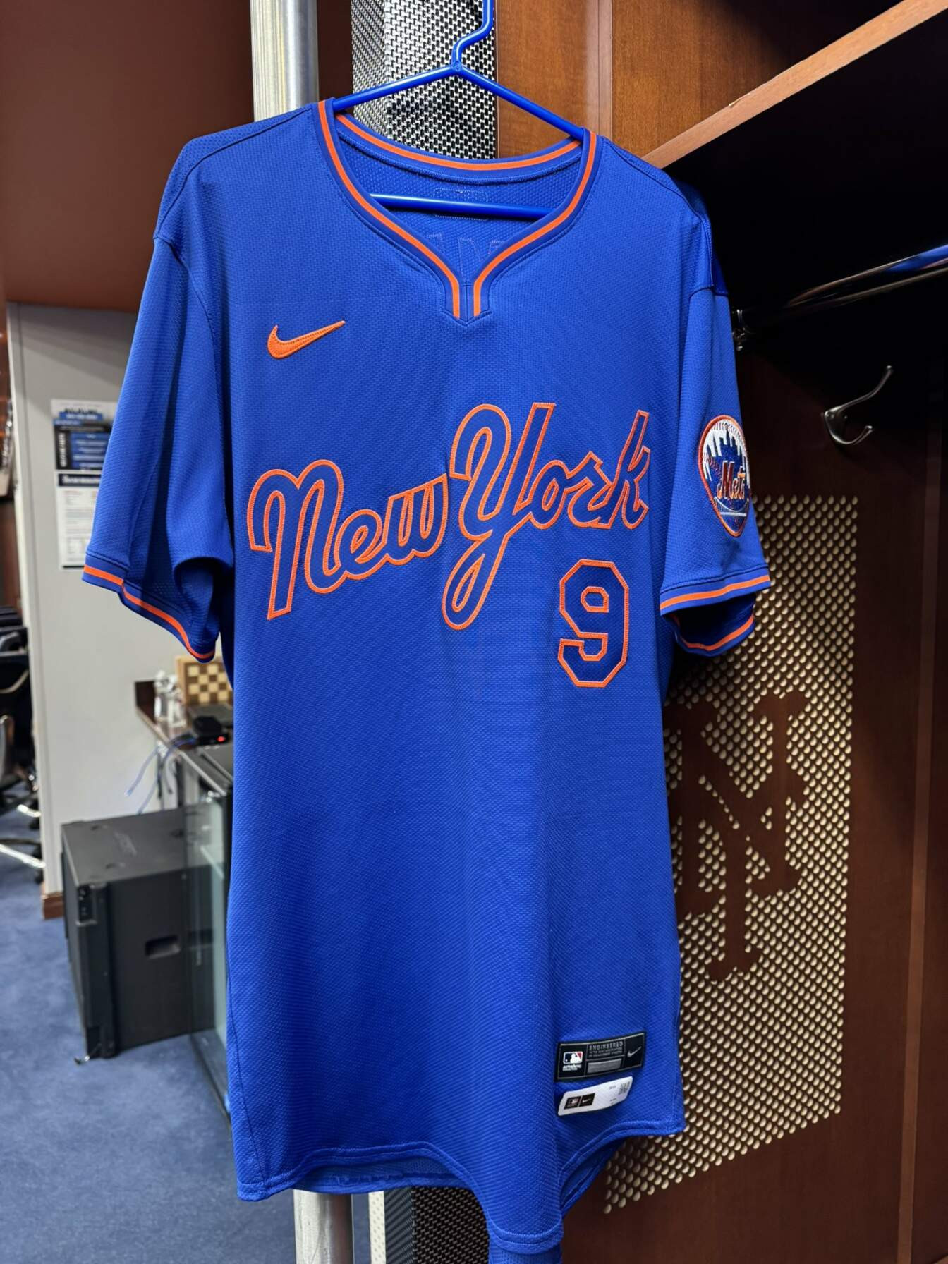 Full view of the new Mets alternate blue pullover jersey showcasing the overall design and potential visibility challenges on the field
Ultimately, while the new mets uniform introduces a unique and modern alternate, addressing the legibility concerns would significantly enhance its functionality and fan experience. Even minor adjustments could transform this jersey from a visually interesting piece into a truly effective and wearable mets uniform. Hopefully, the Mets will consider these visibility issues and perhaps explore adjustments for future seasons. What are your thoughts on the new Mets alternate jersey and the proposed fixes?