
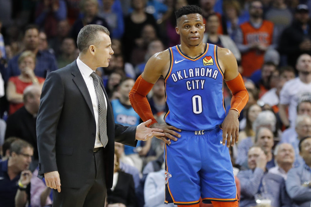
The Oklahoma City Thunder have become a staple in the NBA, and with that presence comes a visual identity – their uniforms. Since their inception, the Thunder have showcased a variety of looks, from the classic to the bold, reflecting not just team colors but also Oklahoma City’s spirit and history. As content creators at onlineuniforms.net, we’re diving deep into the Oklahoma City Thunder Uniforms, ranking them from best to worst and exploring the evolution of their style over 11 impactful seasons.
When Russell Westbrook first donned a Thunder jersey, it was a stark black and white in the Summer League. This initial simplicity stood in contrast to the explosion of color that would soon define the franchise. Upon their official debut, the Thunder palette included five colors: blue, navy blue, yellow, orange, and white. Over time, this has expanded to incorporate sunset orange, turquoise, and gray, alongside alternate logos, sound wave stripes, and themed jerseys. Notably, a recent design pays homage to a poignant chapter in Oklahoma City’s history and its subsequent recovery, demonstrating how uniforms can transcend mere sportswear.
Thanks to the NBA’s partnership with Nike, ensuring at least one updated uniform per team each season, the Thunder’s wardrobe has grown significantly. This constant evolution has yielded mixed results, with some designs hitting the mark while others have missed. With the departure of iconic players like Westbrook and the arrival of fashion-forward talents like Shai Gilgeous-Alexander, it’s an opportune moment to assess the Thunder’s uniform journey.
This ranking, presented from a content creator’s perspective, evaluates each Thunder uniform, excluding Summer League and one-off Christmas Day versions, to provide a comprehensive overview of Oklahoma City Thunder uniforms.
Ranking the Oklahoma City Thunder Uniforms: From Top Tier to Bottom of the League
Here’s our definitive ranking of the Oklahoma City Thunder uniforms, starting with the best and descending to the least impactful designs.
1. Blue Statement Uniform: The Pinnacle of Thunder Style
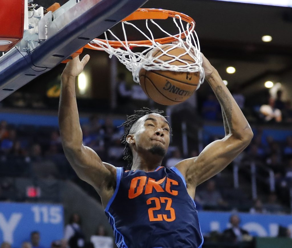 Shai Gilgeous-Alexander wearing the Blue Statement Oklahoma City Thunder uniform
When it was unveiled, the navy blue Statement uniform was the most adventurous Oklahoma City Thunder uniform to date, and it remains the gold standard. In the realm of sports fashion, bold swings don’t always connect, but this now-retired jersey was a home run in both concept and execution. The sound-wave pattern on the back and the fragmented, edgy “OKC” across the chest perfectly capture the essence of thunderous energy and the fervor of “Loud City,” the Thunder’s passionate fanbase. No other Oklahoma City uniform has so effectively embodied the team’s powerful name and identity.
2. Turquoise City Uniform: A Tribute to Oklahoma Heritage
 Nerlens Noel showcasing the Turquoise City Oklahoma City Thunder uniform
While the Statement jersey captured the abstract idea of “Thunder,” the Turquoise City uniform served as a meaningful homage to Oklahoma’s rich Native American heritage. The turquoise color itself represented both the 11th-anniversary gemstone – coinciding with the Thunder’s 11th season in OKC – and the Native American symbol of friendship. Adding to the cultural significance, the waistband featured a pattern inspired by traditional Native American sashes. Designed by Nike’s Carson Brown, who is himself Native American, the uniform was crafted to be “respectful and not appropriating any specific native culture or tribe, to make it encompass everything.” This uniform stands out as a thoughtful and visually striking tribute within the Oklahoma City Thunder uniforms collection.
3. Adidas Sunset Uniform: The Original Orange Statement
 Russell Westbrook in the Adidas Sunset Orange Oklahoma City Thunder uniform
The Thunder’s inaugural orange uniform remains a high point in their design history, possibly even their best. The striking navy blue “OKC” boldly emblazoned across the front was a pivotal design choice for a franchise that had largely relied on “Thunder” or “Oklahoma City” branding. Beyond aesthetics, this uniform holds historical weight. It was worn on the memorable night when Westbrook secured the NBA’s single-season triple-double record, punctuated by a game-winning three-pointer against Denver. However, the uniform sparked some controversy, with some fans interpreting the orange hue as a nod to Oklahoma State University, fueling the state’s intense college sports rivalry with the University of Oklahoma. To mitigate this, internally, the team refers to the color as “sunset,” emphasizing its distinction from OSU’s bright orange. Regardless of the color debate, the “Sunset” uniform is undeniably a visually appealing and historically significant entry in the Oklahoma City Thunder uniforms canon.
4. City Memorial Uniform: A Somber and Powerful Tribute
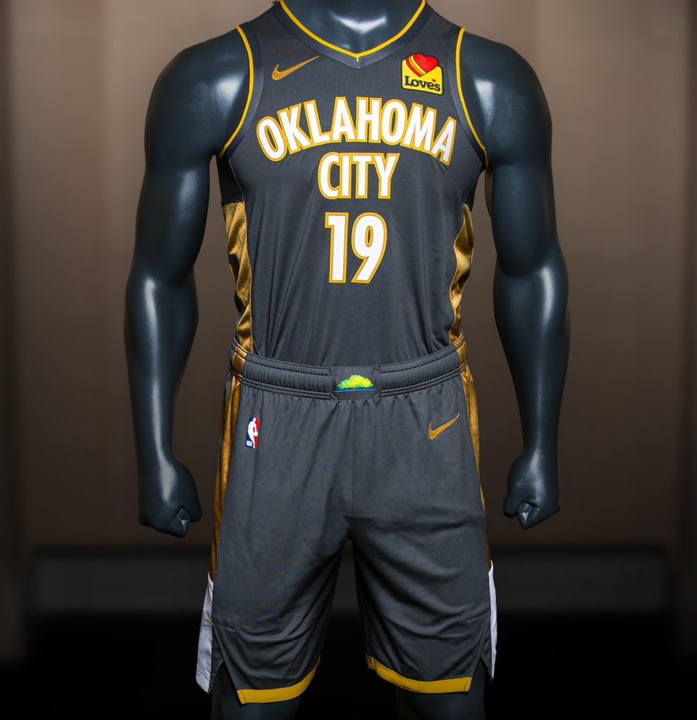 Close-up of the Oklahoma City Thunder City Memorial uniform
This dark gray uniform, a collaboration with the Oklahoma City National Memorial & Museum, is deeply symbolic. It’s designed to “embody the spirit of resilience and remembrance” in honor of the lives lost and affected by the 1995 Oklahoma City bombing. The uniform’s color palette and subtle details powerfully evoke the atmosphere of the outdoor memorial. Notably, the shorts feature vent details displaying the times 9:01 and 9:03 – representing the innocence before the tragedy and the unity that followed. The Survivor Tree, a symbol of hope and resilience from the memorial, is brightly featured on the shorts’ waistband, a stark contrast against the somber uniform, symbolizing hope emerging from darkness.
Despite its powerful concept, the uniform has minor design drawbacks. The stacked “Oklahoma City” across the chest tends to clutter the design, a recurring issue in some Thunder uniforms. Additionally, the prominent advertising patch for Love’s Travel Stops feels particularly jarring against the uniform’s somber theme. A more muted, perhaps monochromatic gold logo, aligning with the jersey trim, would likely be a more fitting and respectful integration. Despite these minor points, the City Memorial uniform is a poignant and meaningful addition to the Oklahoma City Thunder uniforms lineup.
5. Orange Statement Uniform: Echoes of Past Glory
 Front view of the Orange Statement Oklahoma City Thunder uniform
Ranking this upcoming season’s Sunset (or “orange”) uniform is somewhat speculative, given the Thunder haven’t yet worn them on the court, and only front-view images have been released. However, initial impressions place it favorably, largely due to its apparent inspiration from the successful navy blue Statement uniforms of previous seasons. The jagged “OKC” across the chest is a returning feature, and promotional photos suggest the sound wave striping will also be present on the back. If the orange version captures the same bold aesthetic as the former blue Statement uniforms, it could somewhat soften the blow of retiring the Thunder’s previously top-ranked jersey. It stands as a promising addition to the Oklahoma City Thunder uniforms collection.
6. New Icon Uniform: Streamlining the Classic Blue
 Close up of the new Icon Oklahoma City Thunder blue uniform
Since their debut in 2008, the Thunder’s traditional blue uniform had “Oklahoma” positioned above “City” on the chest, over the player number. This arrangement felt somewhat bulky compared to the cleaner “OKC” found on some of their more stylish jerseys. However, this season marks a welcome change. The blue Icon uniform now features “Thunder” across the chest, with “OKC” relocated to the shorts’ waistband. This shift is a significant improvement, streamlining the design and enhancing its visual appeal, even if it creates a less desirable effect on the white uniform. This evolution is a positive step in the ongoing development of Oklahoma City Thunder uniforms.
7. Classic White/Association Uniform: Safe but Unremarkable
 Steven Adams wearing the Classic White Association Oklahoma City Thunder uniform
The Thunder’s original home uniform, updated and refined in 2017 as Nike’s “Icon” edition, was arguably the better of their initial offerings, primarily because it featured “Thunder” across the chest. This branding choice is visually more appealing than the “Oklahoma City” found on the blue uniforms. Beyond this, the uniform is fairly unremarkable. The shield logo on the shorts felt dated even at its debut and appears even more so now. The color scheme, while inoffensive, is somewhat reminiscent of the New York Knicks, lacking the bold, unique identity one might expect from a newer franchise. These Oklahoma City Thunder uniforms are not bad, but they play it safe, missing an opportunity for a more distinctive statement.
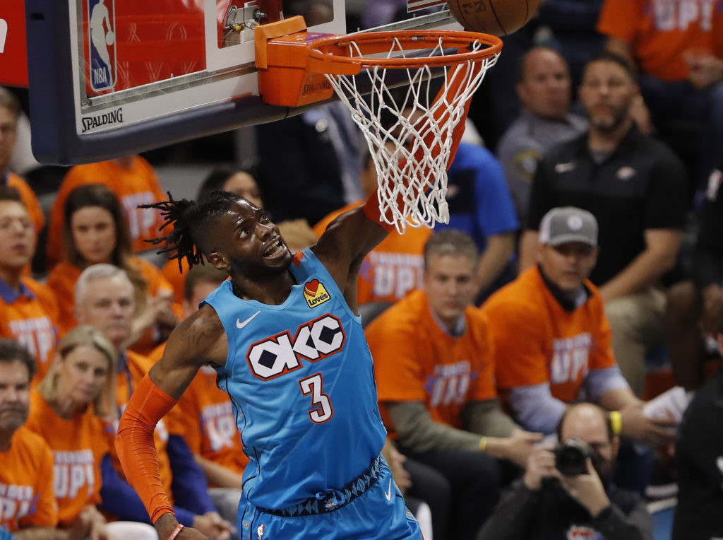
8. Earned Sunset Uniform: Derivative Orange
 Steven Adams in the Earned Sunset Orange Oklahoma City Thunder uniform
The orange uniforms worn by the Thunder last season were Nike’s interpretation of the original Adidas Sunset design. Many details remained consistent, including the player name positioned below the jersey number on the back. The key difference was the “OKC” across the chest, rendered in the same jagged, thunder-inspired style as the recent Statement edition uniforms. However, this uniform loses points for being overly derivative of a previous design and suffers in direct comparison to the newer Orange Statement uniforms. While not inherently flawed, it lacks originality within the Oklahoma City Thunder uniforms history.
9. New Association Uniform: “Oklahoma City” Still a Design Hurdle
 Full view of the New Association Oklahoma City Thunder white uniform
It’s crucial to reiterate: “Oklahoma City” stacked above a number consistently lacks the visual punch of “Thunder” or “OKC.” Perhaps experimenting with “Oklahoma” above the number and “City” below could yield a more balanced design, but the two-words-on-top-of-each-other format invariably detracts from a jersey’s overall ranking. The new white Association uniforms do offer a slight improvement; the outlining of “Oklahoma City” adds some depth and visual pop. The inclusion of the state of Oklahoma outline on the waistband is a commendable detail. Overall, it’s a step up from the very bottom tier of Oklahoma City Thunder uniforms, but still held back by the “Oklahoma City” chest branding.
10. Classic Blue/Icon Uniform: Overcrowded and Bland
 Oklahoma City Thunder blue uniform with "Oklahoma City" on the chest
…This design is simply a mess. The original road blue uniform received a refresh in 2017, becoming OKC’s first Nike Icon uniform, but the changes were minimal and did little to resolve the cluttered and uninspired front panel dominated by “Oklahoma City” above the number. While the City jersey attempts to make this format work, it remains problematic. This iteration of the Oklahoma City Thunder uniforms is a low point in their design history.
11. Navy Alternate Uniform: Daring but Ultimately Flawed
 Serge Ibaka wearing the Navy Alternate Oklahoma City Thunder uniform
These uniforms were largely disliked upon release and haven’t improved with time. However, OKC’s first navy blue alternate uniforms were not boring. The bold decision to place “Thunder” vertically down the jersey front was certainly a risk. While it didn’t succeed aesthetically, the Thunder deserve credit for pushing boundaries. Fans who appreciate these uniforms likely value this willingness to experiment. Even in its failure, this design may have paved the way for the more adventurous styles that emerged during the Nike era. This navy alternate represents a bold swing, albeit a miss, in the evolution of Oklahoma City Thunder uniforms.
12. White Sleeved Uniform: Sleeves Derail a Decent Chest Design
 Russell Westbrook wearing the White Sleeved Oklahoma City Thunder uniform
Adidas’s push for sleeved jerseys was driven by the idea that fans might be more inclined to wear short-sleeved versions in everyday settings. However, the look largely failed to resonate, even if no Thunder player went to the extreme of ripping the sleeves for comfort, as LeBron James famously did. The OKC shield logo on the chest is a clean and dynamic element, far superior to any design featuring “Oklahoma City” across the front. Unfortunately, the addition of sleeves undermines any positive aspects of this Oklahoma City Thunder uniform, placing it low in the rankings.
13. Gray City Uniform: A Muted Miss
 Raymond Felton in the Gray City Oklahoma City Thunder uniform
Simply put: blah. Upon unveiling this gray City uniform, reporters were told it would look better in person than in photos. While this might have been partially true, it still wasn’t a successful design. The concept was that the Thunder’s vibrant team colors would pop against the gray base, but the execution fell flat. Its release in the same season as the much more impactful Statement uniforms further highlighted its shortcomings. This gray set was retired after a single season, and its absence has hardly been noticed. It represents a forgettable chapter in Oklahoma City Thunder uniforms history.
Conclusion: The Ongoing Evolution of Oklahoma City Thunder Uniforms
The Oklahoma City Thunder’s uniform journey has been a fascinating mix of hits and misses. From the heights of the Blue Statement and Turquoise City uniforms to the lows of the Gray City and Sleeved jerseys, the Thunder have explored various styles and concepts. The recurring challenge of effectively incorporating “Oklahoma City” into their designs remains evident, while bolder choices like the sound wave and memorial uniforms showcase their potential for impactful storytelling through sportswear. As the NBA and uniform design continue to evolve, it will be interesting to see where the Oklahoma City Thunder uniforms go next.