
Last night marked a significant moment for the San Diego Padres as they officially unveiled their Padres New Uniforms, signaling a bold step back to their iconic brown and gold color scheme. The event, held at Petco Park itself, offered a refreshing change from the usual sterile conference room setting, creating an immersive and celebratory atmosphere for fans and media alike. This unveiling wasn’t just about seeing new designs; it was a homecoming, a reaffirmation of the team’s identity rooted in its beloved brown uniform era.
Event Highlights: A Ballpark Celebration of Padres Heritage
The padres new uniforms unveiling was more than a reveal; it was an event carefully crafted to resonate with the Padres faithful. From themed cocktails to special guest appearances, the Padres ensured a memorable night that underscored the importance of this uniform change.
Unique Unveiling Setting
Choosing Petco Park as the venue immediately set this unveiling apart. Instead of a typical, impersonal setting, the Padres opted for their home turf. This decision allowed fans to connect the new uniforms directly with the ballpark experience, enhancing the sense of belonging and excitement. Being on the field where the Padres play added an authentic and celebratory dimension that a generic event space simply couldn’t replicate.
Celebratory Atmosphere
Unlike many uniform unveilings that rely on suspense and dramatic reveals, the Padres event embraced a celebratory tone from the outset. The return of brown was already widely anticipated, so the focus shifted to celebrating this homecoming. The atmosphere was less about unveiling a secret and more about rejoicing in the revival of a cherished team identity. This pre-emptive knowledge of the brown theme allowed attendees to fully immerse themselves in the celebratory mood, creating a uniquely positive and anticipatory buzz.
Cocktail and VIP Details
The attention to detail at the event further emphasized the brown and gold theme. Themed cocktails, featuring bourbon and pineapple juice, playfully nodded to the team’s color palette, complete with edible “Brown Is Back” sugar toppers. Even the napkins and VIP passes incorporated the classic Swinging Friar logo in gold on a brown background, reinforcing the visual theme throughout the event. These small touches contributed to a cohesive and immersive brand experience, demonstrating the Padres’ commitment to the brown and gold revival.
Fan and Media Presence
The unveiling attracted a diverse crowd, including dedicated fans and prominent figures in the Padres community. The presence of the Padres Uni Tracker Twitter account runner, sporting a Uni Watch brown shirt, highlighted the event’s appeal to uniform enthusiasts. Padres blogger Brady Phelps played a key role, bridging connections and introducing attendees to figures like former Cy Young winner Randy Jones. The inclusion of Uni Watch reader Mike Ortman, as a raffle winner, further demonstrated the Padres’ engagement with their fanbase, making the unveiling a truly inclusive and community-focused event.
Image of a “Brown Is Back” themed cocktail at the San Diego Padres new uniform unveiling event, showcasing the brown and gold color theme with an edible sugar decoration.
Design and Details of the New Padres Uniforms
The padres new uniforms are a blend of classic inspiration and modern design sensibilities. The Padres opted for an in-house design approach, collaborating with external talent for specific elements, ensuring a cohesive and authentic brand refresh.
Design Team
The core design work for the padres new uniforms was handled by the San Diego Padres’ in-house design team. For specialized logo and typography enhancements, they partnered with Brian Gundell, a designer known for his work on the team’s 50th-anniversary logo. This combination of in-house vision and external expertise ensured that the new uniforms were both deeply rooted in Padres history and professionally executed.
Primary Logo
Subtle yet significant changes were made to the Padres’ interlocking “SD” logo as part of the padres new uniforms design. This updated logo, already seen on the team’s social media, refines the serifs and overall consistency of the design. The adjustments reflect a commitment to a cleaner, more modern aesthetic while maintaining the logo’s recognizable core elements.
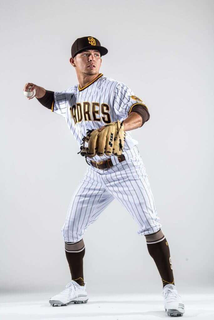
Close-up image of the San Diego Padres new home uniform showcasing the white fabric with brown pinstripes and the updated “Padres” script across the chest in brown and gold.
Home Uniform
The home uniform for the padres new uniforms is a classic white pinstripe design, a nod to Padres heritage. It features brown pinstripes on a white base, with “Padres” arched across the chest in brown lettering outlined in gold. Gold trim accents the collar and sleeve cuffs, and the iconic Swinging Friar patch adorns the sleeve. Completing the look is a brown belt and the new brown cap, creating a cohesive and traditional home uniform set.
Primary Road Uniform
For their primary road uniform, the Padres have introduced a distinctive brown jersey, a bold departure from typical road grays. The jersey features “San Diego” arched across the chest in gold lettering, paired with tan pants the team calls “sand.” These sand pants are a darker, brown-based tan, different from previous iterations. The brown belt and the same brown cap used for the home uniform tie the road look together with the home set, maintaining a consistent team identity.
Image of the San Diego Padres new primary road uniform featuring a brown jersey with “San Diego” in gold lettering, paired with tan “sand” colored pants and a brown cap.
Alternate Road Uniform
Adding depth to the road uniform options, the padres new uniforms include an alternate road uniform in pinstriped tan/sand. This lighter option features “San Diego” in brown lettering across the chest and utilizes the same brown primary cap. Initially intended as a runner-up for the primary road uniform, this design was brought back to fulfill MLB requirements for a lighter road alternative, adding versatility to the Padres’ uniform set.
Camouflage Uniforms
While the brown uniforms took center stage at the unveiling, the Padres also have two new camouflage alternate home uniforms in development. These designs, to be revealed at a later date, will further expand the Padres’ uniform options while maintaining the new design language and branding.
Sleeve Patch
A unifying element across all the padres new uniforms, including the unreleased camouflage versions, is the Swinging Friar sleeve patch. Designer Brian Gundell subtly updated the Friar logo, refining details like the toes, smile, and hair. This refreshed Friar, also used on the 50th-anniversary logo, provides a modern yet familiar emblem for the team.
Nike Maker’s Mark
The Nike logo is prominently featured on the padres new uniforms, appearing as a sewn patch on the upper-right chest of the jersey and above the left rear pocket of the pants. This placement and patch application are consistent with Nike’s branding approach for MLB uniforms, ensuring visibility and brand recognition.
Close-up image showing the Nike logo as a sewn patch on the upper right chest of the San Diego Padres new brown road jersey.
Insights from Padres CMO Wayne Partello
To gain deeper insight into the padres new uniforms design process and strategic thinking, an interview with Padres Chief Marketing Officer Wayne Partello provides valuable context. Partello, instrumental in the uniform redesign, shared the team’s goals and rationale behind key decisions.
Uni Watch: What was your goal with this redesign?
Wayne Partello: We conducted brand research in 2014, which highlighted a lack of clear brand direction. The Padres’ uniform history was marked by inconsistency. Our primary goal was to establish a consistent uniform set that fans would immediately recognize as the Padres. This redesign is intended to be a long-term brand identity, moving away from frequent changes and building brand consistency.
UW: Why the return to brown?
WP: The decision to return to brown was fan-driven. Despite ownership’s preferences, fan research overwhelmingly favored brown and gold. While brown and gold wasn’t the majority first choice due to varied options, it garnered the strongest support overall. Importantly, fans who liked blue and white were also receptive to brown and gold, whereas brown and gold supporters strongly disliked other color schemes.
UW: Is it the same shade of brown you’ve used in the past?
WP: No, it’s a darker, stronger brown. We aimed for a more robust and contemporary shade compared to the softer browns of the past.
UW: You’ve made some very, very subtle tweaks to your “SD” logo. What was the intention there?
WP: Our “SD” logos had become inconsistent over time. Serifs and alignment varied across applications. The update aimed to standardize and refine the logo for a cleaner, more unified brand presentation.
UW: Why did you opt for pinstripes on the home uniform?
WP: Fan research indicated a preference for pinstripes. They evoke heritage and tradition and are associated with successful periods in Padres history.
UW: I’m surprised there isn’t a brown home alternate jersey. Is that something you might add after a year or two?
WP: Initially, we are prioritizing consistency. While a brown home alternate is possible in the future, the immediate focus is on establishing a clear and consistent brand identity with the unveiled uniforms.
UW: Is that also why there are no alternate caps, aside from the camouflage?
WP: Yes, the emphasis on consistency extends to the caps. We want to present a unified and recognizable look.
UW: Why did you opt for a solid-colored road jersey?
WP: We wanted to be unique. Most MLB teams wear gray on the road. We experimented with sand, but a solid brown jersey with sand pants tested best with fans, offering a distinctive road identity.
UW: Why aren’t you presenting the new camouflage designs at the unveiling?
WP: We wanted to allow the brown uniforms to have their moment and not dilute the excitement surrounding their return.
Author’s Review and Grades
The return of brown for the padres new uniforms is undoubtedly a welcome change for many fans. However, a closer look at the individual uniform designs reveals both successes and areas for potential improvement.
Home Uniform (Grade: B+)
The white pinstripe home uniform is a solid and respectable design. While the pinstripes are a pleasant surprise, the chest lettering feels somewhat generic. It lacks the playful character of the Padres’ classic brown era. While an upgrade from recent uniforms and aesthetically respectable, it doesn’t fully capture the potential of the brown revival.
Primary Road Uniform (Grade: B+)
The brown primary road jersey is a bold and unique choice. However, showcasing brown more prominently on the road than at home feels slightly misaligned. A brown home alternate jersey might have been a more impactful way to celebrate the return of the team’s signature color. Nevertheless, the road uniform is a strong and distinctive look.
Alternate Road Uniform (Grade: A)
The pinstriped tan/sand alternate road uniform is arguably the standout design of the set. Pinstripes on a road uniform work exceptionally well here, creating a visually appealing and unique look. In fact, this design is so well-executed that it could easily serve as the primary road uniform.
Conclusion: A Strong Step Forward with Room to Grow
The padres new uniforms represent a significant and positive shift for the franchise. The return to brown is a victory for fans and a powerful statement of brand identity. While some design elements, particularly the home chest lettering, could be more adventurous, the overall uniform set is a substantial improvement. The Padres have successfully reintroduced brown in a modern and appealing way, laying a strong foundation for their brand moving forward, with potential for even greater design evolution in the future.