

Yesterday marked the unveiling of the Dallas Mavericks’ latest uniform design, the result of a contest hosted by Mark Cuban on his blog. Anticipation had been building around this announcement, with fans wondering: Which design would emerge victorious? Would this be a mere alternate uniform, or a complete overhaul of the Mavericks’ iconic look since 2001? And perhaps most intriguingly, would the beloved green color make a triumphant return to the Mavericks Uniforms?
The reveal, however, proved to be somewhat understated. The new uniforms aren’t set to replace the Mavericks’ primary jerseys. Instead, it’s an alternate uniform slated for introduction next season. The defining feature is a rendition of the Dallas skyline emblazoned across the chest – a concept with considerable potential, though its execution remains a point of discussion.
This marks the most significant alteration to the team’s visual identity since 2010, when the away jerseys transitioned from navy to royal blue. But how does this new skyline design stack up against the Mavericks’ history of alternate jerseys, ranging from intriguing to, well, less so? Let’s embark on a journey through the sartorial evolution of basketball in Dallas, as we eagerly await the Mavericks’ on-court debut of their new look in the 2015-16 season. While this is primarily a historical overview, I’ll also be offering my personal grades for each uniform, based purely on my aesthetic preferences. Disagreement is, of course, welcome.
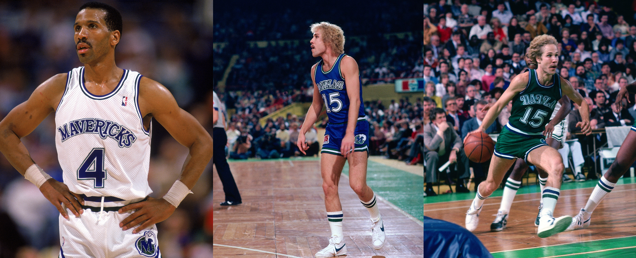
1980: Dallas Mavericks Debut in a Unique Western-Themed Blue and Green Look
 1980s
1980sThe inaugural Dallas Mavericks uniforms in 1980 presented a distinctive western-themed aesthetic, utilizing a color palette of blue and green. The home uniforms were white, while the road uniforms were blue, both incorporating green accents. This initial design was characterized by its simplicity and almost rustic charm, featuring a western-style font that perfectly captured the era. A playful touch was the “M wearing a cowboy hat” logo, adorning the left leg of the shorts on both home and away versions. Following NBA convention, the home jersey proudly displayed the team name, “Mavericks,” across the chest, while the road jersey showcased the city name, “Dallas.” However, the color scheme was tweaked after just one season, with blue becoming the secondary accent color and green taking center stage as the primary color for the away Mavericks uniforms.
The combination of green and blue was truly inspired. It not only created a visually striking look but also established a unique identity for the Mavericks. While blue was a common color in the NBA, and green was used by teams like Boston, Utah, and Milwaukee, no other team dared to pair these colors together. For this bold and original choice alone, these uniforms earn significant praise.
Final verdict: While western-themed designs aren’t typically my personal favorite, these uniforms were exceptionally well-suited for Dallas’s newly formed expansion franchise. Furthermore, the Mavericks’ green and blue color combination was both visually appealing and distinctive within the NBA landscape.
Four out of five stars.
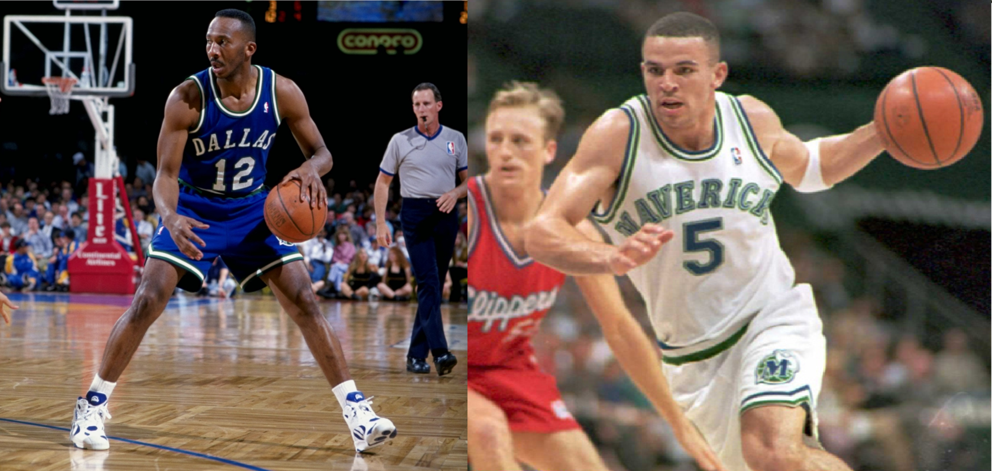
1993: Dallas Mavericks Go Blue
 1990s
1990sMinor adjustments were made to the Mavericks uniforms in 1992, seemingly as a prelude to a more substantial change the following year. In 1993, Dallas made the decision to emphasize blue, shifting away from the green that had defined the team’s identity for over a decade. While these new Mavericks uniforms weren’t inherently bad, the simple western aesthetic had begun to feel somewhat dated, and blue simply lacked the uniqueness and visual impact that the green away uniforms had possessed.
Compounding the issue, the Mavericks wore these uniforms throughout the franchise’s most challenging decade. The 1990s were a particularly difficult period for Mavericks fans, marked by poor team performance. One might humorously suggest that perhaps more stylish uniforms could have improved the team’s fortunes, but alas, that’s likely a stretch. Regardless, by the time Mark Cuban acquired the team in 2000, it was evident that a comprehensive style overhaul was necessary to usher the Mavericks into the new millennium.
Final verdict: Blue simply didn’t capture the same sense of fun or distinctiveness as green, and the western theme had become stale after more than ten years. These Mavericks uniforms felt like a step backward in style.
Two out of five stars.
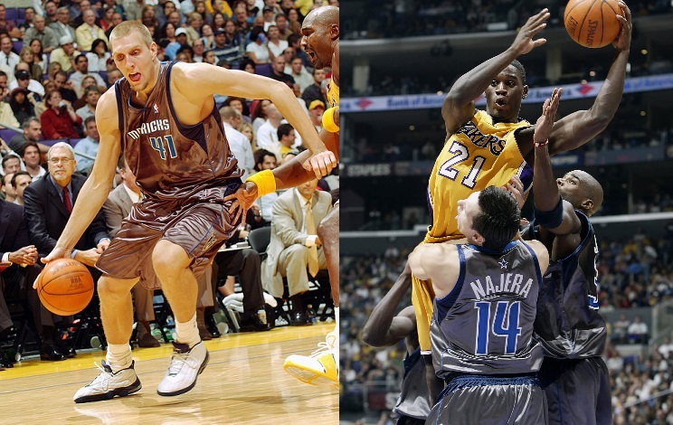
2001: Mark Cuban Modernizes the Mavericks Brand
 2000s
2000sUpon purchasing the team in January 2000, Mark Cuban immediately embarked on a mission to elevate the Mavericks’ popularity both in Dallas and nationwide. A key component of this strategy was a complete rebranding in 2001. This overhaul introduced a navy blue, royal blue, and silver color scheme, replacing the original green and blue. A contemporary logo, featuring an aggressive horse head merging with a basketball, superseded the old “M wearing a hat” logo. The Mavericks also incorporated a couple of alternate “M” logos into their branding. One minor inconsistency I’ve always noted is the logo’s use of black and royal blue, while the broader color scheme favored navy and royal blue.
The jerseys themselves were decidedly modern, representing a bold departure from the simpler designs of the Mavericks’ first two decades. The new-look Mavericks donned white uniforms at home and navy blue on the road. Interestingly, both the home and away jerseys featured “DALLAS” across the chest. This design choice was likely due to the word “MAVERICKS” proving too lengthy and awkward to fit within the new uniform font.
Final verdict: Objectivity is challenging when evaluating these uniforms, as they are the ones the Mavericks have worn for the majority of my time as a fan. For a franchise desperately seeking a fresh direction, this rebrand provided a modern and energetic look that mirrored the boldness and confidence Cuban brought to the team. However, I must admit that I didn’t fully realize my lukewarm feelings towards the navy away uniforms until they were replaced in 2010. These Mavericks uniforms were a solid update but not without minor flaws.
Three out of five stars.
2003: The Infamous Silver “Trash Bag” Mavericks Uniforms
 9-21jerseys7
Mark Cuban, like many of us, has had his share of questionable fashion moments in the early 2000s, but these silver alternate Mavericks uniforms arguably take the crown. It takes a truly unconventional mind to conceive of “silver trash bag material” as a suitable fabric for futuristic basketball uniforms. While there’s merit in pushing boundaries and trying new things, these uniforms were universally criticized for good reason. They simply looked, well, ridiculous.
Even attempting to evaluate these uniforms seriously is a challenge. The word “Mavericks” appears clumsy and cluttered across the front. The material was undeniably poor. Frankly, there’s little else to say about these disastrous Mavericks uniforms.
Final verdict: A complete and utter failure. These uniforms were atrocious. They remain a source of jokes and mockery to this day, a dark mark on the Mavericks’ uniform history.
Zero out of five stars.
2004: Diddy Revives Green in Mavericks Alternate Uniforms
 9-21jerseys9
Full disclosure: these are my all-time favorite Mavericks uniforms. Yes, I acknowledge they are a bit busy, perhaps even bordering on excessive. Green, royal blue, navy blue, silver, white… it’s a lot. But they are undeniably distinctive and fun! If you happen to dislike these uniforms, be warned: Diddy himself, the mastermind behind these beauties, might just track you down for a stern conversation.
Jokes aside, these Mavericks uniforms were truly unique without being overly garish or tasteless. The cool font, the team nickname, the number positioned above the wordmark – these elements combined to create a vibrant and playful design. Perhaps sticking to just one shade of blue would have refined them further, but overall, this is a fantastic alternate uniform. Bonus points for paying homage to the franchise’s green roots.
Final verdict: Despite incorporating a few too many colors, these Mavericks uniforms were a refreshing change of pace that cleverly referenced Mavericks history while still aligning with the team’s modern aesthetic.
Four out of five stars.
2009: Green Mavericks Uniforms Kicked to the Curb Again
 Dallas-mavericks-jersey_1
These Mavericks alternate uniforms were undeniably sharp, weren’t they? While I wasn’t thrilled to see green disappear again – I appreciate alternate jerseys that offer a significant contrast to the standard uniforms – these designs addressed the color overload issue of the previous green alternates. They achieved a stylish look while maintaining simplicity, using royal blue, navy blue, silver, and white. These uniforms demonstrated how effectively the Mavericks could utilize a predominantly royal blue color scheme.
Final verdict: While lacking green, these Mavericks uniforms were still excellent. They seem to have paved the way for royal blue to become the primary away color the following year, earning them additional credit. I personally still favor green, but at least these avoided the pitfall of using too many colors, unlike the original Diddy-designed uniforms.
Four out of five stars.
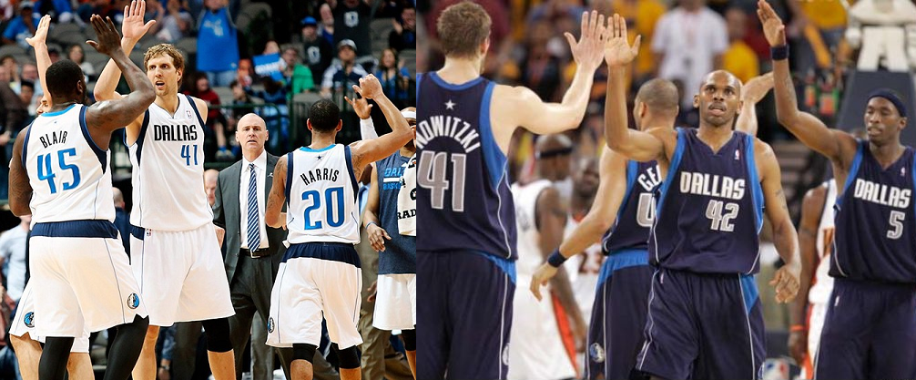
2010: Royal Blue and Navy Blue Swap Roles in Mavericks Uniforms
 2010
2010After nearly a decade, the existing Mavericks uniform set had started to feel stale. Personally, I always preferred the Diddy-designed alternate uniforms over the main set with its somewhat random paneling. In 2010, the Mavericks managed to revitalize this look simply by swapping the roles of royal blue and navy blue, and surprisingly, it worked wonders. The away uniforms looked significantly improved in royal blue compared to navy. And while the alternate Diddy jerseys looked decent in navy, they were undeniably better in green.
Furthermore, the Mavericks’ improved appearance seemed to translate to improved performance, culminating in a championship victory in their first season wearing these updated uniforms. Surely, it can’t be mere coincidence that the greatest Mavericks team in history was also the first to sport the royal blue away uniforms. Perhaps if this color change had happened back in 2005… well, maybe not.
Final verdict: While I’m (mostly) joking about the uniform update being a direct cause of the championship, it’s safe to say that swapping the colors on the away uniforms was a brilliant decision. It breathed new life into a uniform set that had become somewhat “blah.” These royal blue Mavericks uniforms are a definite upgrade.
Four out of five stars.
2015: Dallas Skyline Mavericks Uniforms Allow Players to “Rep the City”
 2015alt
The unveiling of these new Mavericks skyline uniforms yesterday elicited mixed reactions. The concept of incorporating the Dallas skyline into the uniforms seems to be generally well-received. However, the jersey Mark Cuban presented at the media event unfortunately didn’t quite capture the skyline effectively. The overall jersey design appeared somewhat amateurish, and the skyline depiction in particular resembled something hastily created in MS Paint. This is perplexing, considering that the mockup version (pictured on the left) actually looks quite impressive.
Cuban clarified that the jersey he was holding was a rushed prototype. Hopefully, the final product will exhibit a significantly more polished appearance. Some non-Mavericks fans were quick to criticize the jersey for being too similar to Denver’s retro alternate jerseys, which also feature a skyline. To this, I say, “so what?” Those Denver jerseys are fantastic, and the Dallas skyline is arguably the greatest in the world.
Final verdict: If the final jersey design more closely resembles the original mockup, these skyline Mavericks uniforms should be a fun addition. I still believe the Diddy jerseys offer a more stylish and refined overall look, but fans should appreciate these if they are well-executed. However, if the finished product largely resembles what Cuban showcased yesterday, these uniforms won’t be much of an improvement over the infamous “trash bag” jerseys. The potential is there, but execution is key for these Mavericks uniforms.
Three out of five stars (tentatively).