The Philadelphia Phillies unveiled their City Connect uniforms in mid-April, just moments before an unexpected earthquake rattled the Philly area. While we can’t blame the seismic activity on the uniform design, the reaction to these new threads has certainly been earth-shaking in its own way. As part of the ongoing MLB City Connect series in partnership with Nike, these uniforms aim to represent the city’s unique spirit beyond the team’s traditional look. But have the Phillies hit a home run, or struck out with their Friday uniform offering? Let’s delve into the details.
Since 2021, Major League Baseball, collaborating with Nike, has introduced City Connect uniforms for almost every team, excluding the New York Yankees and Oakland Athletics. By the end of 2024, all eligible teams will sport these alternate home uniforms. The goal is to capture the essence of each city in a fresh and distinctive way, diverging from the team’s standard colors and branding. Some teams have achieved remarkable success, like the Miami Marlins, whose vibrant design has been widely praised. Others, however, have faced more criticism, such as the New York Mets’ gray-dominant City Connect uniforms, which could create visual confusion when playing against teams in their gray road uniforms.
But the spotlight is now firmly on the Philadelphia Phillies and their City Connect uniforms, often sported during Friday home games. Let’s break down the design and the fan response.
An ode to Philly’s past, present & future.
➡️ https://t.co/5ZsDu5BBDu pic.twitter.com/RGnXRnl3zC
— Philadelphia Phillies (@Phillies) April 5, 2024
Decoding the Design of the Phillies Friday Uniforms
The Phillies’ City Connect uniform attempts to weave together elements of Philadelphia’s history and identity. The design incorporates a blue collar and draws inspiration from the colors of the city’s flag. The bold lettering is intended to evoke the spirit of the founding documents of the United States, a nod to Philadelphia’s pivotal role in American history. However, the execution of these ideas has been met with mixed reactions.
One point of contention is the typography. While aiming for a historical feel, the number 7 on Trea Turner’s jersey, for example, has been likened to a question mark without its dot, raising concerns about readability. Typography has indeed evolved significantly since the 18th century, and some argue that a more modern font style could have been more effective and visually appealing. Despite these criticisms, the design team’s intentions are clear: to connect the team to the city’s heritage.
On a brighter note, the hat design has garnered some praise. The incorporation of the city skyline within the iconic Liberty Bell, a long-standing symbol of the Phillies, is seen as a clever and visually appealing motif. While the color scheme might not be universally loved, the concept behind the hat design demonstrates a thoughtful approach to city representation.
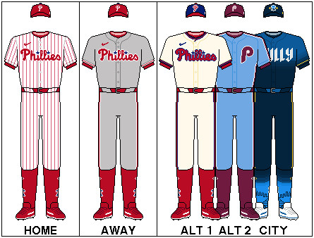 Phillies City Connect Uniform
Fan Reactions: A Mixed Bag for the Friday Uniforms
Phillies fans are known for their passionate and vocal opinions, and the City Connect uniforms are no exception. Social media platforms quickly became a hub for reactions, ranging from humorous takes to outright disapproval. Many fans took to X (formerly Twitter) to share their thoughts, often with a touch of Philly-style humor.
Some compared the uniforms unfavorably to energy drink branding, while others joked about the earthquake being a divine reaction to the design reveal. One popular sentiment was that the uniforms were simply “average,” a significant criticism for a fanbase that expects nothing less than excellence. The Phillies’ classic pinstripe home uniforms are widely regarded as one of the best in baseball, setting a high bar for any alternate design.
The introduction of yellow catcher’s gear for J.T. Realmuto, paired with the City Connect uniforms during a Friday game, also sparked considerable online commentary. The bold color combination further fueled the debate and became a focal point for fan reactions.
OH MY GOD
OH NO
WHO GREEN LIT THIS
WHY https://t.co/VsG9dtQi5N pic.twitter.com/x5xfDsJ3Wo
— Philly Sports Sufferer (@mccrystal_alex) April 19, 2024
These fan reactions highlight the challenge of introducing new uniforms to a fanbase deeply attached to tradition and success. While some may eventually warm up to the City Connect jerseys, the initial response indicates a desire for designs that resonate more strongly with the team’s and city’s identity.
Missed Opportunities and Potential Paths for Phillies Friday Uniforms
Looking ahead, there are alternative design directions that could have potentially resonated more with Phillies fans for their Friday uniforms and beyond. Many fans have expressed nostalgia for the retro 1970s maroon uniforms, suggesting an updated version could be a popular choice. Another intriguing idea is to draw inspiration from the Phillie Phanatic, the team’s beloved mascot, perhaps incorporating a green color scheme. Given Nike’s successful City Edition jerseys for the Philadelphia 76ers basketball team, there’s a proven track record of creating impactful designs for Philadelphia sports teams.
Ultimately, the Phillies City Connect uniforms, while aiming to be a unique representation of the city, have landed in a somewhat polarizing territory. Whether they will grow on fans over time remains to be seen. For now, the Friday uniforms are a talking point, sparking debate and highlighting the passionate connection Phillies fans have with their team’s visual identity. Perhaps future iterations will further refine the City Connect concept and better capture the spirit of Philadelphia baseball.