
College football is as much about pageantry and tradition as it is about touchdowns and tackles. And at the heart of that spectacle are the uniforms. While alternate uniforms have exploded in popularity, vying for attention and recruit buzz, true uniform greatness transcends fleeting trends. We’re diving deep into the pantheon of college football aesthetics to rank not just the best alternate looks, but the Best College Football Uniforms Of All Time. These are the jerseys and helmets that have become iconic, instantly recognizable, and beloved by fans – the designs that define programs and evoke decades of gridiron history.
Timeless Uniforms: The Gold Standard
Some uniforms are classics for a reason. They represent more than just team colors; they embody the spirit and tradition of a university. These are the uniforms that consistently rank among the best, year after year, and often inspire alternate and throwback designs.
1. Notre Dame’s Gold Helmets and Navy Blue:
(Rich Barnes / USA Today)
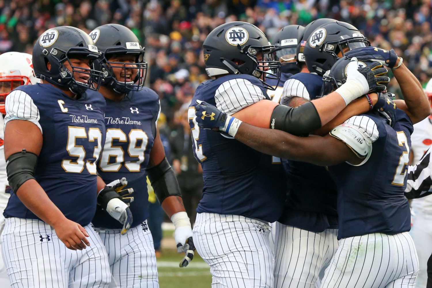 Notre Dame Fighting Irish players in iconic navy blue and gold uniforms, showcasing the famous gold helmets.
Few symbols in college football are as instantly recognizable as Notre Dame’s gold helmets. Paired with their navy blue jerseys and gold pants, the Fighting Irish present a look of timeless elegance and unwavering tradition. The simplicity and rich color palette create an aura of prestige that few programs can match. It’s a uniform that speaks volumes without needing flashy alternates.
2. Alabama’s Crimson and White:
(Courtesy of Florida Athletics)
 Classic white helmet with block 'F' logo, part of Florida Gators' throwback uniform in a game against Alabama.
Alabama’s crimson and white is synonymous with college football dominance. The straightforward design, often featuring simple stripes and block numbers, is the epitome of classic football aesthetics. The power of this uniform lies in its simplicity and the dynasty it represents. Whether home or away, the Crimson Tide’s uniforms exude authority.
3. Penn State’s Basic Blues:
(Aaron Doster / USA Today)
 Ohio State Buckeyes player in gray alternate uniform with wolf fur texture, facing Penn State Nittany Lions in their traditional blue and white.
Penn State’s uniforms are perhaps the most minimalist in major college football, yet they are instantly recognizable. The plain navy jerseys and white helmets with no logos put the focus squarely on the game. This understated approach has become part of Penn State’s identity, representing a no-nonsense, traditional football program.
4. Michigan’s Maize and Blue:
(Courtesy of U-M Athletics)
 Michigan Wolverines players in 'under-the-lights' jerseys, a controversial alternate uniform with varied maize coloring and added helmet numbers.
Michigan’s maize and blue, particularly the winged helmet, is another iconic design in college football. The unique color combination and the distinctive helmet have been associated with Wolverines football for generations. While alternate attempts have been made, the classic maize and blue remains the program’s strongest visual identity.
Alternate Uniform Excellence: When Change Works
While tradition is paramount, some alternate uniforms hit the mark, either by offering a fresh twist on classic themes or by paying homage to program history. These alternates enhance, rather than detract from, a team’s visual identity.
1. Hawaii’s Rainbow Retro:
(Courtesy of Hawai’i Athletics)
 Hawaii Rainbow Warriors football throwback uniforms, featuring the classic rainbow logo and color scheme on white jerseys and helmets.
Hawaii’s rainbow uniforms are a vibrant and joyful tribute to the program’s past. The rainbow logo, a symbol of the islands, is perfectly integrated into a clean and stylish design. These retro uniforms are not just visually appealing; they evoke a sense of nostalgia and pride in Hawaii’s unique football heritage.
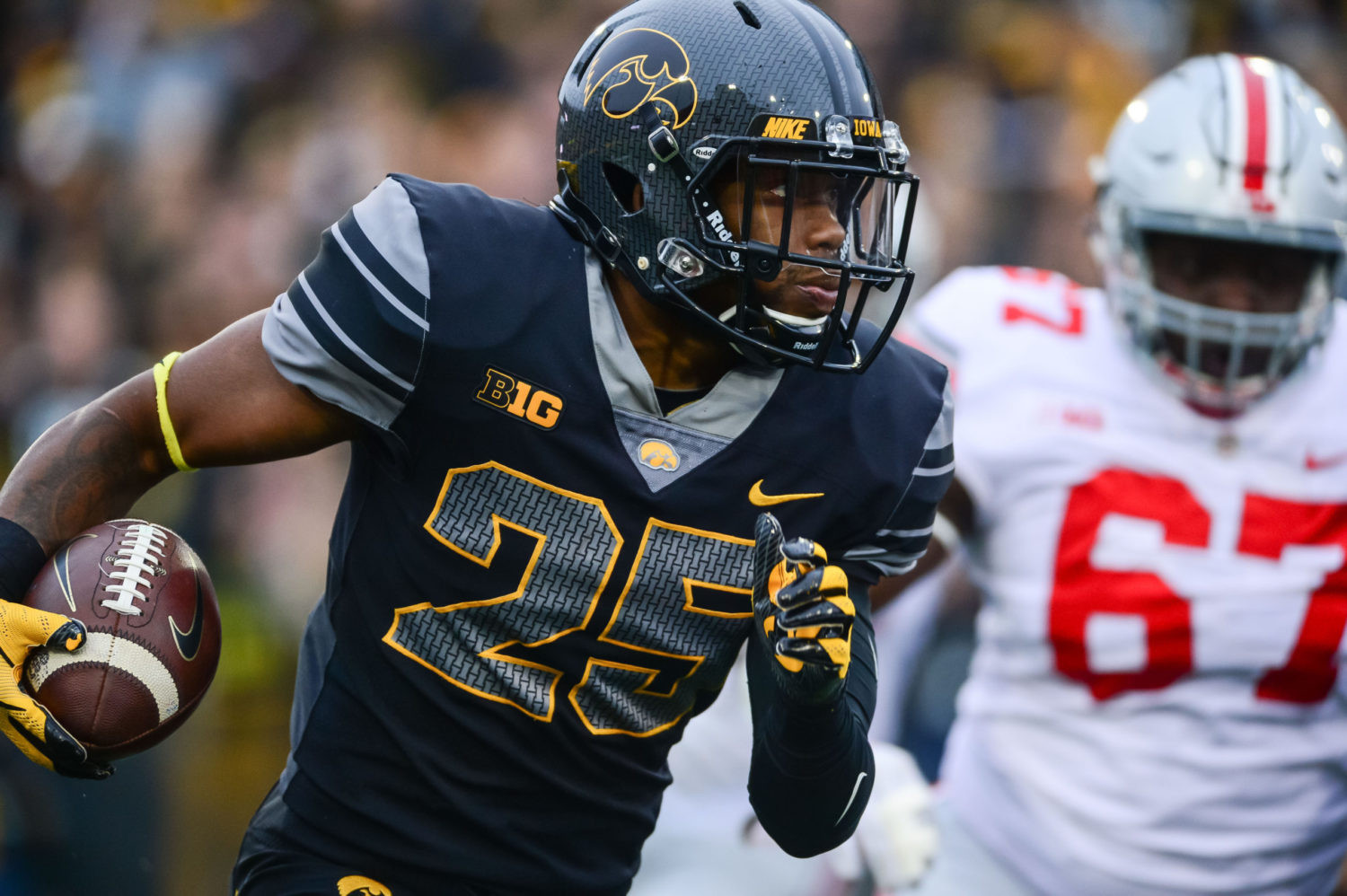
2. Iowa’s “Blackout” Uniforms:
(Jeffrey Becker / USA Today)
Hawaii Rainbow Warriors football throwback uniforms, featuring the classic rainbow logo and color scheme on white jerseys and helmets.
Iowa’s “Blackout” uniforms are a masterclass in creating intensity and drama. The all-black ensemble, punctuated by grey stripes and intricate ‘I’ block detailing, is both menacing and modern. These uniforms were a perfect one-off for a high-stakes game, amplifying the atmosphere and becoming an instant fan favorite.
3. Navy’s Ship Helmets:
(Courtesy of Navy Athletics)
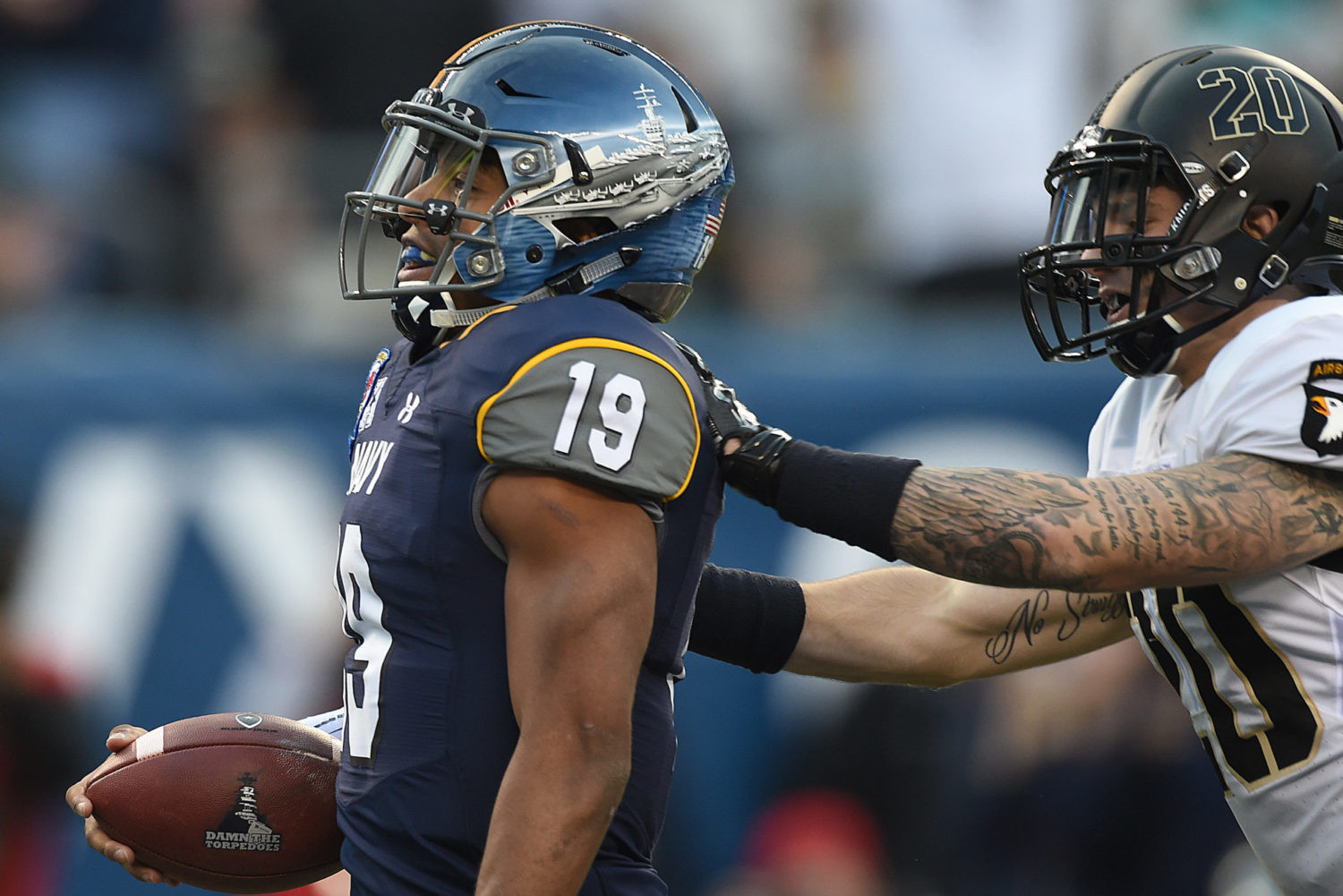 Navy Midshipmen football helmets, hand-painted with different battleship designs, part of their special Army-Navy game uniforms.
Navy’s special uniforms for the Army-Navy game consistently impress, but the ship helmets were a standout. Hand-painted with different ship designs for each position group, these helmets are a powerful and meaningful tribute to naval tradition. They perfectly embody the spirit of the Naval Academy and the significance of the Army-Navy rivalry.
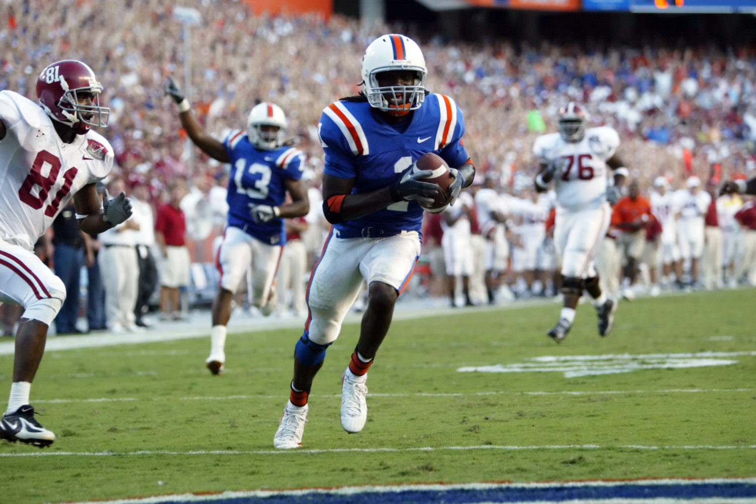
4. Florida’s White Helmet Throwbacks:
(Courtesy of Florida Athletics)
Classic white helmet with block 'F' logo, part of Florida Gators' throwback uniform in a game against Alabama.
Florida’s white helmet throwbacks are a clean and refreshing alternative to their usual look. Paying homage to past eras, these uniforms are bright, crisp, and visually appealing. The old-school block ‘F’ logo is a particularly strong element, adding a touch of vintage charm to a modern uniform landscape.
5. Air Force’s Sharktooth Helmets:
(Casey Sapio / USA Today)
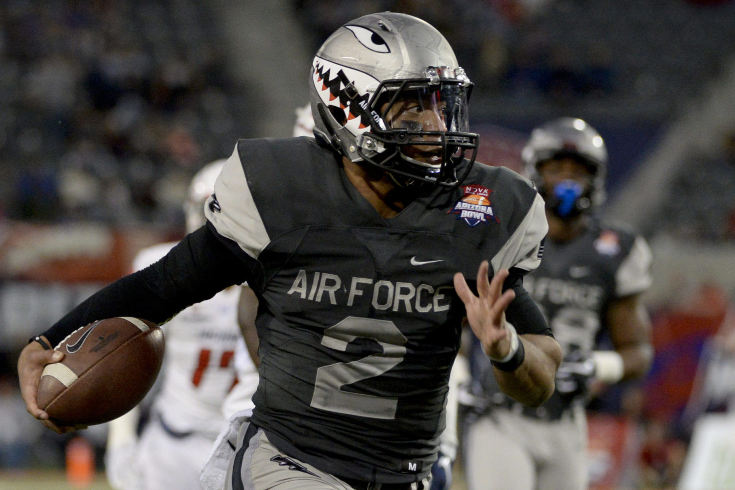 Air Force Falcons football player wearing gray jersey and sharktooth helmet, paying tribute to WWII 'Flying Tigers' nose art.
Air Force’s sharktooth helmets are undeniably “badass.” Referencing the nose art of WWII “Flying Tigers,” these helmets are a striking and historically resonant design. Paired with clean gray jerseys, the sharktooth helmets elevate Air Force’s uniform game and create a memorable on-field presence.
6. LSU’s “Gridiron Gold”:
(Derick E. Hingle /USA Today)
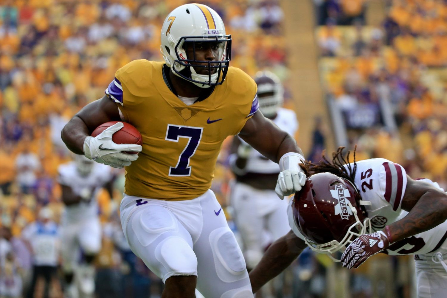 LSU Tigers football player in 'Gridiron Gold' throwback uniform, featuring mustard jerseys with vintage sleeve stripes and a classic feel.
LSU’s “Gridiron Gold” throwbacks are a sophisticated nod to the program’s 1940s era. The mustard jerseys with vintage sleeve stripes exude a cool, retro vibe. These uniforms demonstrate how to tastefully incorporate throwback elements into a modern context, enhancing LSU’s already strong visual brand.
7. Maryland’s State Flag Tribute:
(Courtesy of Maryland Athletics)
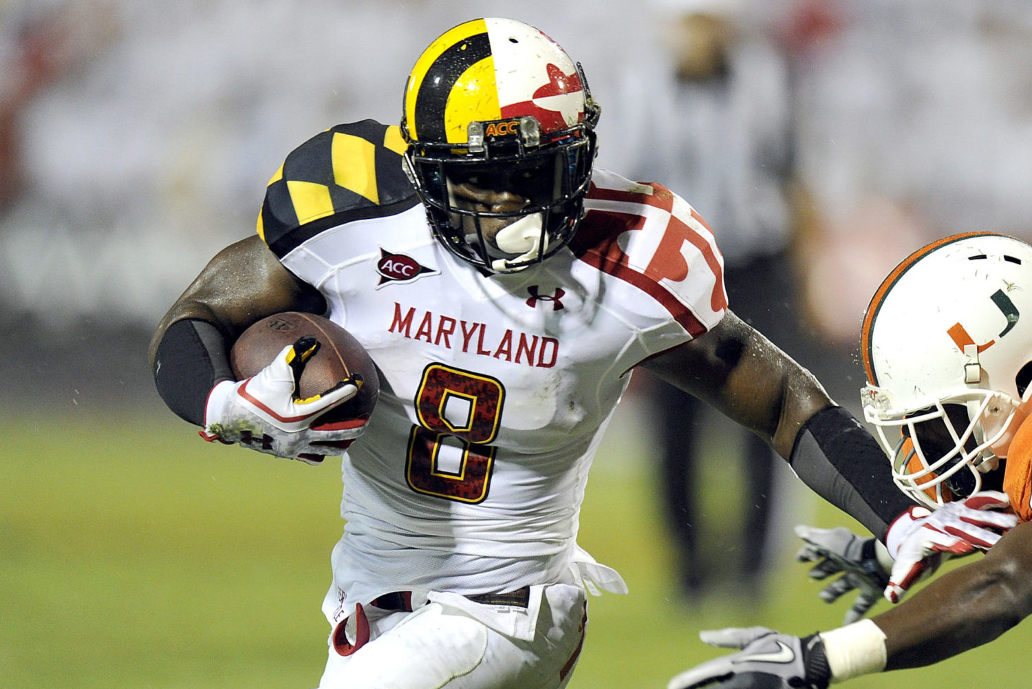 Maryland Terrapins football player in state flag tribute uniform, incorporating the unique and colorful Maryland flag design.
Maryland’s state flag uniforms are undeniably unique. Love it or hate it, the bold and intricate Maryland flag design makes a statement. These uniforms were designed to grab attention and create a distinct identity for the Terrapins, and in that, they succeeded.
8. Pitt’s Retro Revival:
(Charles LeClaire / USA Today)
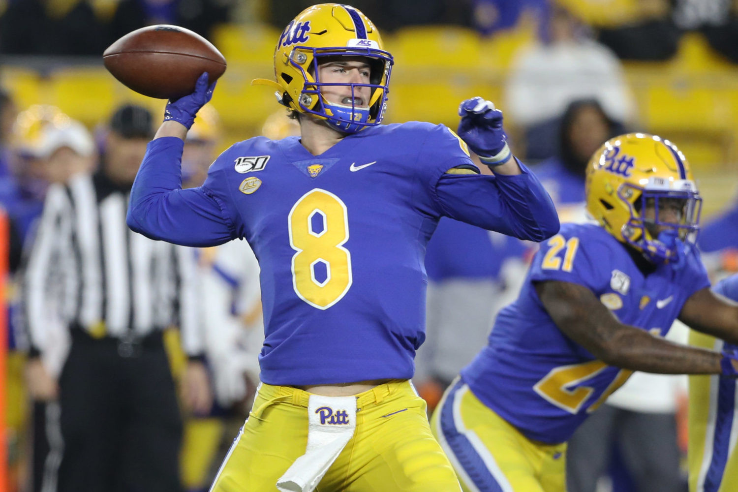 Pitt Panthers football player in retro blue and gold uniform, featuring gold numbers and white trim, a return to their 1970s-80s glory days.
Pitt’s decision to embrace their retro blue and gold as their primary colors was a uniform triumph. These colors, reminiscent of the Tony Dorsett and Dan Marino era, are vibrant and classic. This return to tradition has given Pitt one of the most visually appealing uniforms in college football.
9. Miami’s “Miami Nights”:
(Steve Mitchell / USA Today)
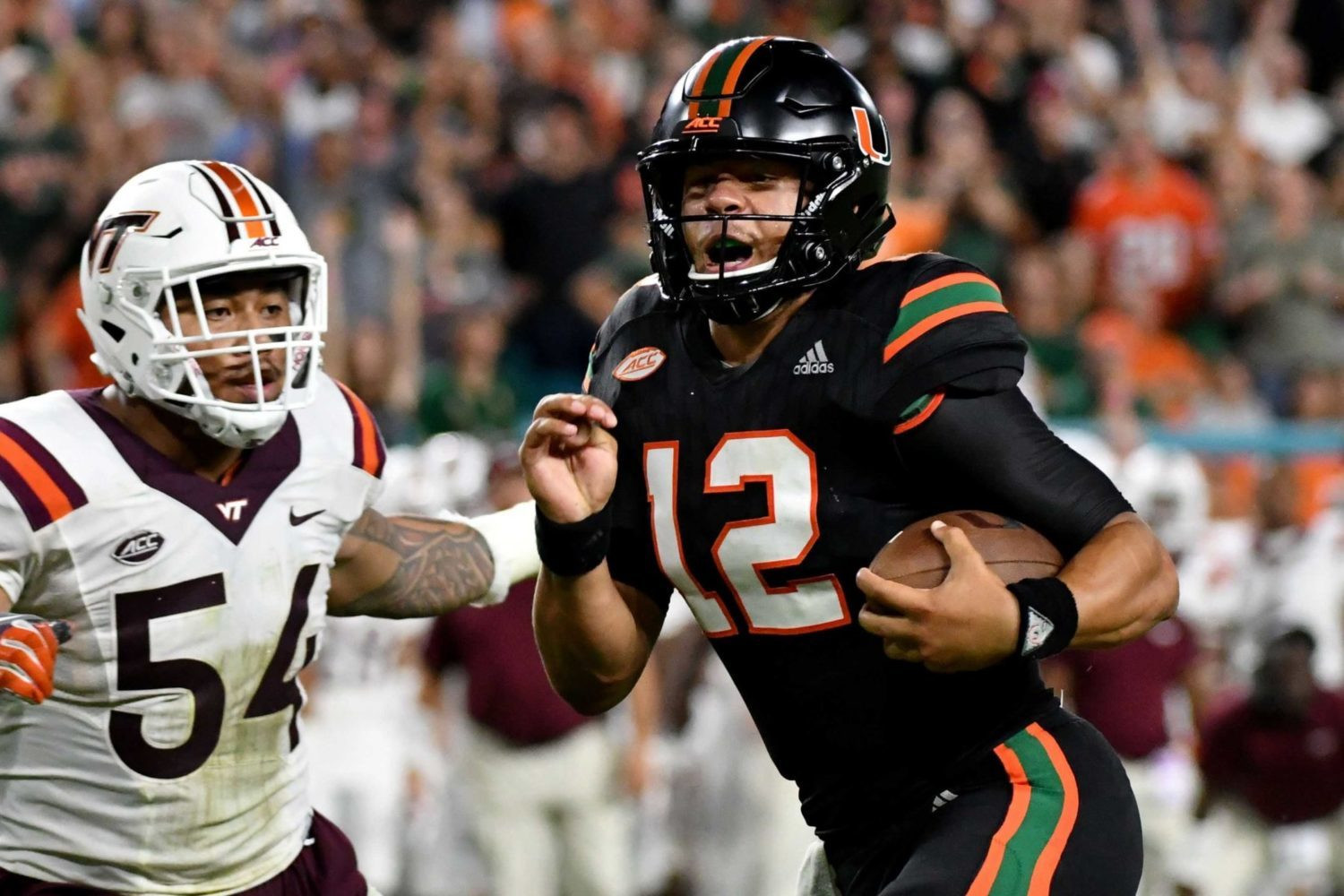 Miami Hurricanes football player in 'Miami Nights' all-black alternate uniforms, a popular and sleek design with fan appeal.
Miami’s “Miami Nights” all-black alternates were a home run with fans. Sleek, modern, and undeniably cool, these uniforms tapped into a desire for a darker, edgier look for the Hurricanes. They proved that sometimes, a bold departure from tradition can be incredibly successful.
10. Missouri’s Liberty Bowl Whites:
(Justin Ford / USA Today)
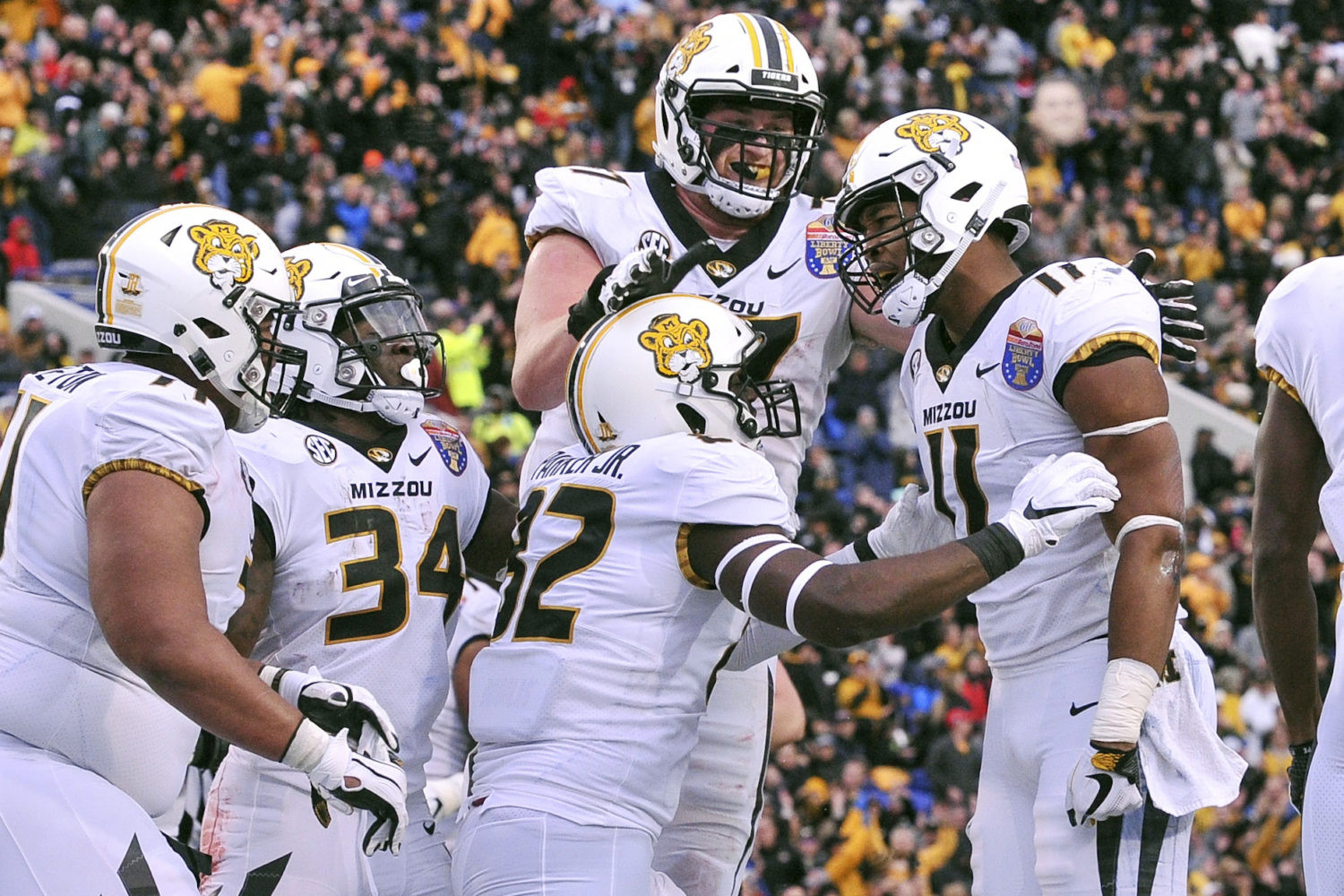 Missouri Tigers football team in all-white uniforms with old-fashioned Tigers logo helmets, worn in the 2018 Liberty Bowl.
Missouri’s all-white Liberty Bowl uniforms were a study in sleekness. The clean white combination, accented by the old-fashioned Tigers logo, was both modern and classic. These uniforms demonstrated the power of a well-executed monochromatic look.
11. UAB’s Children’s Harbor Tribute:
(Marvin Gentry / USA Today)
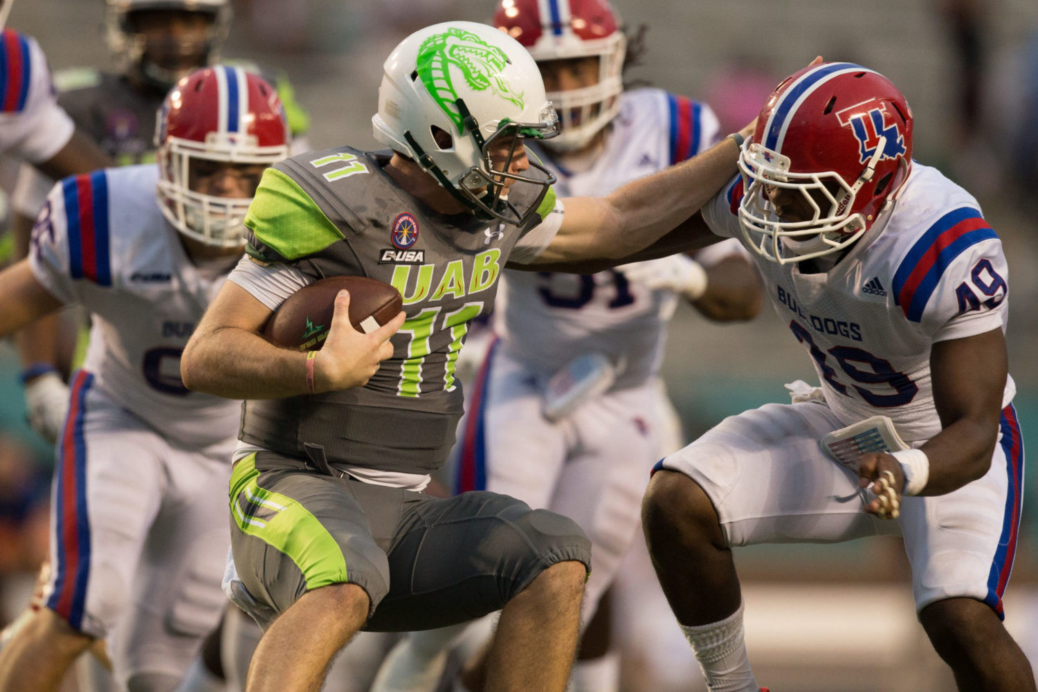 UAB Blazers football team in gray and neon green Children's Harbor tribute uniforms, featuring children's names on the back of jerseys.
UAB’s Children’s Harbor uniforms are more than just visually appealing; they are meaningful. The gray and neon green color scheme is sharp, but the real impact comes from the children’s names on the back, honoring patients from a local hospital. These uniforms represent the best of what alternate uniforms can be – stylish, unique, and for a great cause.
12. Arkansas’ Anthracite:
(Nelson Chenault / USA Today)
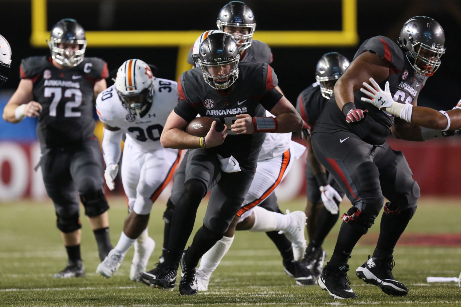 Arkansas Razorbacks football player in anthracite uniform with chrome gray helmet, featuring cardinal and white accents.
Arkansas’ anthracite uniforms are a bold and successful departure from their traditional look. The coal-colored base, accented with cardinal and white, is both modern and menacing. The chrome gray helmet took this uniform to another level, making it a fan and player favorite.
13. Utah’s Homecoming Throwbacks:
(Jeff Swinger / USA Today)
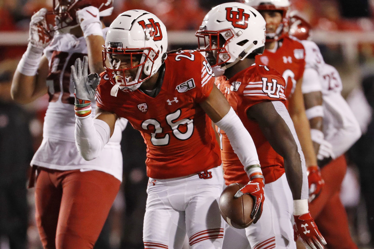 Utah Utes football team in homecoming throwback uniforms, featuring red and white with interlocking 'U' logo helmets from the 1960s-70s.
Utah’s homecoming throwbacks are a perfect example of how to honor the past. The retro interlocking ‘U’ logo and the classic red and white color scheme evoke a sense of nostalgia and tradition. These uniforms have become a beloved part of Utah’s football identity.
14. Clemson’s Purple Reign:
(Adam Hagy / USA Today)
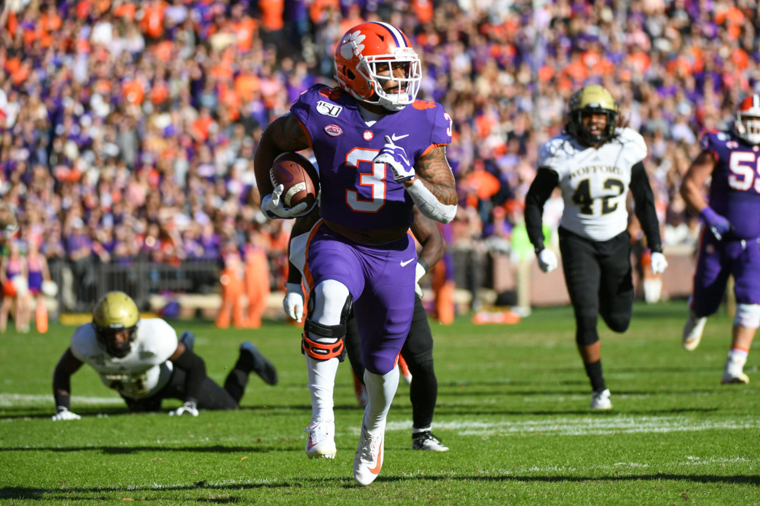 Clemson Tigers football player in all-purple alternate uniform, worn for Military Appreciation Day, considered aesthetically pleasing and royal.
Clemson’s all-purple uniforms are a regal and visually striking alternative to their usual orange. Worn for Military Appreciation Day, these uniforms are a fan and player favorite. The purple adds a touch of royalty and provides a welcome contrast to Clemson’s brighter orange looks.
15. Oregon’s Duck Homage (2016):
(Scott Olmos /USA Today)
 Oregon Ducks football player in 2016 duck homage uniform, featuring orange facemasks, socks, and cleats complementing white and green.
Oregon, the king of alternate uniforms, created a masterpiece with their 2016 duck homage. Incorporating orange facemasks, socks, and cleats to mimic their mascot, these uniforms are playful, creative, and uniquely Oregon. They perfectly blend the program’s innovative spirit with its mascot identity.
16. Oregon’s Green and Gold Throwbacks (2014):
(Courtesy of Washington Athletics)
 Oregon Ducks football player in 2014 green and gold throwback uniforms, featuring softer green, bolder gold, and angry Donald Duck logos.
Oregon’s 1994 throwback uniforms are a nostalgic and stylish trip back in time. The softer green and bolder gold, the interlocking “UO” helmet, and the angry Donald Duck logos are all perfectly executed. These uniforms resonated with fans who appreciated Oregon’s early uniform experimentation.
17. Oregon’s Black Winged Alternates (2011):
(Courtesy of GoDucks.com)
 Oregon Ducks football player in 2011 black winged alternate uniform, featuring black jersey, carbon fiber helmet, and gray pants.
Oregon’s 2011 black winged alternates are a benchmark for black alternate uniforms. The black winged jersey, “carbon fiber” helmet, and gray pants create a sleek, futuristic, and undeniably cool look. These uniforms cemented Oregon’s status as a uniform innovator and set a high bar for other programs to follow.
Uniform Fails: Lessons in What Not To Do
Not all alternate uniform experiments are successful. Some designs miss the mark entirely, clashing with team identity or simply being aesthetically unappealing. These “fails” offer valuable lessons in what to avoid when creating alternate uniforms.
1. Florida’s “Gator Skin” Fiasco (2017):
(Kim Klement / USA Today)
 Florida Gators football player in 2017 alligator-themed alternate uniforms, featuring a textured pattern designed to resemble alligator skin.
Florida’s 2017 alligator-themed uniforms were a well-intentioned but poorly executed concept. The attempt to mimic alligator skin resulted in a muddy, camouflaged look that blended into the field. This uniform serves as a reminder that literal interpretations of mascots don’t always translate well to uniforms.
2. Michigan State’s Neon Nightmare (2019):
(Mike Carter / USA Today)
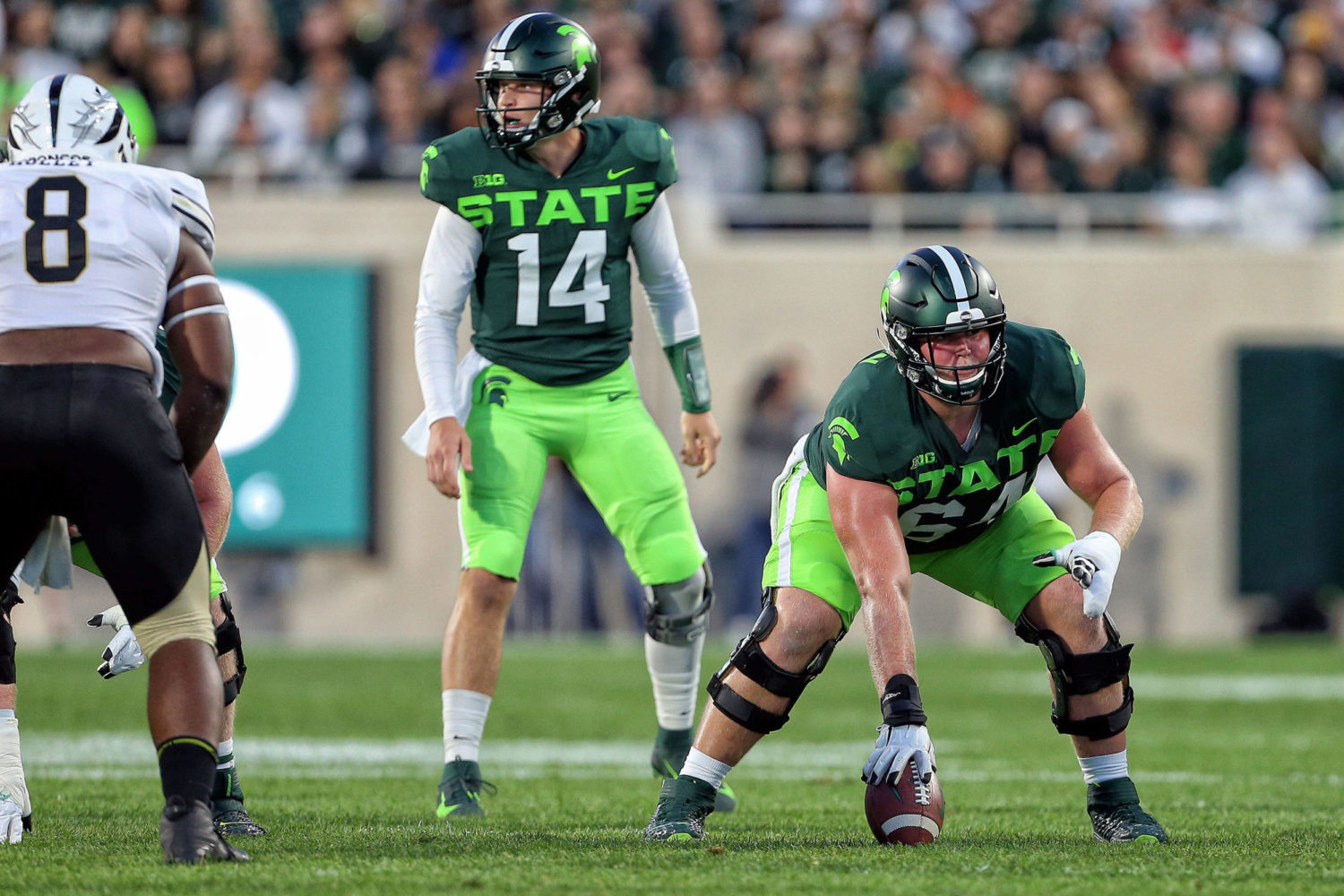 Michigan State Spartans football player in neon green alternate uniforms, featuring bright green pants and large 'STATE' lettering across the jersey.
Michigan State’s neon alternates were widely panned for their garishness. The bright green pants and oversized “STATE” lettering were considered visually overwhelming and lacking in sophistication. While recruits may have liked them, these uniforms were a major misstep aesthetically.
3. Tennessee’s Halloween Black Jerseys (2009):
(Courtesy of Tennessee Athletics)
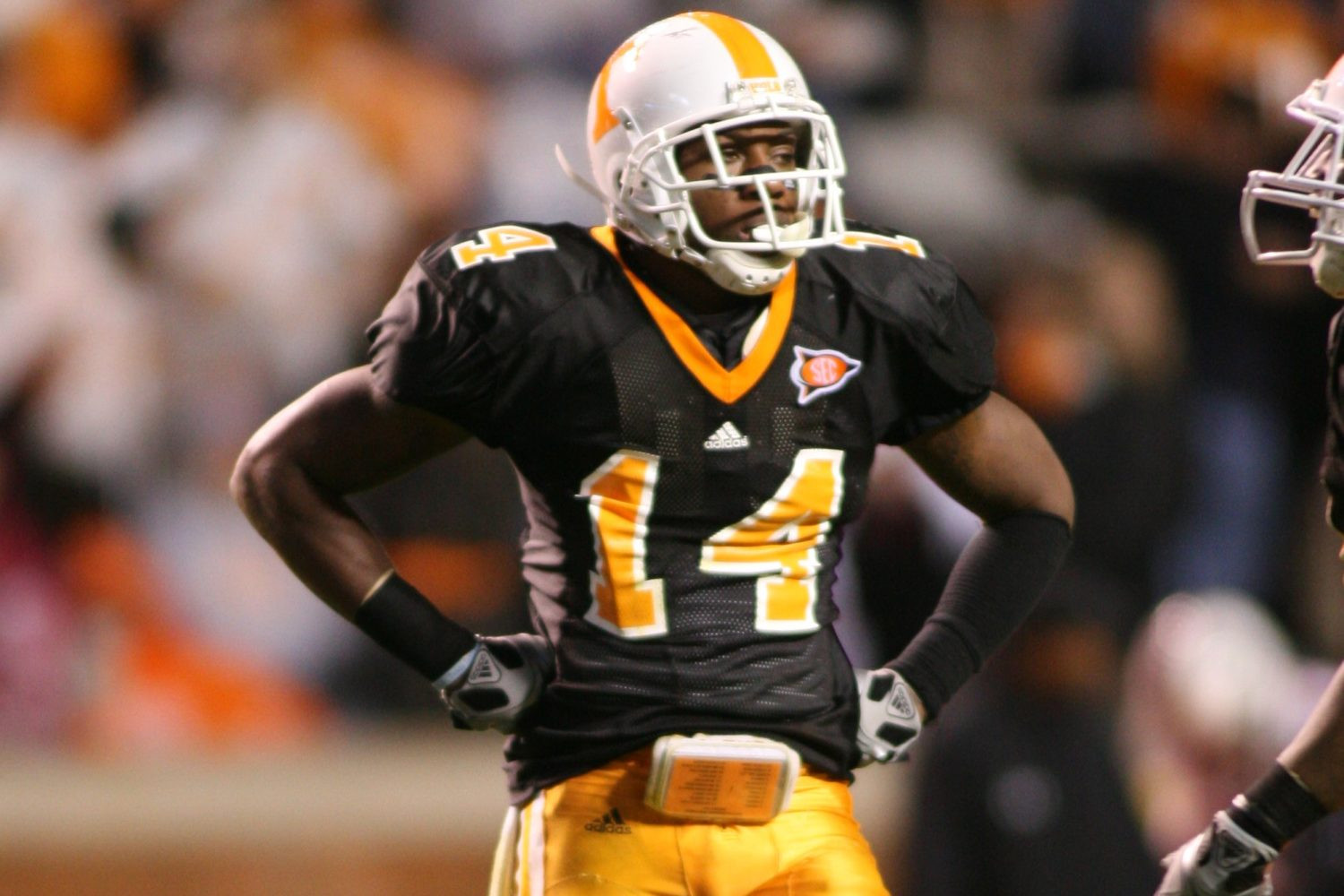 Tennessee Volunteers football player in 2009 Halloween black alternate jersey, mismatched with orange pants and white helmet.
Tennessee’s Halloween black jerseys were a case of mismatched elements. The black jerseys clashed with the orange pants and white helmets, creating a disjointed and unappealing look. This uniform highlighted the importance of a cohesive color scheme and overall design plan when creating alternates.
4. Notre Dame’s Yankee Pinstripes (Shamrock Series):
(Rich Barnes / USA Today)
Notre Dame Fighting Irish players in iconic navy blue and gold uniforms, showcasing the famous gold helmets.
Notre Dame’s Yankee pinstripe Shamrock Series uniforms were a controversial experiment. While intended as a tribute to the New York Yankees, the baseball-inspired design felt out of place on a football field and detracted from Notre Dame’s iconic look. This uniform demonstrated the risk of straying too far from a program’s core visual identity.
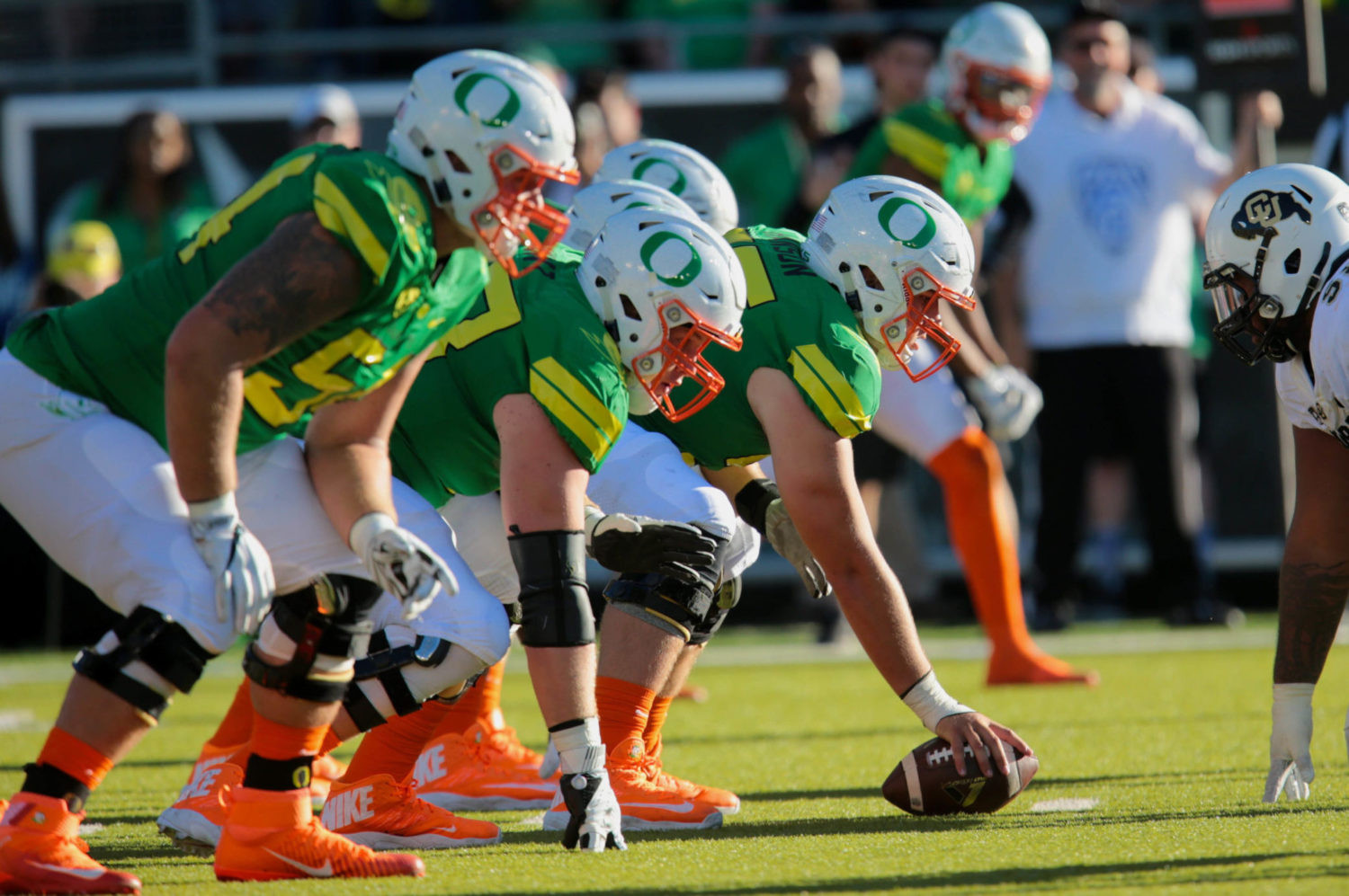
5. Colorado’s 1930s Homage Fail (2009):
(Courtesy of Colorado Athletics)
 Colorado Buffaloes football player in 2009 1930s homage uniform, featuring silver helmets that clashed with the jersey design.
Colorado’s 1930s homage uniforms suffered from poor execution. The silver helmets, intended to evoke the era, clashed with the jersey design and looked out of place. This uniform illustrates that even well-intentioned throwbacks can fail if the details are not carefully considered.
6. Georgia’s Space-Age Pro Combat (2011):
(Courtesy of Boise State Athletics)
 Georgia Bulldogs football player in 2011 Pro Combat alternate uniform, a futuristic and space-age design that fans disliked.
Georgia’s 2011 Pro Combat uniforms were a futuristic misfire. Intended to be cutting-edge, they ended up looking generic and out of sync with Georgia’s traditional brand. These uniforms serve as a cautionary tale against sacrificing program identity for the sake of novelty.
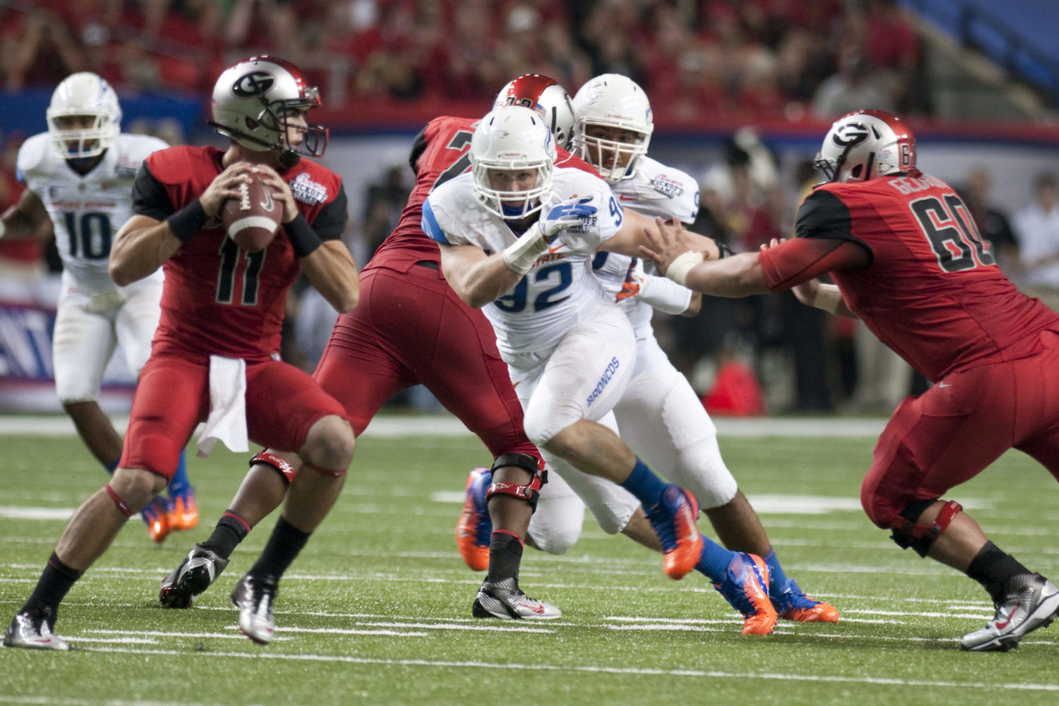
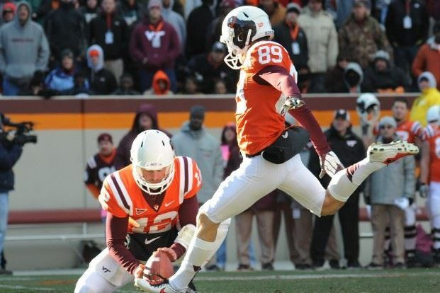
7. Boise State and Virginia Tech’s Pro Combat Clash (2010):
(Courtesy of Boise State Athletics)
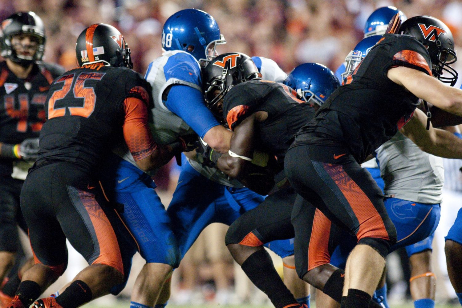 Boise State Broncos football player in 2010 Pro Combat alternate uniform with one-sided logo helmet, facing Virginia Tech Hokies in gradient-numbered uniforms.
The 2010 Boise State-Virginia Tech game featured a clash of Pro Combat uniform disasters. Boise State’s gray-on-gray uniforms looked inside-out, while Virginia Tech’s gradient numbers and helmet stripe were visually jarring. This game was a prime example of how alternate uniforms can go terribly wrong when both teams miss the mark.
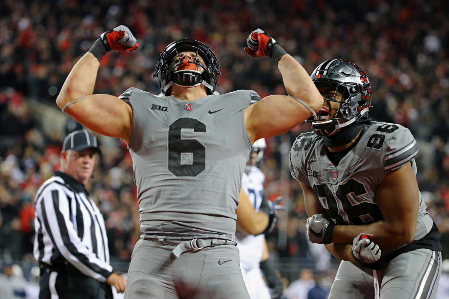
8. Ohio State’s Gray Wolf Uniforms (2017):
(Aaron Doster / USA Today)
Ohio State Buckeyes player in gray alternate uniform with wolf fur texture, facing Penn State Nittany Lions in their traditional blue and white.
Ohio State’s gray “Land of the Wolves” uniforms strayed too far from the program’s identity. The gray color scheme and wolf fur-textured numbers made it difficult to recognize them as the Buckeyes. This uniform underscores the importance of maintaining a clear connection to team colors and branding, even with alternates.
9. The Gray Uniform Trend (General Critique):
(Mark Konezny / USA Today)
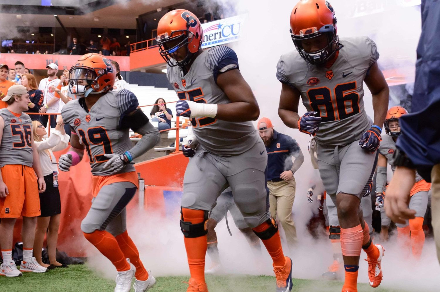 Syracuse Orange football player in gray alternate uniform, part of a broader trend of gray uniforms in college football.
The broader trend of gray alternate uniforms in college football highlights a lack of creativity. While some gray uniforms are passable, many are bland and make it harder to distinguish teams. This trend demonstrates the danger of following uniform fads rather than developing unique and program-specific designs.
10. Nebraska’s Team Netflix Black Helmets (2012):
(Paul Bartunek / NU Communications)
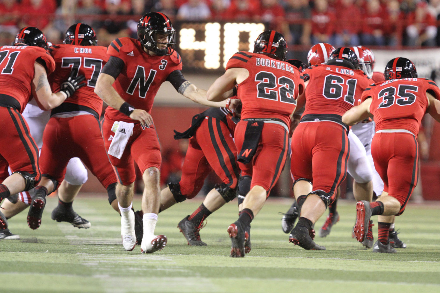 Nebraska Cornhuskers football player in 2012 alternate uniform with black helmet and large 'N' logo, criticized for its generic look.
Nebraska’s black helmet alternates were criticized for their generic and uninspired design. The black helmet with a large “N” logo looked more like a branding exercise than a tribute to Nebraska’s football tradition. This uniform serves as a reminder that alternates should enhance, not replace, a program’s established visual identity.
11. Northwestern’s Invisible Gothic Uniforms (2014):
(Courtesy of Northwestern Athletics)
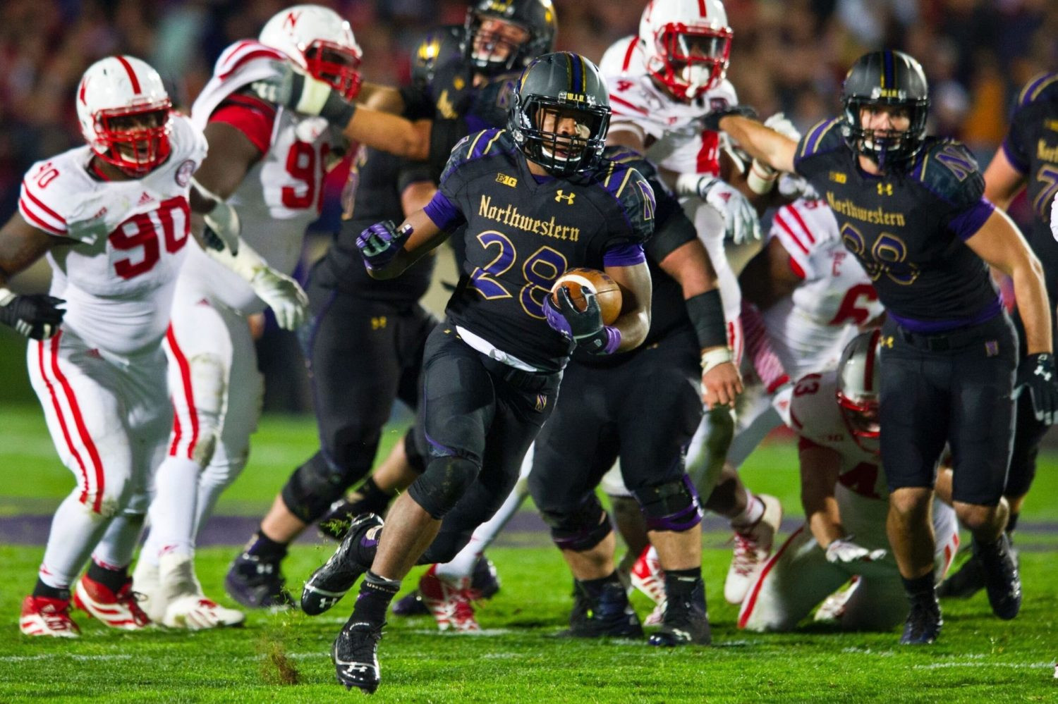 Northwestern Wildcats football player in 2014 gothic alternate uniform, featuring black-on-black with purple gothic numbers, difficult to see on TV.
Northwestern’s gothic uniforms, while potentially sharp in daylight, were a disaster for nighttime television. The black-on-black design with dark purple numbers was nearly invisible under stadium lights. This uniform failure underscores the importance of considering visibility and broadcast quality when designing uniforms.
12. Virginia Tech’s HokieBird Helmet Horror (2012):
(Courtesy of Virginia Tech Athletics)
 Virginia Tech Hokies football helmet with flexing HokieBird logo, a cartoonish and controversial design that replaced the VT logo.
Virginia Tech’s HokieBird helmet was a regrettable design choice. Replacing the recognizable VT logo with a cartoonish HokieBird proved unpopular and visually distracting. This helmet serves as a reminder to be cautious when altering or replacing established and respected team logos.
13. Texas Tech’s Text-Covered “Never Quit” Uniforms (2013):
(Courtesy of Texas Tech Athletics)
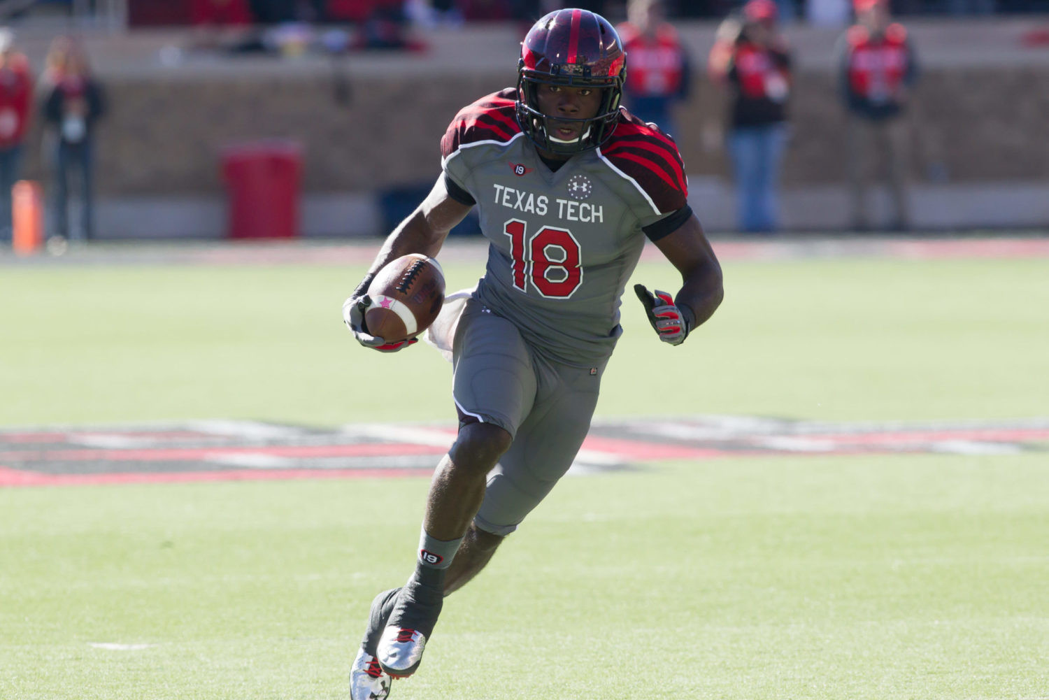 Texas Tech Red Raiders football player in 2013 'Never Quit' alternate uniform, featuring text-covered helmet and various design elements.
Texas Tech’s “Never Quit” uniforms, while well-intentioned as a tribute, were overloaded with design elements. The text-covered helmet, shoulder design, and “butt stripes” created a busy and visually cluttered look. This uniform demonstrates that sometimes, less is more, and that tributes should be executed with subtlety and taste.
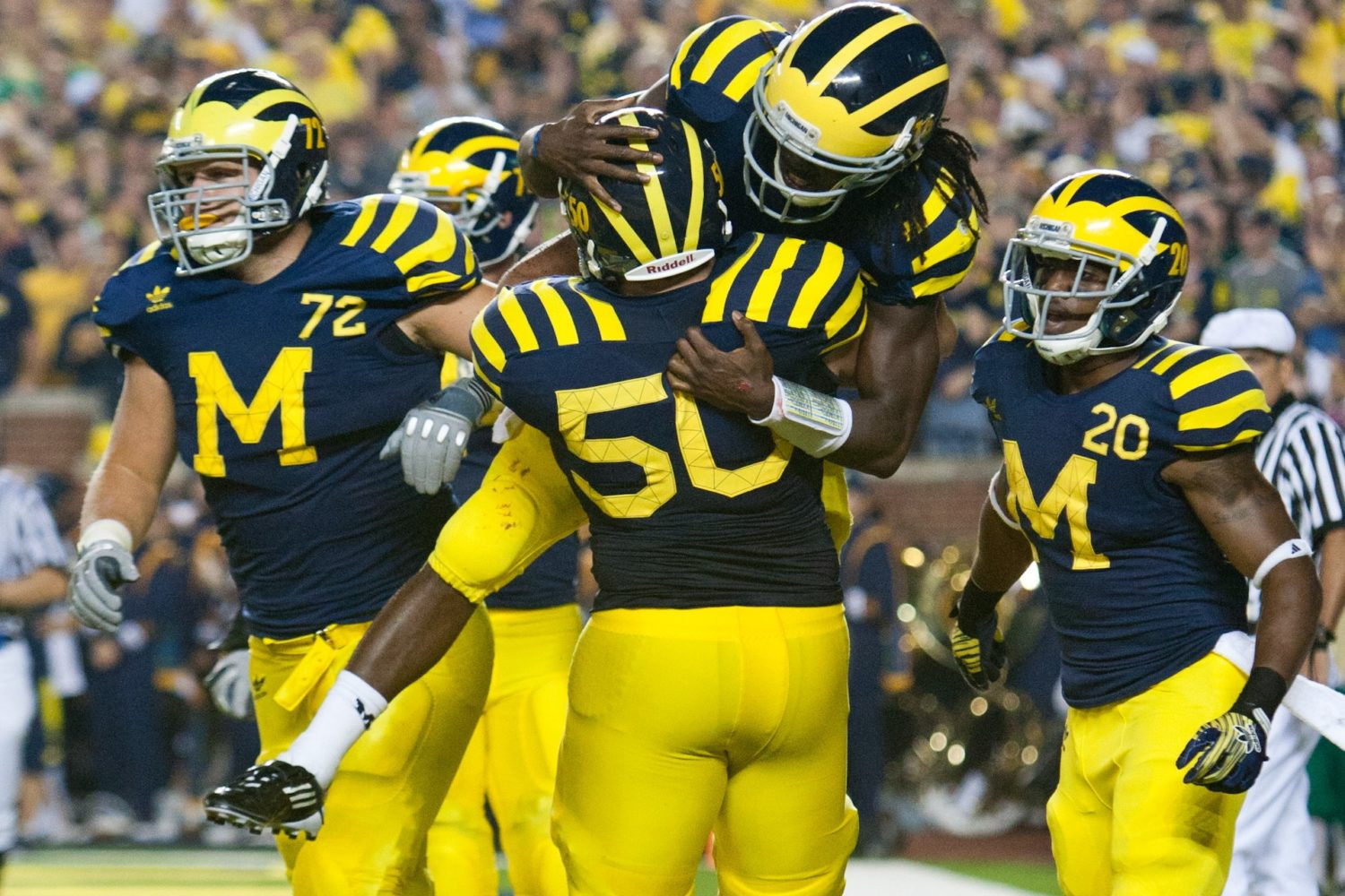
14. Michigan’s “Under the Lights” Mismatches:
(Courtesy of U-M Athletics)
Michigan Wolverines players in 'under-the-lights' jerseys, a controversial alternate uniform with varied maize coloring and added helmet numbers.
Michigan’s “Under the Lights” uniforms were a misstep for a program with such an iconic look. The mismatched maize coloring, added numbers to the winged helmet, and overall design felt like an unnecessary and unsuccessful attempt to modernize a classic. This uniform highlights the risk of tampering with perfection.
The Enduring Appeal of the Best
The best college football uniforms, whether classic or alternate, share common traits: they are visually appealing, they connect to program tradition, and they are executed with attention to detail. While alternate uniforms can be exciting and generate buzz, the truly iconic uniforms are those that stand the test of time, representing the enduring spirit of college football. Ultimately, the best uniforms are those that fans and players wear with pride, embodying the history and future of their beloved teams.
What are your picks for the best and worst college football uniforms of all time? Let us know in the comments below!