
The Jacksonville Jaguars have recently unveiled their new uniforms, and the response has been… well, mixed. While there are clear improvements in certain aspects of the design, particularly the helmet, the overall effect leaves something to be desired. For a team that once boasted one of the more distinctive and underrated looks in the NFL, the new uniforms feel surprisingly conventional and perhaps even a step backward.
Many were hoping for a bold, modern update that would recapture the unique spirit of the Jaguars’ original identity. Instead, what we got feels like an overcorrection. It’s as if, in an attempt to distance themselves from past criticisms of being too flashy or “Oregon-y,” the pendulum swung too far in the opposite direction, landing somewhere in the realm of being almost too plain, dare we say, “Penn State-y.” This isn’t to say they’ve become carbon copies of either extreme, but it highlights the sense of a missed opportunity to truly innovate and create a memorable new visual identity for the franchise.
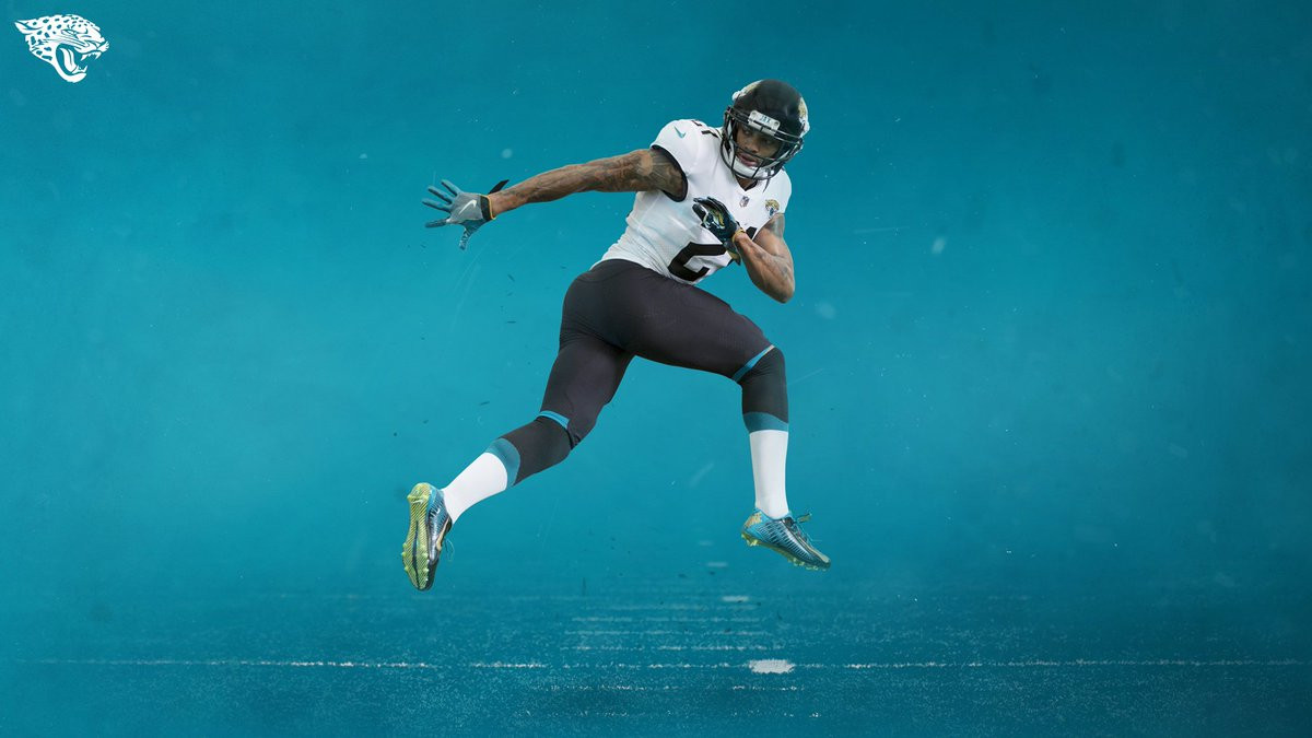
Let’s delve into the specifics. The helmet is arguably the most significant upgrade. The Jaguars have wisely moved away from the two-tone, gradient helmet that was a point of contention for many fans and critics alike. The new helmet adopts a sleek, all-black design. This single-color approach provides a much cleaner and more classic aesthetic.
 Jaguars New Helmet
Image showcasing the Jacksonville Jaguars’ new all-black helmet design, a significant improvement over their previous two-tone gradient helmets, emphasizing a cleaner and more classic aesthetic for the team’s uniform.
However, while the helmet is a definite step in the right direction, the rest of the uniform set doesn’t quite live up to the same level of improvement. The jerseys and pants, while not drastically different from their predecessors, contribute to the overall feeling of underwhelm. The design seems to prioritize simplicity to a fault, resulting in a look that lacks the dynamism and visual interest that could have truly elevated the Jaguars’ brand.
It’s important to acknowledge that the Jaguars were in need of a uniform refresh. Their previous look, while having its moments, had become somewhat dated and perhaps too experimental for its own good. The desire to move towards a more grounded and traditional aesthetic is understandable. However, tradition doesn’t have to equate to blandness. There’s a sweet spot between modern innovation and classic design principles, and it feels like the Jaguars may have missed the mark in finding that balance with these new uniforms.
One of the more talked-about elements of the new uniforms is the sock stripes. According to a Jaguars representative, Nike described the curved/angled sock stripes as being “shaped like a jaguar’s claw.” While this is an attempt at adding a unique, team-specific detail, the execution feels somewhat lost and perhaps even a bit comical. The subtlety of the “jaguar’s claw” design might be too subtle, failing to make a noticeable impact or resonate with fans.
 Jaguars New Sock Stripes
Close-up image of the Jacksonville Jaguars’ new uniform socks, highlighting the curved and angled stripes which Nike describes as being “shaped like a jaguar’s claw,” a subtle detail intended to add a unique team-specific element to the uniform.
In conclusion, the Jacksonville Jaguars’ new uniforms are not a disaster. They are, in many ways, an improvement over their previous set, particularly the helmet. However, they also represent a missed opportunity. In striving for a more classic and less controversial look, the Jaguars seem to have sacrificed some of the unique flair that could have made their new uniforms truly stand out. They’ve landed in a safe, somewhat generic territory, which for a team looking to build a strong and exciting brand, might not be enough. Time will tell how these uniforms are received by fans and how they contribute to the Jaguars’ on-field identity.