
The Dallas Mavericks have a rich history, and their uniforms have evolved alongside their journey in the NBA. From the early days of western-themed designs to modern, sleek looks, Mavericks Uniforms have always been a talking point for fans. In 2014, the Mavericks unveiled a new alternate uniform, sparking conversations about the team’s visual identity and its place in basketball fashion history. This new design, featuring a Dallas skyline, was the result of a design-a-uniform contest hosted by Mark Cuban. While initially met with mixed reactions, it highlighted the ongoing evolution of the Mavericks uniform. Let’s take a look back at the Mavericks uniform history, from their inception to the latest designs.
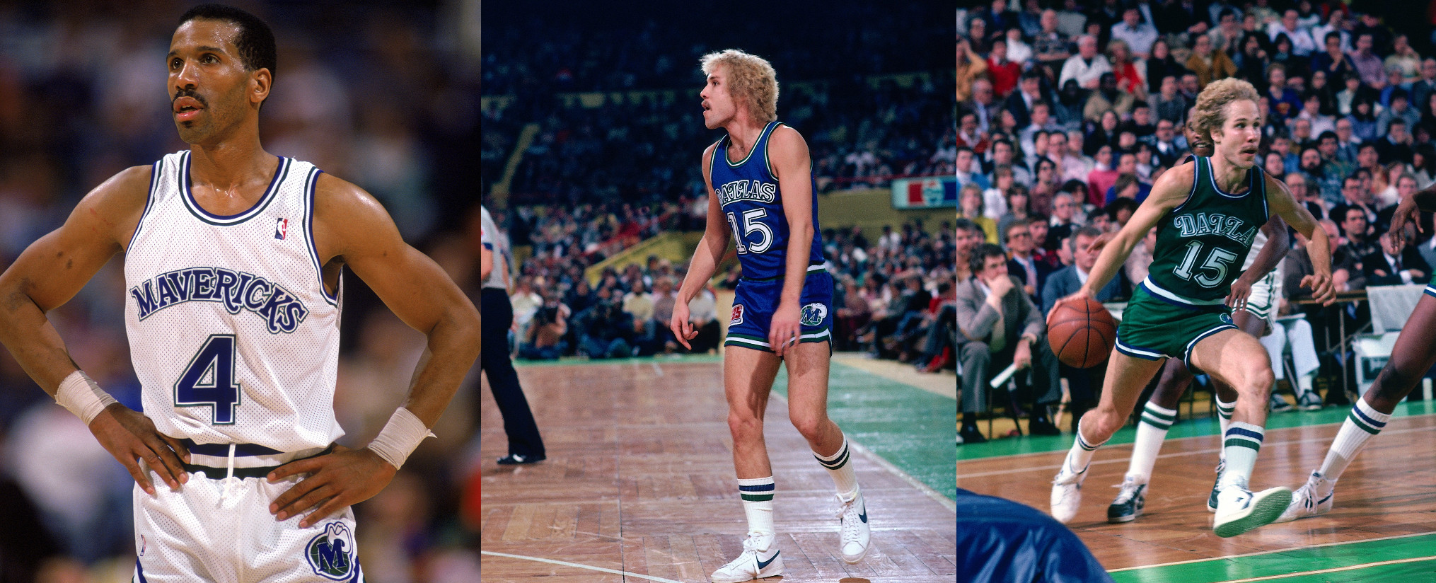
1980: The Inception of Mavericks Uniforms – Western Flair in Blue and Green
 1980s Mavericks Uniform
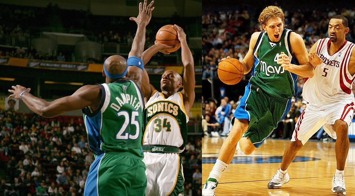
When the Dallas Mavericks joined the NBA in 1980, their uniforms immediately stood out. The original Mavericks uniforms showcased a distinctive western-themed aesthetic, blending blue and green in a unique color combination. For home games, the team wore white uniforms, while road games featured blue jerseys. Both home and away mavericks uniforms incorporated green accents, creating a cohesive visual identity. The font used for the team name and city name had a western-inspired style, perfectly capturing the Dallas vibe. A memorable detail was the “M wearing a cowboy hat” logo, playfully placed on the left leg of the shorts. True to NBA tradition, the home mavericks uniform displayed “Mavericks” across the chest, while the road jersey proudly presented “Dallas.” Interestingly, after just one season, the color emphasis shifted. Blue became the accent color, and green took center stage as the primary color for the away mavericks uniforms.
The choice of green and blue was truly inspired for the Mavericks uniform. It was visually striking and set them apart from other teams. While blue was a common color in the NBA, and green was used by teams like the Boston Celtics, Utah Jazz, and Milwaukee Bucks, no other team combined green and blue in this way. This unique color palette alone earned the Mavericks uniforms significant praise.
Verdict: The 1980s Mavericks uniforms, despite the western theme not being universally favored, were a perfect representation for Dallas’s expansion franchise. The green and blue color scheme was a bold and unique choice in the NBA, making these mavericks uniforms instantly recognizable.
Rating: 4 out of 5 stars.
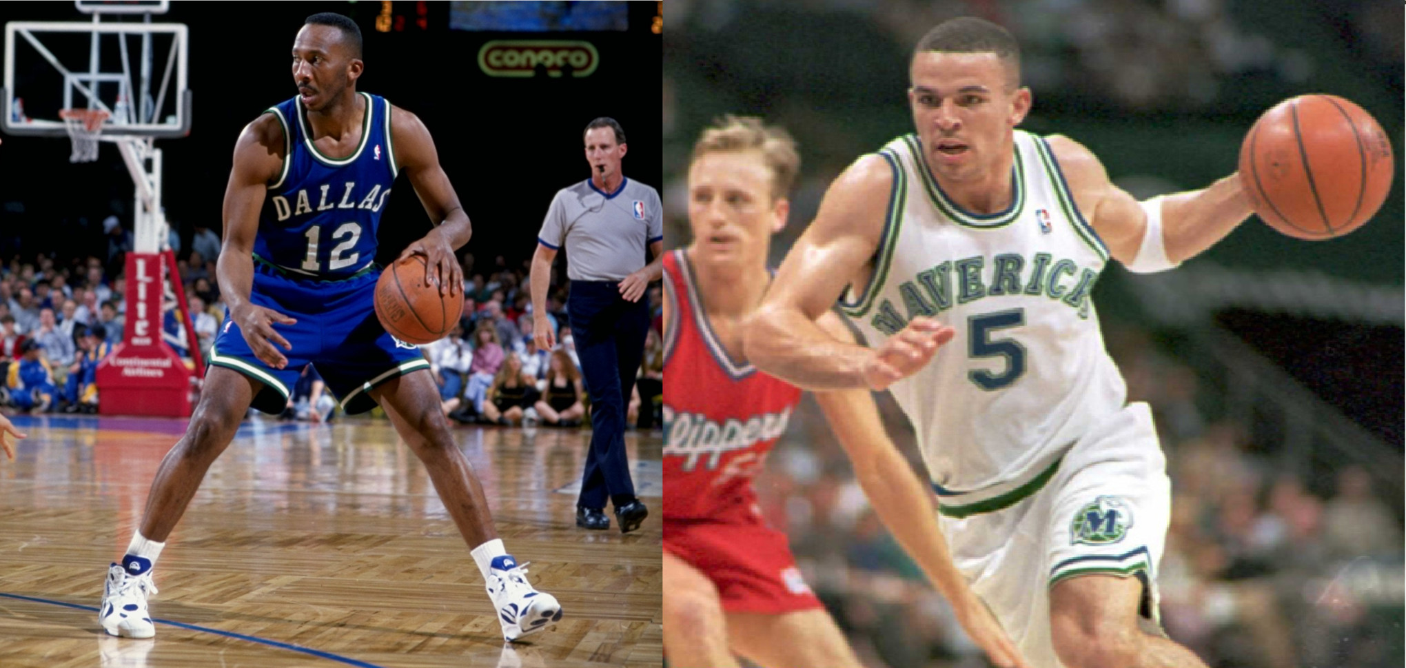
1993: Transitioning to Blue – A New Era for Mavericks Jerseys
 1990s Mavericks Uniform
In 1993, the Dallas Mavericks underwent a significant uniform change, shifting the emphasis towards blue. While minor alterations were made in 1992, the ’93 season marked a clear decision to prioritize blue over the green that had defined the team’s identity for over a decade. These new mavericks uniforms weren’t necessarily visually unappealing, but the simple western style started to feel dated. Furthermore, blue as the primary color lacked the uniqueness and vibrancy that the green away mavericks uniforms had possessed.
The 1990s were a challenging period for the Mavericks franchise, coinciding with the era of these blue-dominant uniforms. This decade is often remembered as the worst in team history, leading some fans to jokingly speculate if more stylish mavericks jerseys could have improved the team’s performance.
While style and performance are not directly correlated, by the time Mark Cuban acquired the team in 2000, it was evident that a comprehensive style overhaul was needed to usher the Mavericks into the new millennium.
Verdict: The 1990s Mavericks uniforms, while not inherently bad, were a step down from the original green and blue. Blue proved to be less distinctive than green, and the western theme had simply run its course.
Rating: 2 out of 5 stars.
2001: Modern Mavericks Uniforms – Mark Cuban’s Rebranding
 2000s Mavericks Uniform
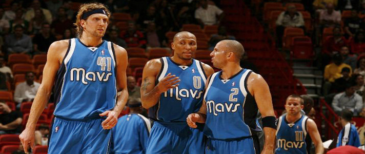
Mark Cuban’s ownership in January 2000 marked a turning point for the Dallas Mavericks, both on and off the court. One of his first major initiatives was a complete rebranding in 2001, which included a fresh new mavericks uniform design. The color scheme shifted from green and blue to a modern navy blue, royal blue, and silver palette. The western “M” logo was replaced with a dynamic and aggressive horse head logo integrated with a basketball, symbolizing a new era for the franchise. Several alternate “M” logos were also introduced, adding versatility to the brand identity. One minor inconsistency was the use of black and royal blue in the logo, while the uniforms primarily utilized navy and royal blue.
The 2001 mavericks jerseys themselves were decidedly modern, offering a bold contrast to the simpler designs of the team’s first two decades. The new home mavericks uniform was white, while the away jersey was navy blue. Interestingly, both home and away jerseys featured “DALLAS” across the chest. This design choice was likely due to the word “MAVERICKS” being too long and visually cumbersome in the new, contemporary font style.
Verdict: These 2000s Mavericks uniforms are iconic for many fans, coinciding with a successful era for the team. For a franchise seeking a fresh identity, this rebrand delivered a modern and bold look that mirrored Mark Cuban’s energetic ownership. While the navy away uniforms might not be everyone’s favorite in retrospect, the overall impact of this uniform set was significant.
Rating: 3 out of 5 stars.
2003: The Silver Alternate – Mavericks “Trash Bag” Jerseys
 2003 Mavericks Silver Uniform
The 2003 Dallas Mavericks alternate uniform is arguably the most controversial in team history. Mark Cuban, known for his willingness to experiment, ventured into uncharted fashion territory with these silver mavericks jerseys. The material choice, resembling “silver trash bag material,” was a bold attempt at futuristic design, but it largely missed the mark. While innovation is commendable, these uniforms were widely criticized and considered visually unappealing.
Even attempting to view these mavericks uniforms objectively, it’s difficult to ignore the negative reception. The word “Mavericks” appeared awkward and bulky across the chest, and the fabric itself was unflattering. These uniforms are often cited as a fashion misstep.
Verdict: The 2003 silver Mavericks alternate uniforms are largely considered a “dumpster fire” in terms of design. They were universally disliked and continue to be a source of jokes among NBA fans.
Rating: 0 out of 5 stars.
2004: Diddy’s Green Revival – A Fan Favorite Mavericks Alternate Jersey
 2004 Mavericks Green Alternate Uniform
In stark contrast to the silver disaster, the 2004 Mavericks alternate uniform, designed in collaboration with Sean “Diddy” Combs, is a beloved fan favorite. These green mavericks jerseys were a vibrant and unique addition to the team’s wardrobe. While some might argue there’s “too much going on” with the color palette – green, royal blue, navy blue, silver, and white – the overall effect was undeniably eye-catching and fun.
These uniforms stood out without being garish. The font was stylish, the team nickname “Mavs” was prominently featured, and the number was placed above the wordmark, creating a distinctive look. The 2004 alternate mavericks uniforms successfully blended vibrancy with a nod to the franchise’s original green color roots. Perhaps sticking to a single shade of blue might have streamlined the design further, but these remain a highly regarded alternate jersey.
Verdict: Despite incorporating a few too many colors, the 2004 “Diddy” Mavericks uniforms were a refreshing and exciting alternate that paid homage to the team’s history while maintaining a modern aesthetic.
Rating: 4 out of 5 stars.
2009: Royal Blue Takes Center Stage – Streamlined Mavericks Alternate Uniforms
 2009 Mavericks Royal Blue Uniform
The 2009 Mavericks alternate uniforms were a welcome addition, offering a cleaner and more streamlined design. While some fans missed the green, these royal blue mavericks jerseys addressed the color complexity of the previous green alternates. By simplifying the palette to royal blue, navy, silver, and white, these uniforms achieved a stylish and cohesive look. They showcased the potential of a predominantly royal blue mavericks uniform design.
Verdict: While not incorporating green, the 2009 Mavericks alternate uniforms were a significant improvement. They demonstrated how effective royal blue could be as a primary color for the team and paved the way for royal blue to become the primary away color in subsequent seasons. These uniforms successfully avoided the color overload of the earlier “Diddy” green jerseys.
Rating: 4 out of 5 stars.
2010: Color Swap – Royal Blue Mavericks Away Uniforms Emerge
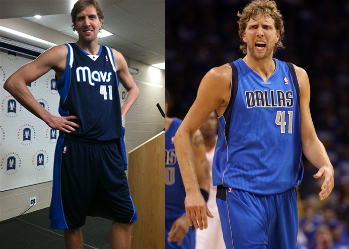 2010 Mavericks Royal Blue Away Uniform
By 2010, the existing Mavericks uniform set, which had been in place for nearly a decade, began to feel somewhat stale. Many fans favored the “Diddy” designed alternate uniforms over the main set. In a subtle but impactful change, the Mavericks updated their look in 2010 by simply swapping the primary colors. The away mavericks uniforms transitioned from navy blue to royal blue, a change that proved to be remarkably effective. The royal blue away jerseys were widely considered a significant improvement over the navy versions. The navy “Diddy” alternate jerseys remained part of the rotation but were arguably more visually striking in their original green colorway.
Interestingly, the Mavericks experienced their greatest success in their first season wearing these updated uniforms, winning the NBA championship in 2011. While uniform changes and championships may be coincidental, the royal blue away mavericks uniforms became associated with this historic victory.
Verdict: While the connection to the championship is largely playful, the decision to switch the away mavericks uniform color to royal blue was undoubtedly a positive one. It revitalized a uniform set that had become somewhat uninspired.
Rating: 4 out of 5 stars.
2015: Skyline Mavericks Uniforms – Representing Dallas Pride
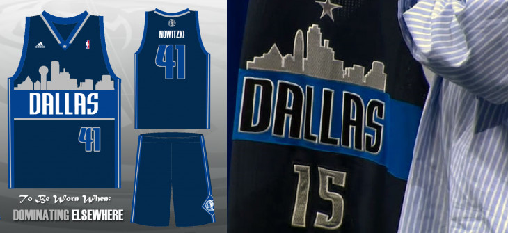 2015 Mavericks Skyline Alternate Uniform
The unveiling of the 2015 Dallas Mavericks skyline alternate uniform generated considerable buzz and mixed reactions. The concept of incorporating the Dallas skyline into the mavericks jersey design was generally well-received. However, the initial prototype jersey displayed at the media event drew criticism for its execution. The skyline depiction appeared somewhat amateurish, resembling a design created with basic software. This was in contrast to the more polished mock-up version that had been circulated earlier.
Mark Cuban clarified that the displayed jersey was a rushed prototype, suggesting the final product would be more refined. Comparisons were quickly drawn to the Denver Nuggets’ retro skyline jerseys, which also feature a skyline design. However, many argued that this was not necessarily a negative, as the Denver jerseys are widely admired and the Dallas skyline is considered among the best globally.
Verdict: The 2015 skyline Mavericks uniforms hold potential, particularly if the final version more closely resembles the initial mock-up. While some may prefer the “Diddy” jerseys for overall style, well-executed skyline uniforms could be a popular choice among fans, allowing them to “rep the city.” However, if the final design remains similar to the prototype, these mavericks uniforms may not be a significant improvement over previous designs.
Rating: 3 out of 5 stars (tentative).