
Welcome to a deep dive into the visually questionable side of the National Football League. While NFL uniforms often evoke images of gridiron glory and team pride, some designs have simply missed the mark, resulting in looks that are, to put it kindly, aesthetically challenged. In this rundown, we’ll be examining one truly ugly uniform from each NFL team’s history.
To keep things focused and avoid delving into the sepia-toned world of pre-Super Bowl era kits (where, let’s face it, “primitive” was often the design standard), we’re mainly looking at modern era uniforms. Also, one-off throwback jerseys, while sometimes offenders, are generally excluded to maintain a focus on uniform sets that had a more substantial presence, or at least aspiration for presence.
It’s crucial to remember that taste is subjective. What one fan deems a fashion disaster, another might find endearingly retro or even bold. Fan opinion will be noted where relevant, but ultimately, this is about highlighting designs that, in this writer’s view, represent the nadir of NFL uniform aesthetics. Let’s explore the rogues’ gallery of Ugly Nfl Uniforms!
Arizona Cardinals
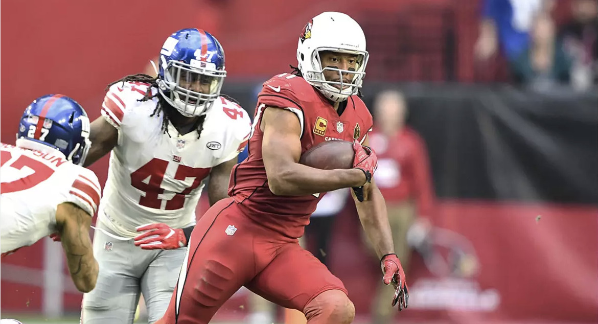 Alt text: Arizona Cardinals all red ugly NFL uniforms, featuring bland and monotonous design.
The Arizona Cardinals’ uniform history from 2005 to 2022 is a treasure trove of questionable choices, and almost any design from this period could qualify as their ugliest. The common thread? A reliance on busy black stripes and paneling that somehow manages to be both cluttered and completely devoid of color. The all-red uniform set stands out as particularly offensive. It’s a sea of red, unrelieved by any contrasting color, making it appear utterly bland and, frankly, depressing. The black-on-white alternate wasn’t much better, begging the question: why did it even exist?
Even their newer uniforms, intended to modernize the look, fall short. They stripped away some of the visual noise, but in doing so, they also removed any potential for visual interest. The result is still a largely empty and uninspired design.
Atlanta Falcons
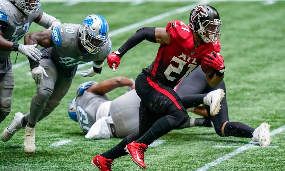 Alt text: Ugly gradient Atlanta Falcons NFL uniforms, showcasing a poorly executed color fade.
The Atlanta Falcons boast a uniform so famously bad, it’s often cited as a contender for the worst NFL jersey of all time: the gradient jersey. The gradient effect, transitioning from black to red, was a novel idea in theory, but in execution, it was a visual mess. The fact that it was only worn three times in three years speaks volumes about its unpopularity. A solid red jersey would have been a far superior choice. The gradient stripe down the side gets lost against the red at the bottom, negating its purpose, and the oversized everything clashes terribly with the distracting color-changing background.
The Falcons’ previous uniform set also deserves a dishonorable mention. Characterized by random paneling and an overwhelming number of possible combinations, it was an era of visual incoherence. Even the all-red color rush uniform from this period couldn’t escape the design malaise.
Baltimore Ravens
 Alt text: Baltimore Ravens gold pants and purple jersey combination, an example of ugly NFL uniform color clashing.
While thankfully only worn once, the Baltimore Ravens’ gold pants and purple jersey combination represents a near-miss uniform disaster. It’s clear this wasn’t intended as a one-off experiment, but rather a potential regular combo. The Ravens’ gold color simply doesn’t translate well to pants. Paired with the purple jersey, it creates a jarring and unpleasant visual clash. This uniform experiment may have been a misguided step towards a gold color rush concept, a bullet thankfully dodged.
The Ravens’ inaugural uniform set also earns a dishonorable mention for being utterly unremarkable. Featuring a large helmet logo, huge numbers, and thick stripes, it was a design that screamed “generic.” While not actively offensive, it lacked any visual flair or memorability, failing to make a strong first impression for the then-new franchise.
Buffalo Bills
 Alt text: Buffalo Bills 2002-2010s era ugly NFL uniforms, featuring a confusing color palette and paneling.
In 2002, as the Buffalo Bills moved past their Super Bowl era, they attempted a uniform refresh that, unfortunately, resulted in a visual downgrade. The designs from this era are universally considered bad, marked by a confusing color palette and inexplicable paneling. It’s as if the team couldn’t decide on its color scheme, resulting in a muddled mix of navy blue (a color never traditionally associated with the Bills), royal blue haphazardly placed, and distracting side panels. This period was undoubtedly a low point for the Bills in terms of on-field aesthetics.
The all-red color rush uniform is also worthy of criticism. While not inherently ugly, it features an overwhelming amount of red, a color that has historically been a secondary accent for Buffalo. The uniform is simply too bright and deviates too far from the team’s established visual identity.
Carolina Panthers
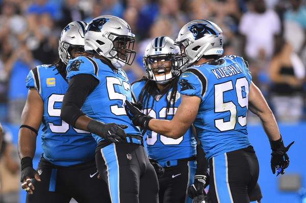 Alt text: Carolina Panthers powder blue alternate ugly NFL uniforms with black pants, an awkward color combination.
The Carolina Panthers have largely avoided truly terrible uniform missteps, but their powder blue alternate jersey paired with black pants is a notable exception. While powder blue has its proponents, its combination with black pants creates an awkward and unbalanced look. It’s possible the slightly updated uniform template might improve this combination, but the fundamental color clash remains a significant aesthetic hurdle.
The away uniform set also receives a dishonorable mention, specifically for its consistent pairing with black pants. The silver pants, rarely seen, are a far more visually appealing option and should be the standard pairing for the white jersey.
Chicago Bears
 Alt text: Chicago Bears orange alternate ugly NFL uniforms with new helmet, a clash of bright colors.
Chicago Bears fans can breathe a sigh of relief that the 75th-anniversary throwback uniforms were a one-off. Had they been a regular fixture, they would undoubtedly top this list. Instead, the orange alternate jersey with the new helmet earns the dubious honor of Chicago’s ugliest. The uniform is simply too bright, lacking sufficient navy blue to balance the color scheme. Orange has never been a flattering primary color for the Bears, and the new helmet only exacerbates the issue.
Unsurprisingly, the dishonorable mention goes to the aforementioned 75th-anniversary throwback uniforms. These truly hideous designs are in a league of their own when it comes to ugly NFL uniforms.
Cincinnati Bengals
 Alt text: Cincinnati Bengals paneling era ugly NFL uniforms, featuring outdated design elements and stripes within panels.
The entire era of Cincinnati Bengals uniforms characterized by paneling, Bengal stripes awkwardly placed inside those panels, and large, shadowed numbers was a design low point. The away set, complete with a rarely seen shoulder yolk, was equally offensive. While personal preference dictates which combination is the absolute worst, the entire set was visually outdated even by 2010, yet inexplicably persisted for another decade.
The Bengals’ inaugural uniform set also warrants a mention for its blatant similarity to the Cleveland Browns’ uniforms. Founded by Paul Brown, who also founded the Browns years prior, the Bengals’ initial design was a near carbon copy, distinguishable only by a wordmark on the helmets.
Cleveland Browns
The single worst uniform ever inflicted upon Cleveland Browns fans is the orange-on-brown look that debuted with the 2015 Nike redesign. Featuring words inexplicably placed on the pants, large words emblazoned across the front of the jersey, and oversized stripes, this uniform was a visual disaster that thankfully had a short lifespan. Brown pants, in general, are a questionable choice for the Browns, with the exception of the color rush set, which surprisingly works.
The Browns’ 2016 uniform combinations are dishonorably mentioned as a whole. The sheer chaos and visual incoherence of the various pairings showcased the design’s fundamental flaws.
Dallas Cowboys
 Alt text: Dallas Cowboys standard home ugly NFL uniforms, criticized for mismatched colors and dated design.
This might be a controversial opinion, but as a non-Cowboys fan, their ubiquitous home uniform is far from aesthetically pleasing. Forced upon viewers almost every game (worn 12 times in 2022, including playoffs), it’s a design that wears thin quickly. The color inconsistencies are baffling: the pant colors don’t match the stripe colors, which, in turn, don’t match the helmet logo colors. The jersey design itself feels dated and visually tiring.
The Cowboys’ alternate/throwback set also earns a dishonorable mention. Infrequently seen, it’s visually inferior to their standard uniform, burdened by awkward shoulder logos and an overall less cohesive design.
Denver Broncos
While the 2009 AFL throwback uniforms were strong contenders for Denver’s ugliest, their one-off status exempts them from the top spot. However, their new uniform set is underwhelming at best. The more it’s seen, the more bland and uninspired it appears. The “mountain effect” on the shoulders is poorly executed, and the pants striping looks awkward. Numerous combinations within the set simply don’t work, such as the jarring white helmet-blue jersey-orange pants pairing. While not aggressively ugly, it’s far from impressive.
The dishonorable mention, however, rightfully belongs to the AFL throwbacks. These uniforms are simply bad – truly, deeply bad. They were visually unappealing in the AFL and had no place resurfacing in the NFL.
Detroit Lions
 Alt text: Detroit Lions black and silver ugly NFL uniforms from the 2000s, a poorly executed blackout concept.
A Detroit Lions blackout uniform concept has potential. Their color rush uniform hinted at it, and fan-made concepts showcase truly awesome possibilities. Even their new 2024 blackout uniform is a significant improvement. However, in the 2000s, the team attempted a blackout look that fell drastically short. For five games, they donned a black jersey with silver pants and a silver helmet. This combination simply looked wrong, echoing the aesthetic failures of the Cardinals’ black jersey of the same era.
The dishonorable mention goes to the Lions’ color rush set. The gray is incredibly bland, and the designers couldn’t even be bothered to add stripes to the pants. The Lions’ recent uniform redesign thankfully put an end to this era of visual mediocrity.
Green Bay Packers
 Alt text: Green Bay Packers navy and gold throwback ugly NFL uniforms, a mismatched color scheme.
These throwback alternate uniforms, worn repeatedly over multiple seasons, are eligible for this list, and deservingly so. Every time they appeared, fans clamored for a return to the Packers’ classic green and gold. The navy and gold color scheme is awkward, and the tan pants are visually unappealing. The Pittsburgh Maulers of the USFL manage to pull off a similar color combination with far more success, highlighting the Packers’ misstep.
The dishonorable mention goes to the Packers’ previous throwback uniforms. Worn for several seasons prior, they were equally visually offensive, demonstrating a recurring theme of throwback misfires for Green Bay.
Houston Texans
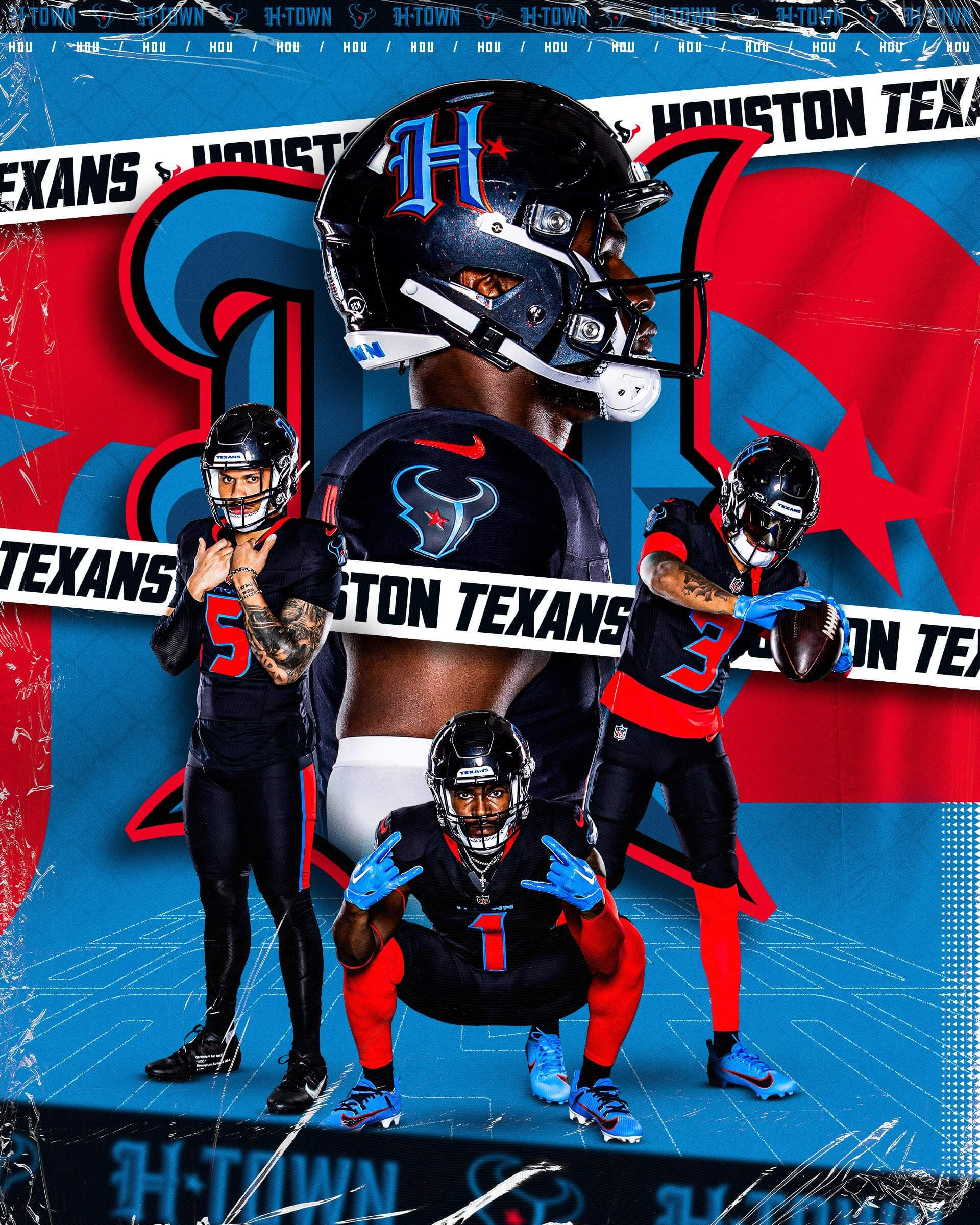 Alt text: Houston Texans color rush ugly NFL uniforms, a mismatched design within the team’s set.
As the NFL’s newest franchise, the Houston Texans generally sport tame and simple uniforms. Hopes were high for a more Columbia Blue-focused design with their 2024 changes. However, the Tennessee Titans’ colorblocking rights apparently restricted this, resulting in a mediocre color rush uniform that feels out of place within the Texans’ overall set. Featuring an entirely different helmet logo, it lacks visual cohesion and feels like a generic “NFL City Edition” concept.
The dishonorable mention goes to the Texans’ all-red uniforms from the 2000s. Upon their initial unveiling, these monochromatic uniforms were unpopular. The red color appears washed out, and without the current version’s red helmet, it lacks visual impact.
Indianapolis Colts
 Alt text: Indianapolis Colts “Indiana Nights” ugly NFL uniforms, featuring clashing colors and shoulder stripes.
The Indianapolis Colts have largely avoided truly ugly uniforms. Their throwbacks are generally well-received or haven’t been worn enough to earn the “worst” title. Therefore, the “Indiana Nights” set, unveiled last year, becomes their ugliest. The horizontal stripes on the jersey shoulders are odd enough, but pairing the entire uniform with a black helmet was a questionable decision. A black helmet with a blackout uniform or a blue helmet with the blue uniform would have been more aesthetically coherent than this mismatched combination.
The dishonorable mention goes to any instance of the Colts wearing non-standard pants. Fan reaction to deviations from their usual pants has been so negative that these alternate pairings rarely reappear, making the occasional all-blue set something of a minor miracle.
Jacksonville Jaguars
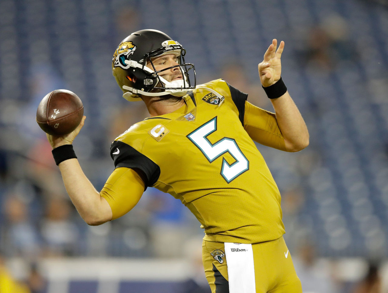 Alt text: Jacksonville Jaguars mustard color rush ugly NFL uniforms, widely considered one of the worst in league history.
The Jacksonville Jaguars’ uniforms from 2013-2017 were generally considered terrible, but the mustard-colored color rush uniform stands out as the absolute worst. The bizarre paneling, two-tone helmet, and atrocious base color combine to make this a strong contender for the ugliest uniform in NFL history. Thankfully, this visual offense was retired before the “Sacksonville” season, and the entire design era was abandoned shortly thereafter.
The Jaguars’ set from 2009-2012 earns the dishonorable mention as the beginning of the end. Featuring random lines and poorly placed logos, it marked a decline in the team’s visual identity.
Kansas City Chiefs
 Alt text: Kansas City Chiefs all white ugly NFL uniforms, considered bland and lacking contrast.
The Kansas City Chiefs have a remarkably clean uniform history, devoid of truly bad designs. Therefore, their ugliest set is simply their most bland: the all-white uniform. While not offensive, it’s undeniably boring, featuring thin stripes and limited contrast. However, even this “worst” Chiefs uniform is still significantly better than many other teams’ best looks, highlighting the overall strength of Kansas City’s visual branding. Their Super Bowl wins likely guarantee this set will remain a fixture for years to come.
Las Vegas Raiders
 Alt text: Las Vegas Raiders white jersey ugly NFL uniforms, considered boring and lacking visual interest.
The Raiders uniforms are undeniably classic, and many fans adore their simplicity. However, the white jerseys are, in this view, boring and visually empty. They resemble practice jerseys, saved only by the silver pants, which provide a unique and redeeming element. The color rush variant, with its silver numbers, is a slight improvement, demonstrating that even minor design tweaks can enhance the overall look.
The dishonorable mention goes to any instance of the Raiders using gold in their uniforms. Gold simply doesn’t complement the Raiders’ silver and black color scheme, resulting in a visually jarring and out-of-place element.
Los Angeles Chargers
 Alt text: Los Angeles Chargers navy and white ugly NFL uniforms, a downgrade from their iconic powder blue.
The Chargers’ navy-on-white uniform set isn’t overtly offensive, but it’s undeniably worse than the iconic powder blue that it largely replaced for years. The panels featuring lightning bolts look out of place and disrupt the visual flow of the uniform. The entire template felt awkward and uninspired. The navy color itself was a less desirable choice compared to the team’s signature powder blue. The all-navy version of this uniform, however, was a significant improvement, clearing up some of the visual clutter.
The initial iteration of the navy blue jersey also deserves a dishonorable mention, suffering from similar design flaws as the navy-on-white version.
Los Angeles Rams
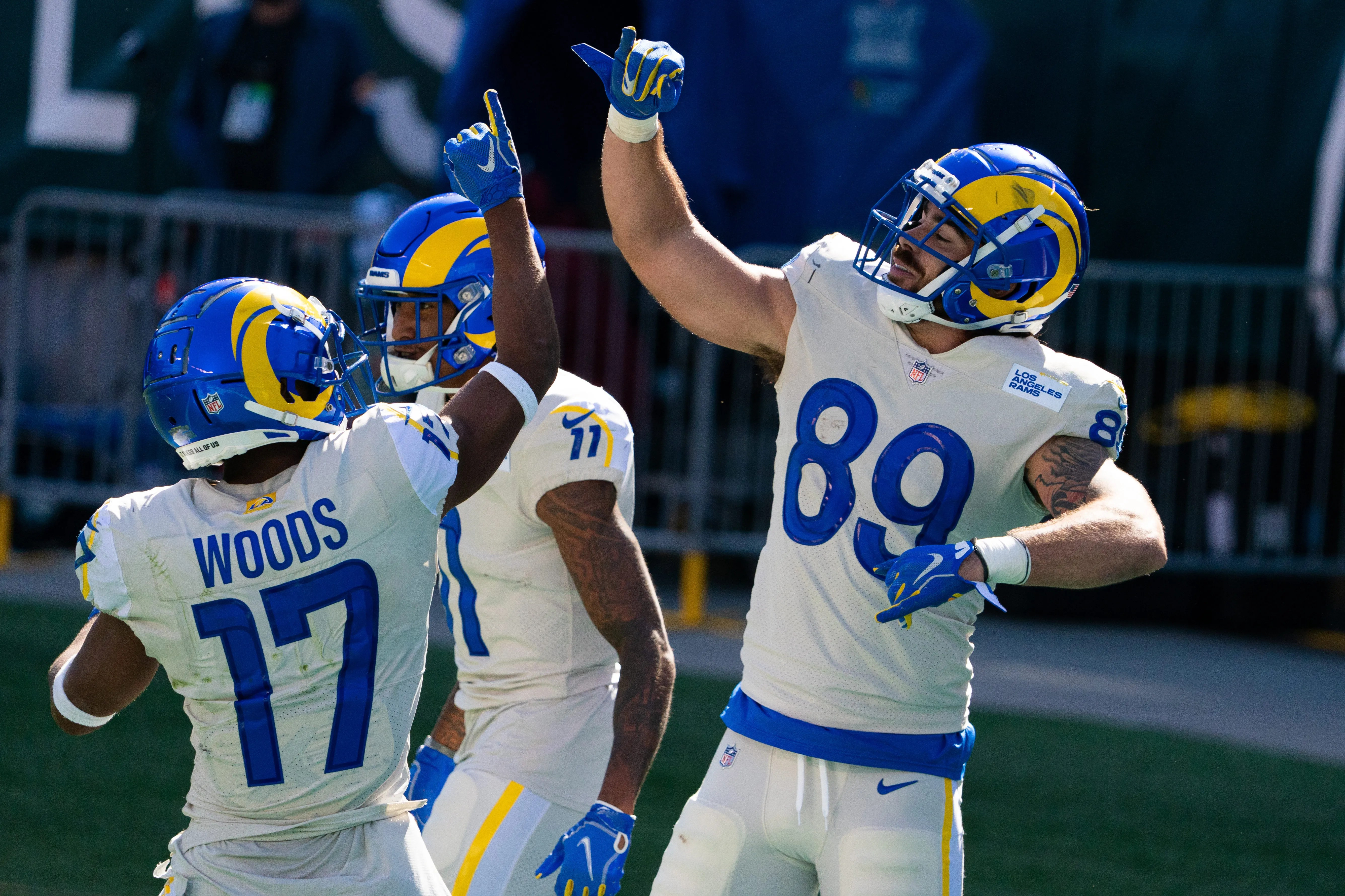 Alt text: Los Angeles Rams “bone” jersey ugly NFL uniforms, criticized for color and random yellow stripes.
The Rams’ color rush uniform was a significant design failure, but somehow, their “bone” jerseys manage to be even worse. The off-white color looks dingy and aged, and the random yellow stripes are jarring and visually unpleasant. The numbers and wordmark patch suffer from the same generic and uninspired design criticisms as other elements of this set.
Other Rams uniform atrocities include the color rush uniform, any instance of them wearing a yellow jersey, and the navy blue and bronze combination, which simply didn’t work. The team’s indecision between this color scheme and the classic royal blue and yellow only compounded their uniform woes.
Miami Dolphins
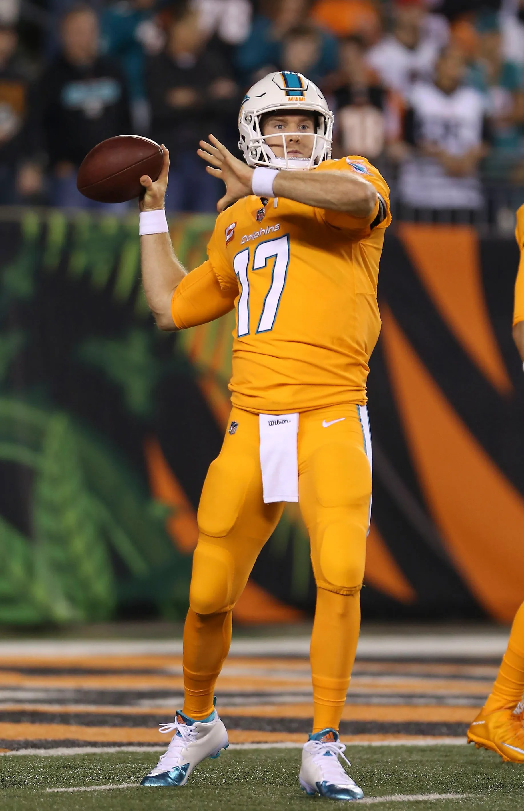 Alt text: Miami Dolphins all orange color rush ugly NFL uniforms, an overwhelming and visually jarring monochromatic look.
Orange has always been a vibrant accent color for the Miami Dolphins, complementing their teal (or aqua) base. However, when used as the primary color in an all-orange color rush uniform, the result is visually overwhelming and unpleasant. With minimal blue accents, the uniform is intensely bright and jarring, and the white helmet looks completely out of place. Thankfully, this design was retired in favor of a full teal color rush, a significant improvement. While some may dislike an all-teal look, it’s undeniably superior to the all-orange alternative.
The dishonorable mention goes to the original orange alternate jersey. While still flawed, it was slightly less offensive than the color rush version, particularly when paired with white pants.
Minnesota Vikings
 Alt text: Minnesota Vikings all purple ugly NFL uniforms from the 2000s, featuring excessive purple and chaotic side paneling.
For six long years, from 2006-2012, the Vikings inflicted monstrosities upon the eyes of football fans, characterized by side paneling and logos awkwardly interrupting said paneling. The all-purple set is the worst offender. It’s an overwhelming sea of purple, amplified by the chaotic design elements. Worn sparingly in 2007 and 2010, it thankfully wasn’t a frequent visual assault. Other all-purple uniform attempts have been far more successful.
The rest of the jerseys from this era also deserve dishonorable mentions. While undeniably flawed, these uniforms were at least creatively misguided and stood out, though whether standing out for the wrong reasons is a positive is debatable.
New England Patriots
 Alt text: New England Patriots Drew Bledsoe era ugly NFL uniforms, featuring drop shadow numbers and shoulder logos.
The uniforms worn by the New England Patriots during much of the Drew Bledsoe era were far from their best. While the shift to blue was a welcome change, the design execution was flawed. Drop shadow numbers, a universally disliked design element, slight pinstripes that were barely visible and only served as a distraction, and oversized shoulder logos combined to create a visually cluttered and unappealing uniform. Fans were already resentful of the Pat Patriot logo’s removal, and these uniforms only added insult to injury.
The dishonorable mention goes to their silver alternate jersey. Largely forgotten and unnecessary, it offered little visual appeal. The silver pants, however, were a decent element within an otherwise unremarkable uniform.
New Orleans Saints
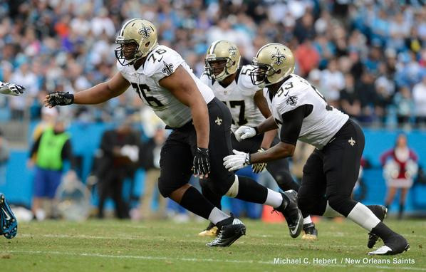 Alt text: New Orleans Saints black and white ugly NFL uniforms with plain pants, a bland and uninspired design.
The New Orleans Saints generally boast a strong uniform history, but this particular combination is a notable exception. The pants, devoid of stripes, are incredibly boring, and the mismatched black and white elements create a visually disjointed and bland look. It’s visually uninteresting and lacks any distinctive features. The gold stripe on the pants, even if not universally loved by fans, would be a significant improvement over this plain design.
The dishonorable mention goes to any Saints uniform featuring mustard pants. While the jersey itself might be an improvement over their standard design, the mustard pant color suffers from the same aesthetic issues as the Ravens’ gold pants – a visually unappealing and out-of-place color choice.
New York Giants
 Alt text: New York Giants recent throwback ugly NFL uniforms, a mismatched and visually jarring design.
While technically a throwback intended for only two uses, this New York Giants uniform is exceptionally awful. It inexplicably mixes and matches uniform elements from different eras, somehow making it even uglier than the sum of its parts. It resembles the Montreal Canadiens’ uniforms, but in a significantly worse rendition. The Giants made a major misstep by releasing this visual disaster.
When the Giants unveiled a red uniform in 2004, it resembled a practice jersey designed to protect quarterbacks. The issue is the over-reliance on red. Giants uniforms should be predominantly blue, and an all-red jersey feels out of place and uninspired. Another dishonorable mention goes to the uniforms worn when the Giants played at Shea Stadium. These designs were visually overwhelming and chaotic, exacerbated by the strange helmet logo.
New York Jets
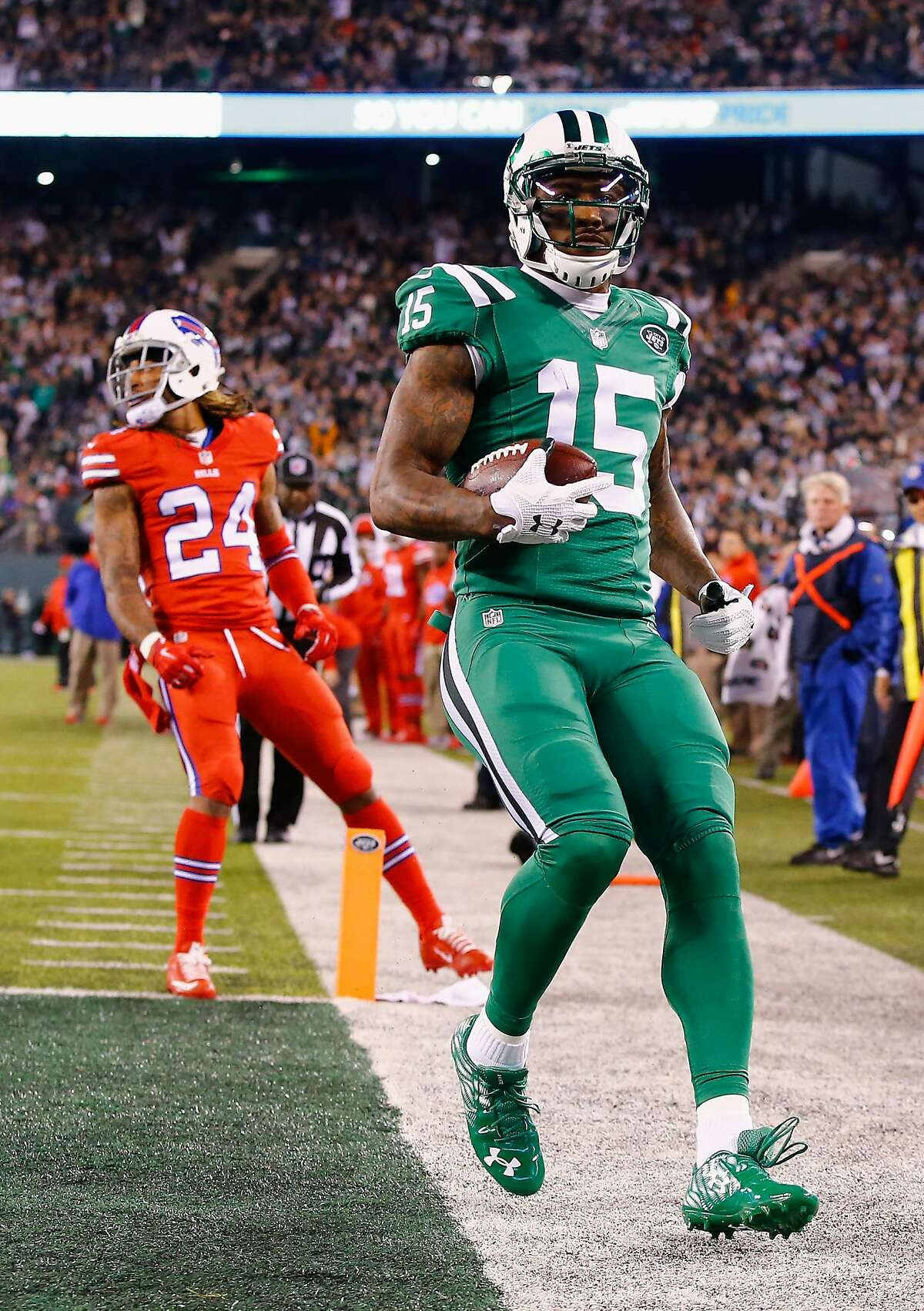 Alt text: New York Jets color rush ugly NFL uniforms, an unnecessary and visually jarring light green design.
If the New York Titans throwbacks were eligible, they would undoubtedly claim the top spot for ugliest Jets uniform. Instead, the color rush jersey, serves as a prime example of an unnecessary and visually jarring design. With an already existing all-green set, the lighter green and occasional black accents made little sense. Its debut was particularly unfortunate, as the Jets played the Buffalo Bills, who wore all red in the same game, creating a colorblind nightmare for viewers.
As promised, the New York Titans throwbacks earn a dishonorable mention. Their weird color scheme and oddball design make them a strong contender for the ugliest uniforms in Jets history.
Philadelphia Eagles
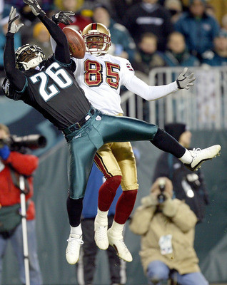 Alt text: Philadelphia Eagles black alternate ugly NFL uniforms with mismatched pants and helmet, an initially awkward design.
Another throwback is narrowly avoided by the rules, allowing this often-forgotten Philadelphia Eagles combination to take the “ugly” crown. The black alternate jersey, worn for rivalry games since 2003, initially lacked matching pants or a helmet. This resulted in a disjointed and unpopular look. However, with the eventual addition of matching black pants and helmet, the black alternate has been salvaged and is now a more cohesive design.
While the Eagles’ current uniform set initially drew criticism for its “disgusting blue-green” hue, the 2007 throwback uniforms are truly deserving of condemnation. Their visual awfulness speaks for itself.
Pittsburgh Steelers
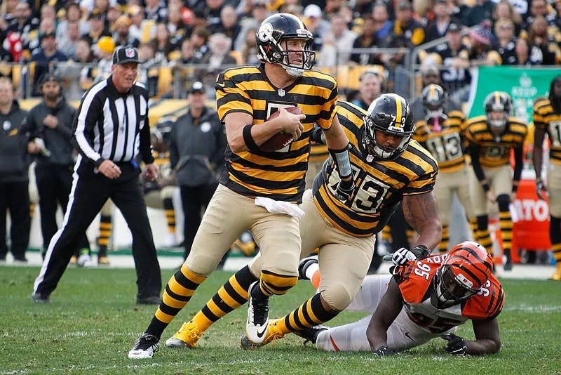 Alt text: Pittsburgh Steelers “Bumblebee” ugly NFL throwback uniforms, widely considered among the worst ever.
The Pittsburgh Steelers have largely avoided uniform missteps, with the exception of throwbacks. The “bumblebee” throwback uniforms, worn for multiple seasons, barely qualify, and represent the nadir of Steelers’ aesthetics. While the striped sock commitment is admirable, it’s the only positive aspect of this truly hideous jersey set. These uniforms are strong contenders for the worst ever worn in the NFL, making it baffling that fans clamored for their repeated return.
The dishonorable mention goes to the 1994 throwback uniform. Nearly as visually offensive as the bumblebees, it thankfully only lasted for a single season.
Seattle Seahawks
 Alt text: Seattle Seahawks neon green alternate ugly NFL uniforms, a visually jarring and unbalanced design.
The original neon green alternate uniforms from the Seattle Seahawks are simply bad. While worn only once, they were intended to become a regular part of Seattle’s rotation, not a temporary throwback. However, the design misses the mark. Neon green can work in small doses, but as a primary color, it’s visually overwhelming. Paired with navy pants, the combination is unbalanced and unflattering. The navy shoulder area and thin green pant stripe do little to improve the overall look.
While some might expect the newer “action green” color rush uniform to be the dishonorable mention, this earlier version is arguably worse, suffering from similar color balance issues. However, both pale in comparison to the truly depressing and boring navy blue uniform sets worn during the same era, which were simply visually uninspired and forgettable.
San Francisco 49ers
 Alt text: San Francisco 49ers two-tone blackout ugly NFL uniforms, a design that clashed with team identity.
The San Francisco 49ers generally have strong uniform designs, making it difficult to pick a truly “ugly” one. While fan reaction to this two-tone blackout jersey was negative enough to warrant its inclusion here, it’s not objectively terrible. The 49ers simply don’t seem like a team suited for a blackout jersey concept. A matching helmet might have improved it, but fan disapproval led to its discontinuation after only three seasons. While not a design triumph, it’s arguably more misguided than truly ugly.
The second weakest 49ers jersey is likely the all-white set, whether the throwback version or the original. While still decent, all-white uniforms are almost invariably less visually interesting than their colored counterparts.
Tampa Bay Buccaneers
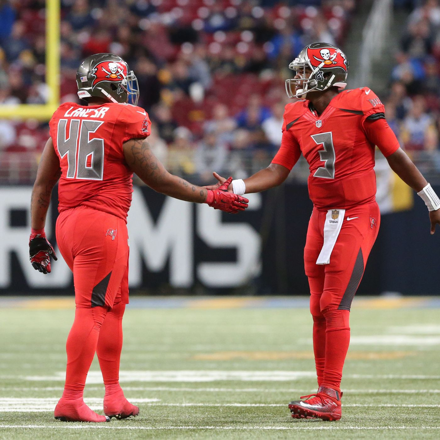 Alt text: Tampa Bay Buccaneers all red color rush ugly NFL uniforms from the 2010s, featuring random shapes and ugly fonts.
The Buccaneers’ uniforms from the 2014-2019 era were generally rough, but the all-red color rush takes the dubious prize as the ugliest. While less busy than their standard uniforms from this period, it’s still riddled with design flaws. The random shapes masquerading as stripes are out of place, and the number font remains aggressively ugly.
It’s difficult to find redeeming qualities in any Buccaneers uniform from 2014-2019. These sets are visually cluttered messes. The “Creamsicle” throwbacks also earn a dishonorable mention. The logo is dated and unappealing, and the orange and red color combination is a strange and visually jarring choice.
Tennessee Titans
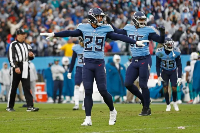 Alt text: Tennessee Titans powder blue and navy ugly NFL uniforms, featuring clashing colors and arena football elements.
The Tennessee Titans’ current uniforms are generally disliked, but the powder blue and navy combination is particularly offensive. The pants feature a grayscale trapezoid instead of a stripe, and the sword motifs on the shoulders look like they belong in arena football, not the NFL. The overall design is visually unappealing and lacks sophistication.
The rest of the Titans’ current uniform set also earns a dishonorable mention. The mediocre design is consistently underwhelming, although the variety of color combinations is a minor positive.
Washington Commanders
 Alt text: Washington Commanders stencil font ugly NFL uniforms, a bland and poorly designed set.
For a truly awful uniform set with minimal design elements, yet still manages to look terrible, look no further than the Washington Commanders. The stencil font is visually unappealing, and the complete lack of stripes is incredibly bland. These jerseys are deeply disliked, representing a significant design failure. Whoever approved this design made a grave error.
The rest of the Commanders’ current uniforms also earn a dishonorable mention, ranking among the worst in the entire NFL. The fact that the blackout uniform, devoid of any burgundy, is arguably the best look in the set speaks volumes about the overall design quality. Even the old throwback uniform, beloved by some, is included in the dishonorable mentions for its dated and visually unappealing elements.
Final Thoughts on the NFL’s Worst Looks
While some uniform designs achieve iconic status, others fall spectacularly short. This list is a subjective exploration of the latter, highlighting uniforms that, in this writer’s opinion, represent the ugliest the NFL has to offer. However, beauty is in the eye of the beholder, and some readers may find redeeming qualities in even these questionable designs. Your own opinions and alternative “ugly uniform” lists are welcomed! This exploration of NFL fashion fails has been a fun journey and a fitting introduction to the Uniform Hour series. Stay tuned for more uniform discussions on Shady Sports Network!
Sponsor
This article and much more is brought to you by Seatgeek. Seatgeek is your go-to platform for securing tickets to all the sporting events you desire, often at great prices. Use code SamShady to unlock an even better deal.
YouTube Channel
Don’t forget to explore the YouTube channel for podcasts, interviews, and a variety of sports-related video content!
Share this:
- Tweet
- Share on Tumblr
- Telegram
- Mastodon
Like this:
Like Loading…
Related Posts
Discover more from Shady Sports Network
Subscribe to get the latest posts sent to your email.