
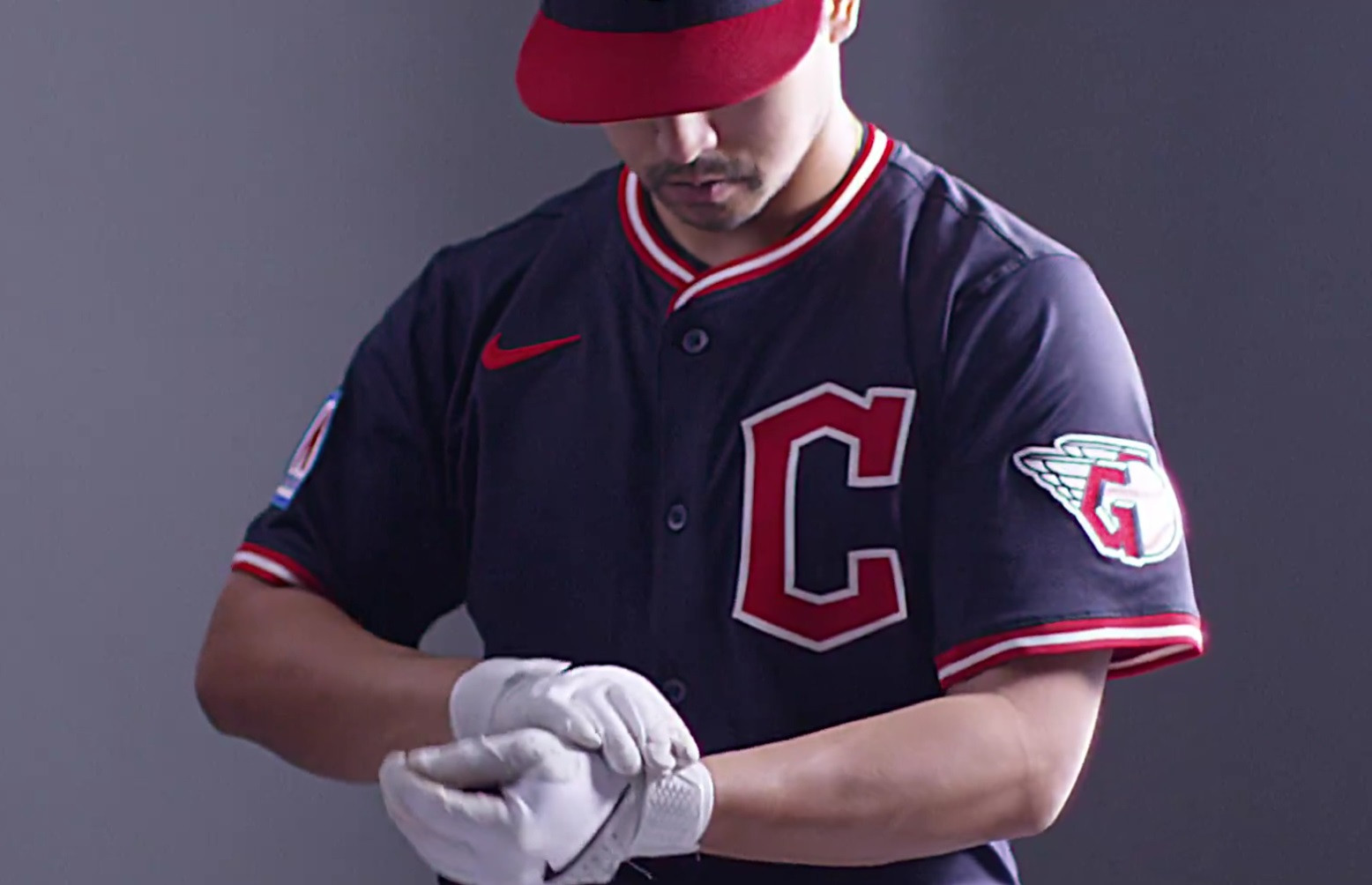
The Cleveland Guardians are set to step onto the field in 2025 with subtly updated uniforms. While the team refers to these changes as “refinements,” they collectively bring a fresh perspective to all four of their uniform sets. Fans and uniform enthusiasts alike will notice tweaks across the home whites, road grays, red alternates, and blue alternates, each contributing to an evolved aesthetic for the team. Let’s delve into the details of these uniform adjustments for the upcoming season.
White Home Uniform: Script Guardians and Red Hat Debut
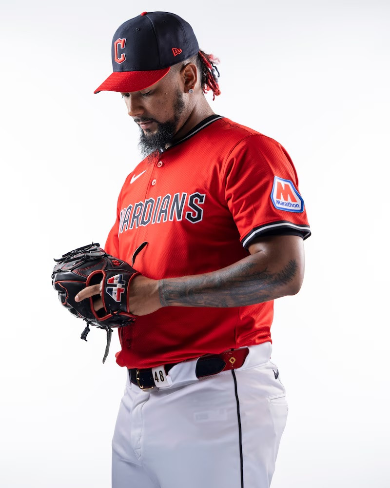
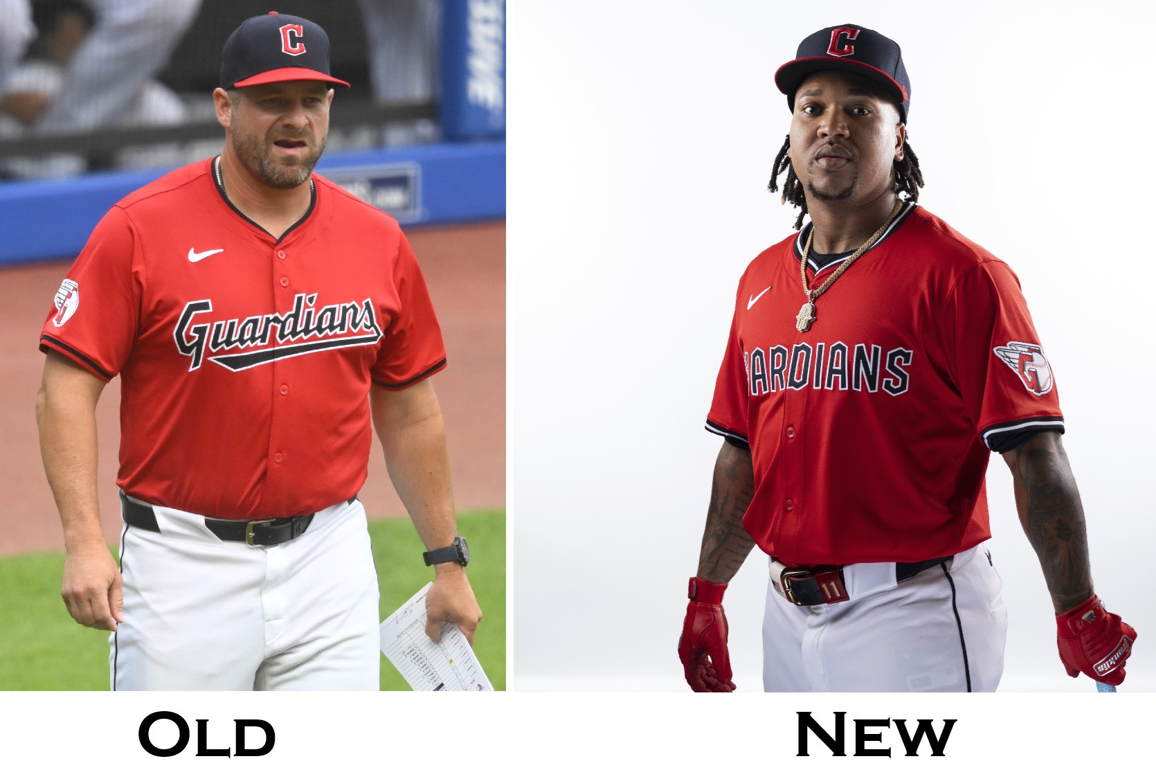
The classic white home uniform of the Cleveland Guardians will retain its familiar charm while incorporating key modifications. The iconic script “Guardians” across the chest remains the centerpiece, but it’s now presented in a horizontal alignment, moving away from the previous slant. Adding a touch of visual interest, new piping featuring a red-blue-red design will adorn the neckline and sleeves of the jersey.
A notable addition to the home whites is a brand-new hat. Exclusively paired with this uniform set, the hat will feature a striking red crown with a contrasting blue bill. However, the familiar “Diamond C” logo will continue to be proudly displayed on all Guardians caps. For the other uniform sets – the home red, road blue, and road gray – the team’s existing blue cap with a red bill will remain the standard headwear.
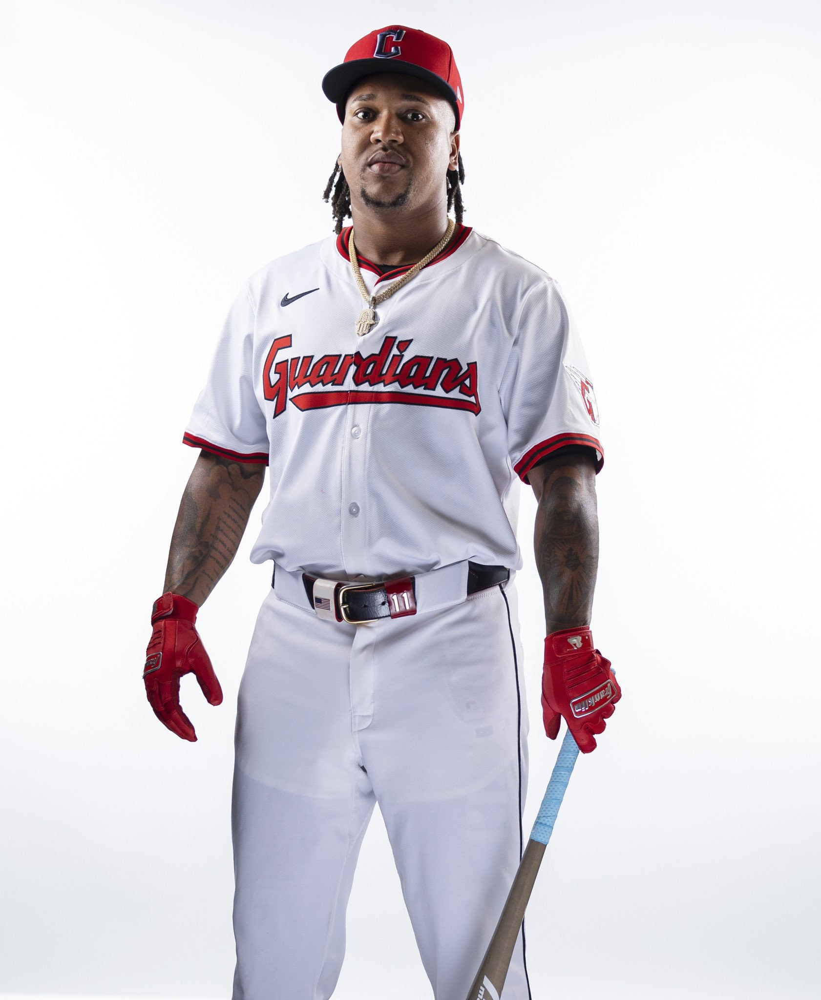
Alt text: Close-up of the Cleveland Guardians 2025 white home baseball uniform jersey, showcasing the horizontal script font and red-blue-red piping details.
Alt text: Side-by-side comparison of the Cleveland Guardians home white uniforms, highlighting the changes in script font alignment and piping for the 2025 season.
Road Gray Uniform: Consistent Cleveland in Bridge Print
For their road games, the Cleveland Guardians’ gray uniform will largely maintain its current design. The word “Cleveland” will continue to be displayed across the chest in the distinctive Bridge Print font, ensuring consistency in the team’s branding on the road.
Similar to the home whites, the gray road jersey will also incorporate the new red-blue-red piping color scheme. This subtle addition harmonizes the design elements across both the home and road uniform sets, creating a cohesive visual identity for the team.
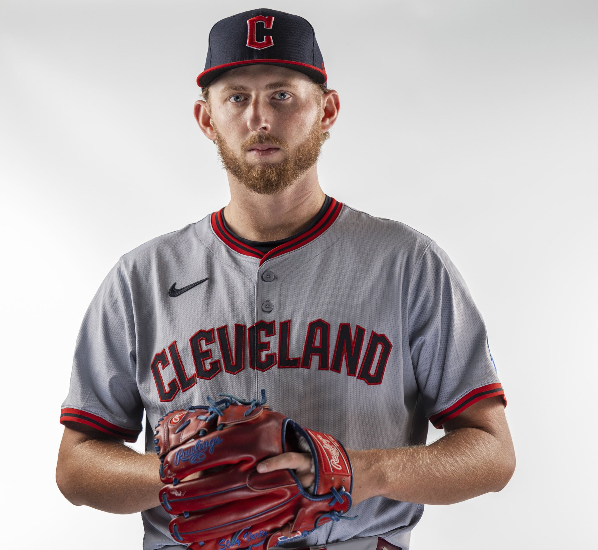
Alt text: Detail view of the Cleveland Guardians 2025 road gray baseball uniform, emphasizing the “Cleveland” wordmark in Bridge Print font and red-blue-red piping.
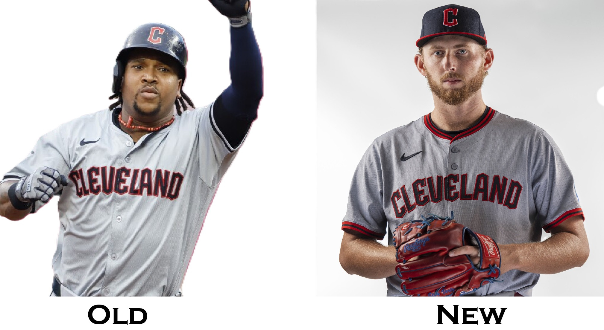
Alt text: Cleveland Guardians road gray uniform comparison, showing the 2024 version alongside the refined 2025 design, focusing on piping and font consistency.
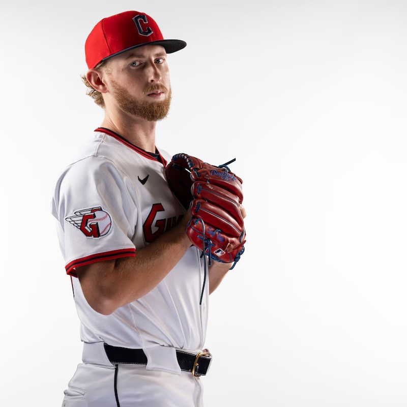
Red Home Alternate: Bridge Print Guardians Takes Center Stage
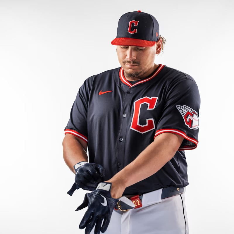
The red home alternate uniform is receiving a more significant update. The script “Guardians” that was featured in 2024 is being replaced with the team’s Bridge Print font, now spelling out “Guardians” across the chest. This change aligns the red alternate with the font used for the numbers on the back of all Cleveland jerseys and the “Cleveland” wordmark on the road grays, creating a unified font family across the uniform collection. The piping on the red jersey will also be refreshed, showcasing a blue-white-blue color combination.
Alt text: Cleveland Guardians 2025 red home alternate uniform, highlighting the “Guardians” wordmark in Bridge Print font and blue-white-blue piping detail.
Alt text: Comparison of Cleveland Guardians red alternate jerseys, demonstrating the font change from script to Bridge Print for “Guardians” in the 2025 update.
Blue Road Alternate: Diamond C Logo Returns to the Chest
The blue road alternate uniform sees the most substantial transformation for 2025. While maintaining its navy base color, the jersey is moving away from the “Cleveland” wordmark across the chest. In its place, the Guardians’ prominent “Diamond C” logo will take center stage. This design choice pays homage to the franchise’s history, recalling jerseys from 1901-1945, including the 1920 World Series team, which also featured a “C” on the chest. This update elevates the Guardians’ primary logo on their alternate blue jerseys. The piping on the blue jersey will also be distinct from the other uniforms, featuring a red-white-red design that complements the navy base.
Alt text: Detailed image of the Cleveland Guardians 2025 blue road alternate uniform, showing the prominent “Diamond C” logo and red-white-red piping.
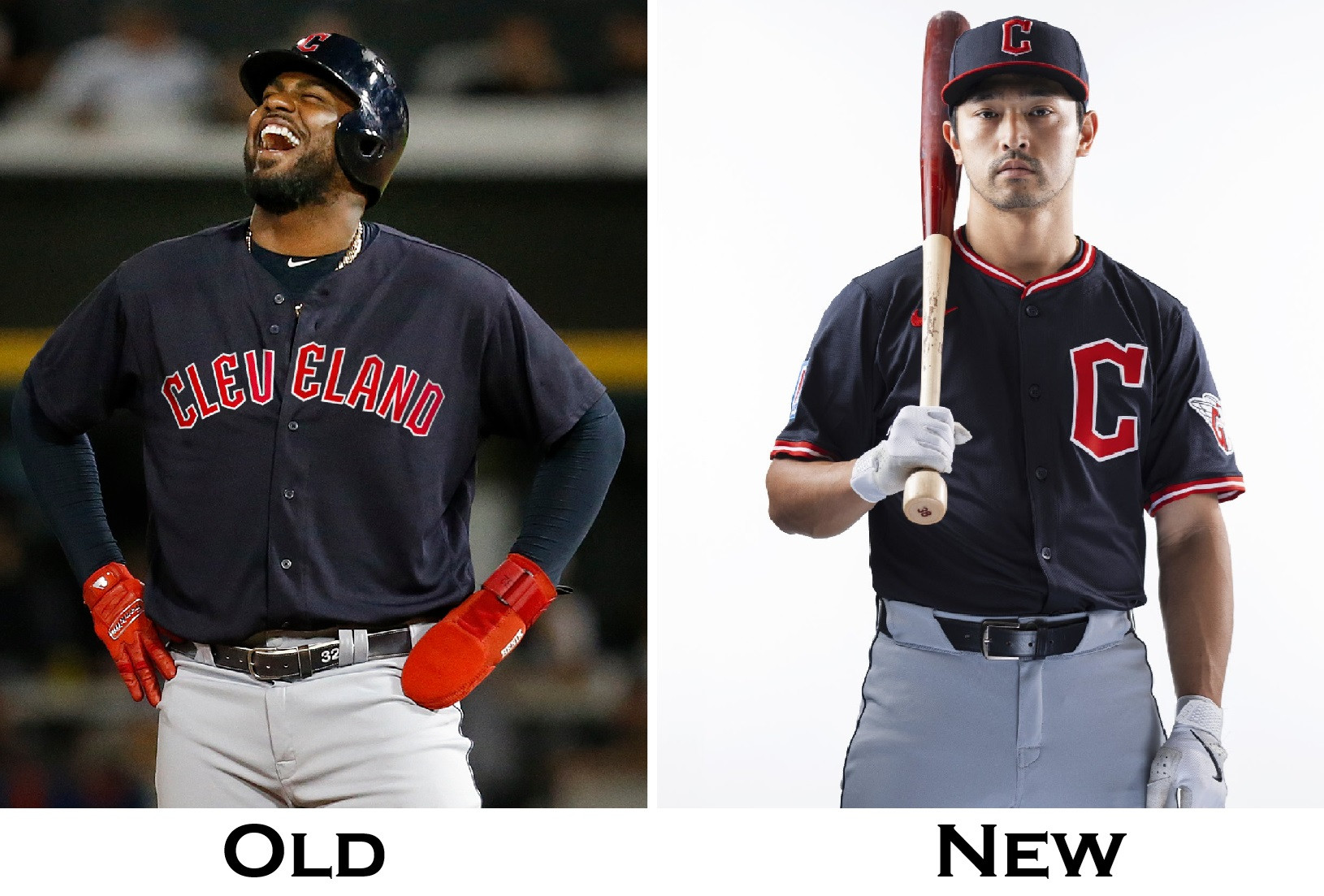
Alt text: Cleveland Guardians blue road alternate uniform evolution, contrasting the 2024 “Cleveland” wordmark with the 2025 “Diamond C” logo design.
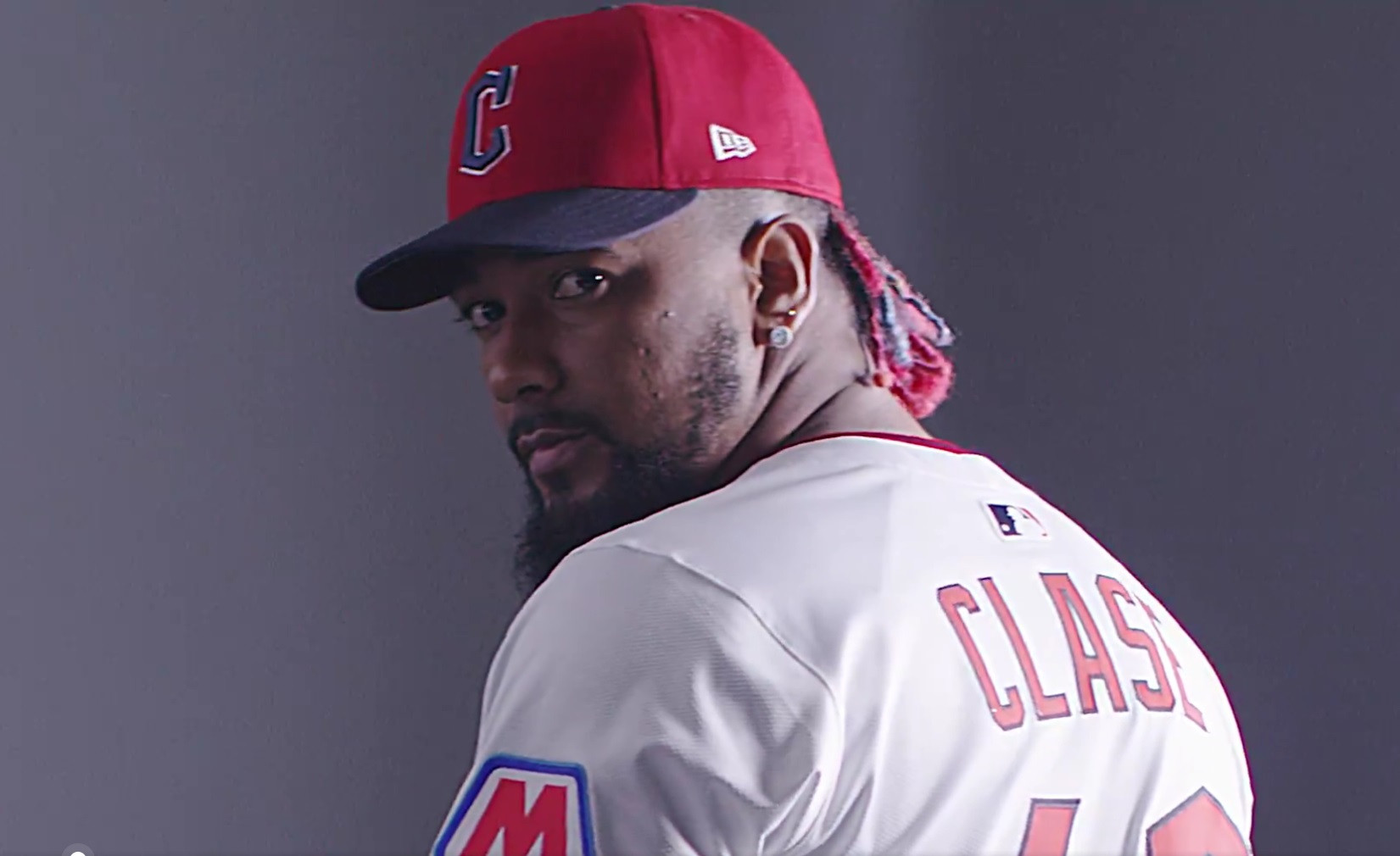
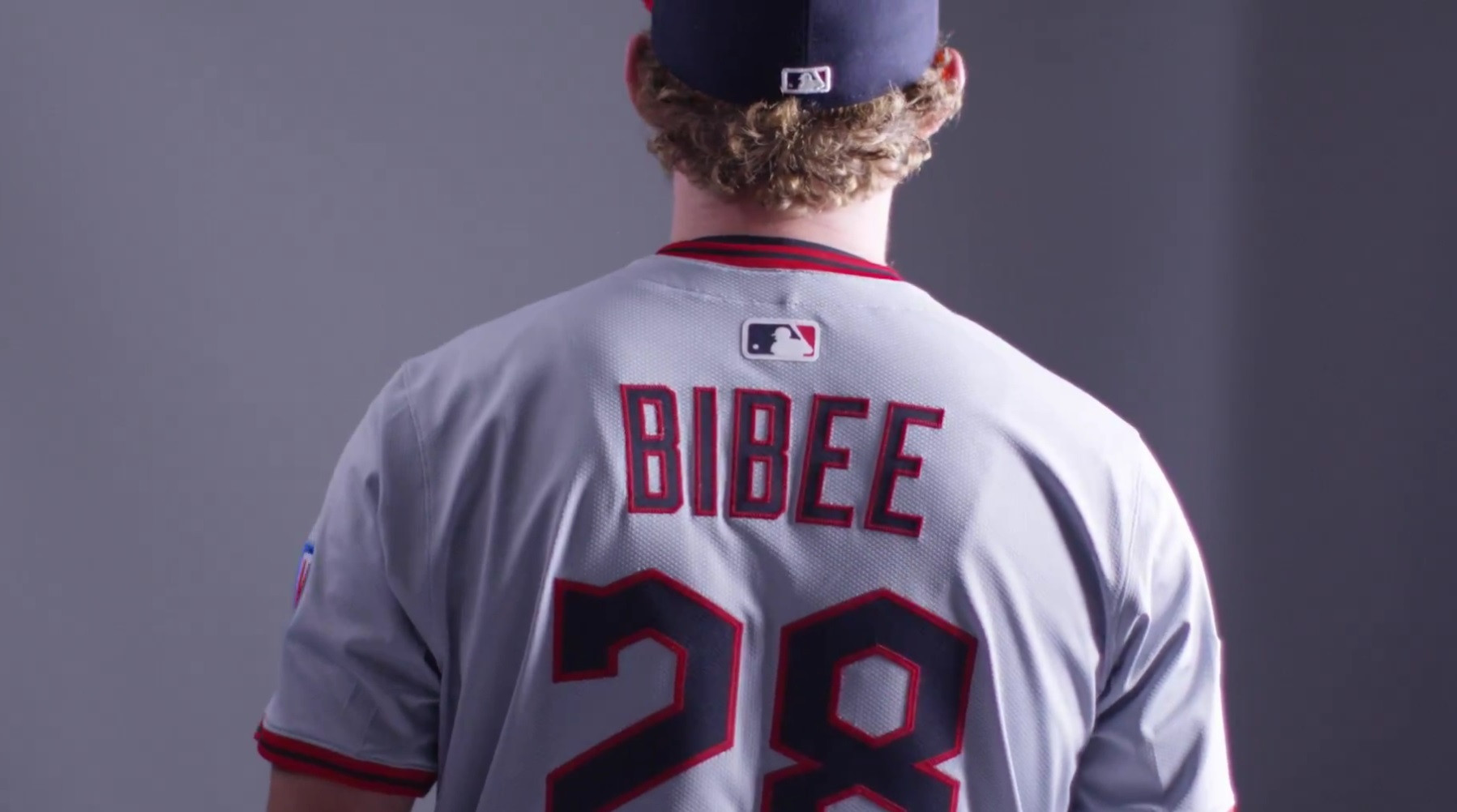
Name On Back (NOB) Font Size Adjustment
Beyond the chest logos and piping, there’s an indication of another potential uniform adjustment. MLB had previously announced that the size of the Name On Back (NOB) lettering would return to a “normal” size. While the Guardians’ official announcement didn’t explicitly mention this, visual evidence from the uniform reveal video suggests that this change may indeed be implemented for the 2025 season. Although official photos of the jersey backs were not provided, screen captures from the video seem to show NOBs that appear larger than those from the previous season.
Alt text: Screen capture from the Cleveland Guardians 2025 uniform reveal video, potentially showcasing the larger Name On Back (NOB) font size.
Alt text: Another frame from the Cleveland Guardians 2025 uniform announcement video, providing a clearer view of the possibly increased NOB font size.
Alt text: Side-by-side comparison image suggesting a potential increase in the Name On Back (NOB) font size on the Cleveland Guardians 2025 uniforms compared to the 2024 versions.
Final Thoughts
Overall, the Cleveland Guardians’ 2025 uniform refinements are subtle yet impactful. The changes maintain the team’s core identity while introducing fresh design elements. The new home cap is a standout, and the consistent use of the Bridge Print font across different jerseys provides a more unified look. The return of the “Diamond C” logo to the blue alternate jersey is a welcome nod to the team’s rich history. And if the larger NOB size is indeed confirmed, it’s another positive tweak for uniform traditionalists. What are your initial reactions to these updated Guardians uniforms?