The Arizona Diamondbacks have sported a variety of looks since joining Major League Baseball as an expansion team in 1998. Their uniform evolution tells a story of a franchise finding its identity, embracing bold colors, and eventually refining its aesthetic for a modern era. Let’s delve into the history of the Diamondbacks Uniform, charting its course through different eras and design choices.
The Original Diamondbacks Uniform Set (1998-2006): A Wild West Debut
When the Arizona Diamondbacks burst onto the MLB scene, their original uniforms were as vibrant and untamed as the desert landscape they represented. Unveiled in 1995, these uniforms were a bold statement. The color palette was a striking mix of purple, teal, black, and copper – a far cry from traditional baseball aesthetics. This initial Diamondbacks uniform set was a visual explosion, perfectly capturing the energy of a new expansion team eager to make its mark. This style, with minor tweaks, remained the team’s look until 2006.
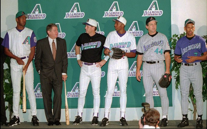 Arizona Diamondbacks original uniforms unveiled in 1995, showcasing the vibrant purple, teal, black, and copper color scheme.
The initial Diamondbacks uniform collection included an alternate black jersey. Interestingly, prior to their inaugural season, this black alternate underwent a change. The original design featured a full “Diamondbacks” wordmark across the chest. However, the final version adopted the team’s primary logo – a stylized snake head – as the chest emblem. This shift towards the logo emphasized the team’s brand identity right from the start.
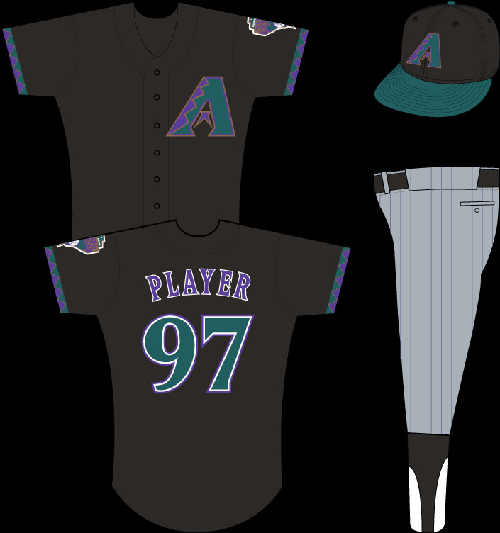 Arizona Diamondbacks alternate black uniform as it appeared for the inaugural season, featuring the primary snake head logo on the chest.
Minor Uniform Updates (2001-2006): Tweaks After a Championship
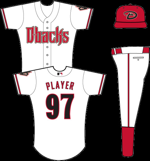
Following their World Series victory in 2001, the Diamondbacks made subtle but significant updates to their MLB uniforms. The home white jersey saw the “D-backs” logo replace the wordmark across the chest, streamlining the look. The road gray uniform transformed into a vest style, worn over a black undershirt, adding a unique dimension to their away appearance. The black alternate jersey also switched, now featuring the “Diamondbacks” wordmark instead of the logo, creating a visual balance within the uniform set. These changes, implemented shortly after their championship win, marked a refinement of the original bold aesthetic.
The First Sedona Red Diamondbacks Uniform Set (2007-2015): Embracing the Desert
In 2007, the Arizona Diamondbacks ushered in a new era with their first Sedona Red uniform set. This redesign was significant, introducing new colors and designs that aligned the Diamondbacks with the color palettes of other Arizona sports teams like the Coyotes (hockey) and Cardinals (football). Sedona Red, a deep, earthy red inspired by the Arizona landscape, became the team’s primary color, replacing purple. New wordmarks and an updated logo accompanied this color shift, signaling a more mature and geographically grounded team identity in their Diamondbacks uniform.
 Arizona Diamondbacks Sedona Red home uniform, showcasing the updated wordmarks and logo.
 Arizona Diamondbacks Sedona Red away uniform, featuring the team name in gray on a Sedona Red base.
 Arizona Diamondbacks alternate black uniform from the Sedona Red era.
 Arizona Diamondbacks alternate Sedona Red uniform, completing the color set for this era.
During this period, the Diamondbacks also participated in the throwback uniform trend, particularly for Thursday home games starting in the early 2010s. These throwback Diamondbacks uniforms offered a nostalgic nod to baseball history and the team’s own past.
Arizona Diamondbacks Sedona Red home uniform, showcasing the updated wordmarks and logo.
The 2016 Rebrand: Evolution and the Return of Teal
The 2016 season marked another significant shift in the Diamondbacks uniform narrative. The team unveiled a rebranded look, touted as an “evolution.” Teal, a color synonymous with their original expansion era, made a comeback as an accent color. Gradient shoulder stripes, designed to mimic snakeskin patterns, were a distinctive new element. Side and back patterns were also introduced on the jerseys and pants, adding further textural detail to the Diamondbacks uniform. While the pants pattern was discontinued after just one year, the overall 2016 rebrand injected a modern, edgy feel into the team’s on-field attire. Throwback Thursday uniforms continued to be part of the rotation, and the “Los D-Backs” alternate uniform, previously a promotional item, became a more established part of the set.
 Arizona Diamondbacks 2016 uniform rebrand, showcasing the return of teal accents and gradient snakeskin stripes.
2020 Uniform Revisions: Streamlining the Look
In 2020, the Diamondbacks opted for revisions rather than a complete overhaul of their MLB uniforms. These changes focused on streamlining the existing design. The gradient pattern was removed, creating a cleaner aesthetic. The “Los D-Backs” uniform received an update, and overall, the Diamondbacks uniform set became more refined and less visually busy. Teal accents were scaled back, taking a more subtle role in the color scheme. Throwback uniforms were officially retired from regular rotation, though the team indicated they could still be worn for special occasions like anniversaries.
 Arizona Diamondbacks 2020 uniform revisions, demonstrating a more streamlined design with reduced teal accents.
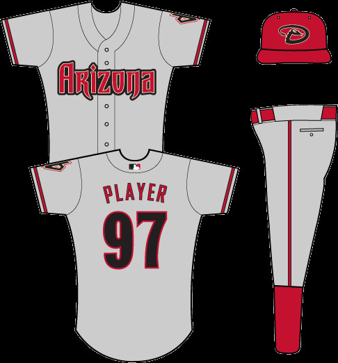
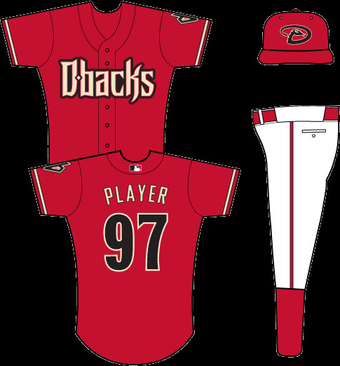
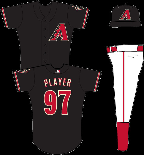
The 2024 Redesign: Blending Past and Present
The most recent chapter in the Diamondbacks uniform history began in 2024 with a refreshed design. This latest iteration aimed to blend elements of the team’s past and present. The core colors of Sedona Red, black, and white remained central, but teal trim was brought back in a more prominent role, signaling a stronger connection to the team’s origins. Sand color, which had been a secondary accent, took a backseat in the primary uniform set. The 2024 redesign represents a thoughtful evolution, respecting the franchise’s heritage while updating the Diamondbacks uniform for a new era.
 Arizona Diamondbacks 2024 uniform redesign, highlighting the increased presence of teal and the blending of past and present design elements.
Diamondbacks Uniform: Beyond the Regular Rotation
Beyond their standard home, road, and alternate jerseys, the Diamondbacks have also participated in various league-wide uniform initiatives and special designs.
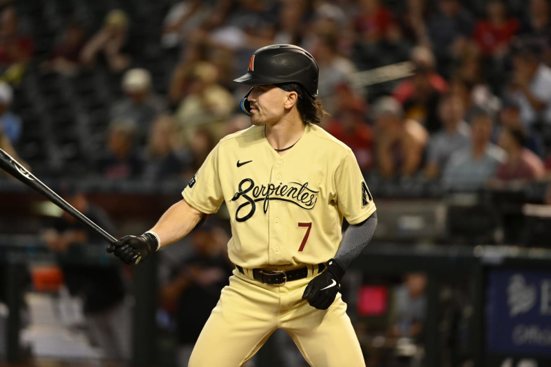
City Connect Uniform (2021-Present): Honoring Hispanic Heritage
As part of MLB’s City Connect series, the Diamondbacks unveiled a special uniform in 2021. This City Connect Diamondbacks uniform is designed to honor the team’s Hispanic culture and fan base, reflecting the strong Hispanic influence in Arizona and baseball. Initially paired with sand-colored pants, it has also been seen with white pants, offering versatility in its presentation.
 Arizona Diamondbacks City Connect uniform worn with sand pants, celebrating Hispanic culture.
 Arizona Diamondbacks City Connect uniform more recently styled with white pants.
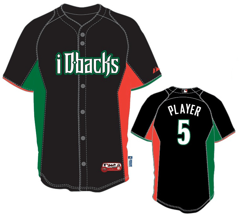
Turn Ahead the Clock Uniform (1999): A Futuristic Experiment
In 1999, MLB’s “Turn Ahead the Clock” promotion resulted in some truly unique and often unconventional uniform designs across the league. The Diamondbacks Turn Ahead the Clock uniform was no exception, featuring a futuristic and somewhat bizarre aesthetic that was a hallmark of this one-time event.
 Arizona Diamondbacks Turn Ahead the Clock uniform from the 1999 league-wide promotion.
Players Weekend Uniforms (2017-2019): Personalization and Nicknames
MLB’s Players Weekend initiative allowed players to express their personalities through their uniforms. In the first iteration (2017-2018), the Diamondbacks Players Weekend uniform featured a black base with red sleeves and a simple wordmark. The most memorable aspect was the inclusion of player nicknames on the back of the jerseys, adding a personal touch.
 Arizona Diamondbacks Players Weekend uniform from 2017-2018, featuring player nicknames on the back.
In 2019, Players Weekend uniforms adopted a stricter black or white color scheme depending on the team designation. As a designated black team, the 2019 Diamondbacks Players Weekend uniform was rendered entirely in black.
 Arizona Diamondbacks Players Weekend uniform from 2019, adhering to the all-black color scheme.
Wrigley Field 100th Anniversary Uniform (2014): A Nod to Baseball History
To mark the 100th anniversary of Wrigley Field, the Diamondbacks wore a special throwback uniform in 2014. This Diamondbacks Wrigley Field anniversary uniform paid homage to the Kansas City Packers, the first visiting team to play at Wrigley Field, connecting the Diamondbacks to a broader historical narrative in baseball.
 Arizona Diamondbacks Wrigley Field 100th Anniversary uniform, a tribute to the Kansas City Packers.
Italian Heritage Uniform (2012): Celebrating Community
For a single game in 2012, the Diamondbacks wore an Italian Heritage Diamondbacks uniform. This special jersey, paired with a red cap and away gray pants, was a gesture to celebrate the Italian-American community and its connection to baseball.
 Arizona Diamondbacks Italian Heritage uniform worn for a single game in 2012.
The Arizona Diamondbacks uniform history showcases a dynamic evolution, reflecting changes in team identity, branding trends, and special celebrations. From the bold colors of their expansion years to the refined designs of today, the Diamondbacks uniform continues to be a visual representation of this exciting MLB franchise.