
Is there anything as universally recognized and beloved in baseball as the Dodger Uniform? It exudes an aura of classic Americana, instantly signaling “good guys” to fans across generations. Conversely, the stark contrast of orange and black on a vanilla background often evokes the opposite sentiment. This visual language in baseball uniforms speaks volumes, and for many, choosing to root against the boys in blue feels almost…unthinkable. It’s a sentiment rooted in the iconic imagery associated with blue and white – the colors of heroes, from Superman to the US Olympic team.
But let’s delve deeper into what makes the Dodger uniform so special. For many aficionados, the magic lies in the seemingly unconventional yet utterly essential red number placed on the lower left quadrant of the jersey front. Initial impressions might question its placement, but this very detail is what truly authenticates it as a genuine Dodger uniform. Seeing a fan sporting a Dodger jersey without this distinctive red number feels incomplete, like a classic painting missing its signature brushstroke.
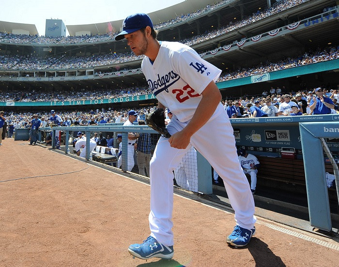 Clayton Kershaw in his iconic Dodger uniform, showcasing the red number on the front.
Tommy John, even while playing for the New York Yankees, eloquently captured this sentiment in a 1989 interview with Sports Illustrated. He stated, “You know what makes the Dodger uniform? It’s the red number on the shirt, I love that.” This simple red detail is more than just a number; it’s the soul of the uniform.
The addition of these front red numbers dates back to 1952. The primary reason? Television. The Dodgers were pioneers, becoming the first Major League Baseball team to incorporate this feature for better on-screen player identification. Within a decade, numerous other teams followed suit, recognizing the visual advantage. But why red specifically? The answer likely lies in the Dodger logo itself, a vibrant emblem that has always incorporated red, white, and blue. While some speculate that the red was chosen for better visibility on black and white televisions of the era, the connection to the team’s established color palette appears to be the more probable explanation. This color scheme is deeply rooted in Dodger history, tracing back to their letterhead design from the 1930s.
The iconic “shooting ball” logo, with its dynamic streaks of color, has undergone subtle font adjustments over the years, even recently. However, the core color scheme has remained steadfast, with red consistently prominent in the ball and its motion lines. Observing the evolution of the logo, from the skinnier font of the past to the bolder version used today, reveals a dedication to preserving the visual identity while subtly modernizing.
 Close-up of the Dodgers' shooting ball logo, emphasizing the classic red, white, and blue color scheme.
Beyond aesthetics, the front uniform numeral serves a practical purpose: aiding in the age identification of vintage baseball photos. For historians and fans alike, spotting a Dodger home uniform in an old photograph instantly reveals whether it predates 1952, the year the red number was introduced. Interestingly, the red number didn’t appear on the road Dodger uniform until 1959. While baseball uniform historian Marc Okkonen initially documented 1960 as the introduction year for road jerseys, photographic evidence from the 1959 World Series clearly shows Dodger road uniforms already sporting the iconic red front numbers.
 Charlie Neal during the 1959 World Series, wearing the Dodgers road uniform with the red front number.
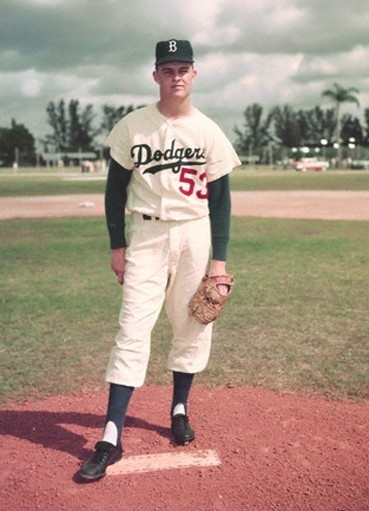
In the early years, variations existed in the red number design on the home uniforms. Some featured a skinnier font, while others displayed thicker numbers. Anecdotal accounts from baseball-fever.com suggest that some players, like Gil Hodges, may have even preferred the skinnier font. Archival photographs seem to support this observation, showing Hodges wearing both font styles, indicating a period where uniform consistency wasn’t rigidly enforced.
 Gil Hodges in a Dodger home uniform with a thinner font style for the red front number.
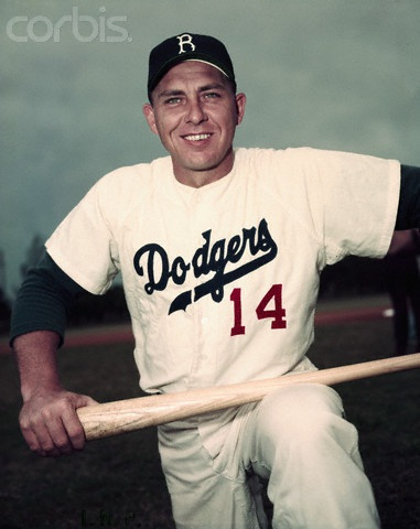
Similarly, photos of Don Drysdale in a Brooklyn Dodger uniform showcase the slimmer font number style prevalent in that era.
 Don Drysdale pictured in a Brooklyn Dodgers uniform, demonstrating the slimmer font style of the red number.
Contrasting these with images of Billy Cox and Carl Erskine from 1952 further highlights the font variations during the initial years of the red number’s introduction.
In conclusion, the Dodger uniform stands as a testament to timeless design in baseball. Its crisp, clean aesthetic is widely recognized as one of the sport’s best. Even Jim Caple, an admitted fan of the rival Giants, ranked the Los Angeles Dodger uniform at the top of ESPN’s list of MLB uniforms. When even your rivals acknowledge your superiority, it truly underscores the enduring legacy of the Dodger uniform and its iconic red number.