
The Orlando Magic unveiled new uniforms for the 2008-2009 NBA season, and the initial reaction was overwhelmingly positive. These new designs represented a significant departure from the previous uniforms, injecting a fresh and distinctive identity into the team’s on-court appearance. Let’s delve into what makes these Orlando Magic Uniforms a notable chapter in the team’s visual history.
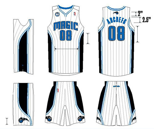 Orlando Magic white home uniforms featuring silver pinstripes, worn in the 2008-2009 NBA season, showcasing team branding.
The New Home Uniforms: Classic White with a Modern Edge
The home uniforms are anchored by a crisp white base, immediately recognizable as a basketball staple. However, the addition of silver pinstripes elevates the design, adding a touch of sophistication and visual interest. This subtle detail sets these Orlando Magic uniforms apart, preventing them from appearing generic. The black and blue trim further reinforces the team’s classic color scheme, ensuring instant recognition. Even without prominent logos, the color combination and pinstripe detail strongly evoke the Orlando Magic brand, a testament to effective uniform design.
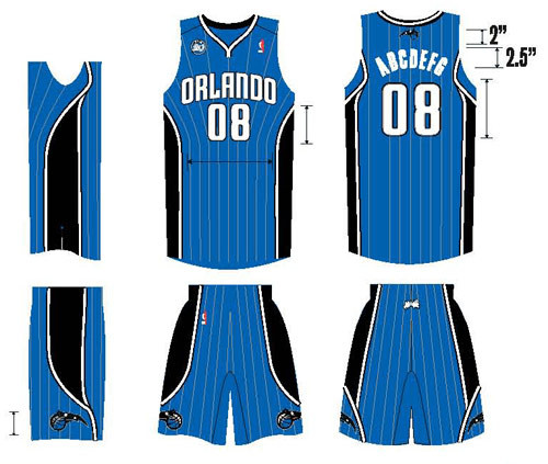 Orlando Magic blue road uniforms with silver pinstripes for the 2008-2009 NBA season, displaying team's away kit design.
The New Road Uniforms: Bold Blue with Silver Accents
Mirroring the home design, the road uniforms feature a vibrant blue base, accented by the same silver pinstripes. This consistent design language across both home and away kits creates a unified and professional image for the Orlando Magic. The blue road uniforms provide a strong visual contrast on the court, ensuring the team stands out during away games. The silver pinstripes again play a crucial role, adding a refined detail that distinguishes these Orlando Magic uniforms from simpler designs.
Design Elements: A Blend of Tradition and Modernity
These Orlando Magic uniforms effectively blend elements from the team’s past with contemporary design trends. The pinstripes, while reminiscent of classic basketball uniforms, are executed in a modern silver, providing a subtle shimmer without being overly flashy. The color blocking is clean and strategic, highlighting the team’s colors without appearing cluttered.
However, certain design choices also drew some criticism. The wordmarks placed on the rear of the shorts were seen by some as reminiscent of novelty clothing, a detail that felt slightly out of place on professional NBA uniforms. This trend of branding the back of shorts, while becoming more common in the NBA, was not universally appreciated.
The side panels, with their curved design and black contrast, were another point of contention. While intended to create a sleek and modern aesthetic, some observers felt they appeared overly stylized or even slightly awkward. The curvature, particularly at the bottom of the shorts where it meets the team’s basketball logo, was seen as a less successful element of the overall design. In comparison to the Atlanta Hawks’ uniforms, which featured more complex and arguably less cohesive side panel designs, the Magic’s were still considered relatively restrained.
The neckline of the jersey was also noted for its unusual design, lacking the central star detail that had been a feature of previous Orlando Magic uniforms. This omission, while minor, was seen as a slight downgrade by some fans who appreciated the star detail on the previous jerseys.
Color Considerations: Blue in a Blue League
One broader observation about the Orlando Magic uniforms concerned the prevalence of blue uniforms in the NBA. With a significant number of teams, approximately 17 out of 30, utilizing blue in their uniform palettes, the Magic’s choice of blue for their road uniforms meant they could sometimes blend in with the visual landscape of the league. This is an inherent challenge for any team using a common color like blue, and not a specific flaw of the uniform design itself. Teams like the Charlotte Bobcats (with their greyish blue alternates) and even the rumored Oklahoma City Thunder uniforms further contributed to the blue saturation in the league. Even the Los Angeles Lakers, despite their iconic purple road uniforms (referred to as “Forum Blue”), technically fall within the blue spectrum.
Conclusion: A Definitive Upgrade
Despite minor criticisms regarding specific design elements, the overall consensus was that the 2008-2009 Orlando Magic uniforms represented a significant improvement over the previous designs. The new uniforms were widely praised for their clean, modern aesthetic, their effective use of the team’s classic colors, and the subtle yet impactful addition of silver pinstripes. They successfully captured the essence of the Orlando Magic brand while presenting a fresh and updated visual identity. These uniforms arguably became the best in the team’s history to that point, surpassing even the popular “dazzle” uniforms with sublimated stars in the eyes of many fans.
What are your thoughts on these Orlando Magic uniforms? Share your opinions in the comments below!