
The Philadelphia Phillies recently unveiled their City Connect uniforms in mid-April, coinciding, somewhat ironically, with an earthquake that shook the Philly area. While we’re not suggesting a direct causal link between seismic activity and jersey design, the internet’s reaction to these new threads has been…earth-shattering, to say the least.
Major League Baseball’s City Connect series, a collaboration with Nike launched in 2021, aims to give each team (excluding the Yankees and A’s for now) an alternate home uniform that reflects the city’s unique character, beyond the team’s traditional colors. Some teams have genuinely hit it out of the park with their designs, capturing the city’s vibe perfectly. Others…well, let’s just say they’ve struck out. And then there are the Phillies.
Let’s dive into the details of these Philadelphia Phillies New Uniforms and see what’s causing all the buzz, both positive and decidedly not-so-positive.
Decoding the Design of the Philadelphia Phillies City Connect Uniforms
The Phillies’ City Connect uniforms are intended to be an “ode to Philly’s past, present & future,” as the team itself declared. The design incorporates elements meant to resonate with Philadelphia’s heritage. This includes a blue collar, drawing inspiration from the city’s flag colors. The lettering is bold and supposedly reminiscent of the typography found in historical founding documents.
However, the execution has left many scratching their heads. The number “7” on Trea Turner’s jersey, for example, has been widely mocked for its resemblance to a question mark without the dot. While the historical font concept is there, its readability in a modern baseball context is questionable. Some might argue that typography has evolved since 1776 for a reason.
On a slightly brighter note, the hat design has garnered some appreciation. The team cleverly integrated the Philadelphia skyline within the Liberty Bell, a long-standing symbol for the Phillies. This inlay is a unique and arguably successful touch on the cap, even if the overall color scheme remains a point of contention for many fans. Despite this hat detail, the overall uniform aesthetic has been compared, less than favorably, to something you might see in a beer league softball game.
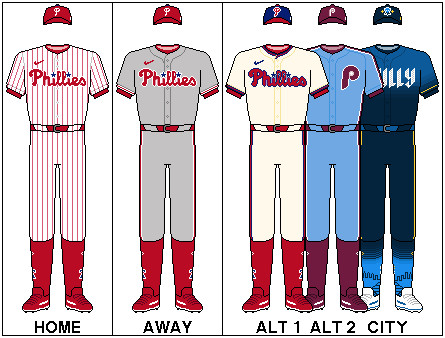 Philadelphia Phillies City Connect Uniforms Displaying Team Logos and Wordmarks
Fan Reaction: Love It, Hate It, or Just Confused?
Philadelphia fans are known for their passionate opinions, and the Philadelphia Phillies new uniforms have certainly ignited strong reactions across social media. Many fans have taken to platforms like X (formerly Twitter) to express their dismay, often with humor and sarcasm.
J.T. Realmuto’s yellow catcher’s gear, debuted with the new uniforms, became an immediate focal point for online jokes, amplifying the already critical reception. Tweets ranged from disbelief and outright rejection to humorous comparisons.
Release day saw a flood of reactions, with some fans jokingly comparing the uniform colors to energy drinks found in local convenience stores. Others posted nostalgic images of past Phillies uniforms, lamenting what could have been. Even typically positive fan accounts expressed their disappointment, albeit with humor, suggesting that perhaps Nick Castellanos’s untucked jersey style might distract from the uniform design itself.
The earthquake that occurred around the time of the uniform release became an instant metaphor for the fan reaction, with numerous tweets joking that it was a sign of divine disapproval of the new jerseys.
The prevailing sentiment seems to be that the Philadelphia Phillies new uniforms are, at best, “average.” While some fans might find them acceptable, many feel they don’t live up to the high standards associated with the Phillies brand, especially given the team’s recent competitive success and passionate fanbase.
Missed Opportunities and High Expectations
Many fans and critics point out missed opportunities in the design process. Suggestions for alternative directions include updated versions of the popular retro 1970s maroon uniforms, or even incorporating green as a base color to honor the beloved Phillie Phanatic mascot. Nike’s successful City Edition jerseys for the Philadelphia 76ers basketball team only heightened expectations and perhaps made this baseball uniform reveal even more disappointing for some.
Ultimately, designing a uniform that pleases all Phillies fans was always going to be a challenge. The Phillies already boast some of baseball’s best home pinstripe uniforms. To surpass such a classic design is a tall order. Philadelphia fans are known for their high standards and their willingness to voice their opinions, especially online.
While opinions on the Philadelphia Phillies new uniforms remain divided, one thing is clear: Phillies fans are passionate and deeply invested in their team’s image, both on and off the field. Whether these City Connect uniforms will eventually grow on the fanbase or become a quickly forgotten experiment remains to be seen. For now, the focus remains on the team’s performance on the field, as Phillies fans always prioritize winning above all else. #RingTheBell