
The Texas Rangers boast a variety of uniforms, each telling a part of the team’s story. While opinions on each design vary, some stand out more than others. Here, we delve into two noteworthy uniforms: the City Connect and the Alternate Blue, offering a closer examination of their design elements and appeal.
City Connect Uniform: A Nod to Texas History
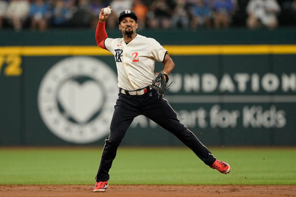
The Texas Rangers City Connect uniform is rich with historical references, making it a unique piece in the team’s apparel collection. Designed to celebrate the team’s connection to its city and state, this uniform incorporates several elements that resonate with Texas history. The gothic-style lettering across the chest immediately catches the eye, lending a vintage yet bold aesthetic. This choice of font evokes a sense of tradition while maintaining a modern feel. A significant detail is the inclusion of the 4/21 date, subtly woven into the design, likely commemorating a key moment in Texas Rangers history or local significance. Another distinctive feature is the “Peagle,” an emblem that adds a playful yet meaningful touch, further grounding the uniform in local culture and lore. While the historical nods are strong and well-integrated, some argue that the overall design, particularly the hat, could have been further enhanced. Suggestions, like incorporating the Peagle onto the hat instead of the primary gothic logo, have been popular among fans seeking an even bolder statement. Despite minor critiques, the City Connect uniform successfully blends historical significance with contemporary design, creating a memorable look for the Texas Rangers.
Alternate Blue Uniform: Classic and Clean Design
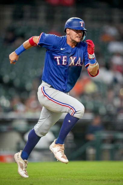
In contrast to the historical richness of the City Connect series, the Alternate Blue uniform for the Texas Rangers presents a study in classic, clean design. This uniform adopts a straightforward approach, focusing on the team’s colors and traditional baseball aesthetics. The dominant blue hue is both strong and versatile, providing a solid base for the white lettering that boldly displays the team name. The lettering style mirrors that of the Rangers’ road uniforms, creating a sense of visual consistency across different uniform variations. The white letters stand out sharply against the blue jersey, ensuring readability and impact from a distance, crucial for both players on the field and fans in the stands. A noteworthy design element is the pant stripes, which, when paired with the blue jersey, create a striking contrast that is even more pronounced than on other Texas Rangers uniforms. This subtle detail adds a dynamic visual element without compromising the overall clean aesthetic. The uniform is often seen worn with socks pulled high, a style that particularly complements this design, as exemplified by players like Josh Jung. Overall, the Alternate Blue uniform excels in its simplicity and classic baseball appeal, offering a timeless look for the Texas Rangers.
In conclusion, both the City Connect and Alternate Blue uniforms offer distinct styles for the Texas Rangers. The City Connect is a narrative-rich design celebrating Texas history, while the Alternate Blue provides a clean, classic aesthetic rooted in baseball tradition. Each serves to represent the team in different contexts, appealing to a wide range of fan preferences within the Texas Rangers community and beyond.