
When it comes to National Hockey League teams with a flair for jersey design, the Vancouver Canucks are undoubtedly among the most adventurous. Throughout their history, the Canucks have showcased a wide spectrum of styles, from iconic and beloved to, shall we say, less successful. This willingness to experiment has resulted in a jersey history as colorful and dynamic as the city they represent. Let’s dive into a ranking of Vancouver Canucks Uniforms, from designs that missed the mark to the absolute best that have graced the ice.
Number 15: The Infamous “V” Home Jersey (1978-1985)
Seriously, what were they thinking? This Vancouver Canucks uniform, known as “The V,” is often cited as one of the most visually jarring jerseys in the history of professional sports, not just hockey. The clashing yellow and black, combined with the awkward “V” design, created a home jersey that was more of an eyesore than a symbol of team pride. Despite its unpopularity, this design inexplicably remained the Canucks’ home jersey for nearly a decade. It’s a testament to the fact that even in the world of hockey fashion, mistakes can happen, and sometimes, they linger far too long.
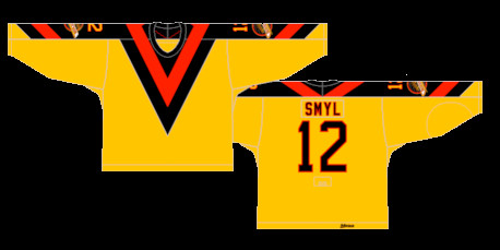 Vancouver Canucks Worst Uniform: The V Home jersey in black and yellow, worn from 1978 to 1985, widely considered an ugly NHL jersey design.
Number 14: “The V” Away Jersey (1978-1985)
If there’s any slight redemption for the “V” design era, it’s that the away version, rendered in black, is marginally less offensive to the eye than its home counterpart. However, let’s be clear, “slightly less terrible” is hardly a ringing endorsement. This Vancouver Canucks away uniform still suffers from the same fundamental design flaws as the home version. The black base does little to salvage the overall aesthetic of this confusing and unattractive NHL jersey. It remains firmly planted near the bottom of any Canucks uniform ranking.
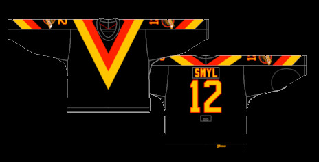 Vancouver Canucks Ugly Away Uniform: The V Away jersey, a black version of the unpopular V Home design, worn from 1978 to 1985.
Number 13: The Bizarre First Alternate (1995-1997)
When the NHL introduced the alternate jersey program in the mid-1990s, it unfortunately unleashed a wave of experimental and often questionable designs across the league. The Vancouver Canucks, never ones to shy away from the unconventional, were no exception. Their first foray into alternate uniforms resulted in a jersey that can only be described as…bizarre. This design, thankfully short-lived, represents a low point in Vancouver Canucks uniform history and serves as a reminder that not all experiments are successful.
Number 12: The Gradient Alternate (2001-2006)
It’s been almost two decades since the Vancouver Canucks last sported this gradient alternate jersey, and opinions on its quality remain divided. There’s no denying its uniqueness; the gradient effect was certainly aggressive and distinctive, embodying the Canucks’ penchant for pushing design boundaries. However, the chosen color scheme and its execution in a gradient format are debatable. While some might appreciate its audaciousness, others find it simply doesn’t quite work. This Vancouver Canucks alternate uniform occupies a strange middle ground – undeniably memorable, but not necessarily for the right reasons.
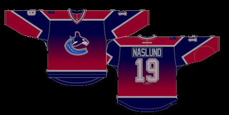 Vancouver Canucks Gradient Jersey: The alternate jersey featuring a gradient color scheme, worn from 2001 to 2006, a unique but divisive NHL uniform.
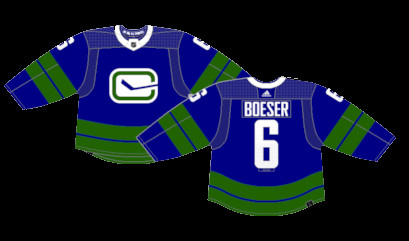
Number 11: Reverse Retro 1.0 (2021)
The Reverse Retro 1.0 Vancouver Canucks uniform offered a more refined and visually appealing take on the gradient concept compared to its predecessor. This design demonstrated a better understanding of how to utilize the gradient gimmick effectively in a hockey jersey. While perhaps best suited as a limited-edition, one-off design, the Reverse Retro 1.0 is undeniably closer to a genuinely decent hockey jersey than the original gradient alternate. It showed potential, even if gradients remain a risky design choice for NHL uniforms.
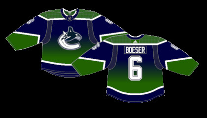 Vancouver Canucks Reverse Retro 1.0 Jersey: A 2021 Reverse Retro uniform featuring a gradient design, an improvement over previous gradient jerseys but still a one-off style.
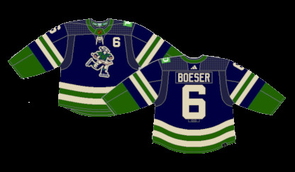
Number 10: Stick in Rink Alternate (2019-2022)
These short-lived Vancouver Canucks alternate jerseys were a reimagining of their classic 1970s uniforms, a nod to the team’s origins. However, this iteration, while referencing a beloved era, suffered from an imbalance in its color palette. The overabundance of green and the limited use of white disrupted the visual harmony of what is otherwise a solid color scheme derived from their traditional home and away kits. While a decent concept, the execution fell slightly short of capturing the true essence of the classic Canucks look.
 Vancouver Canucks Stick in Rink Alternate Jersey: A reimagined version of the 1970s Stick-in-Rink jersey, used as an alternate from 2019 to 2022, featuring a green-heavy color balance.
Number 9: Reverse Retro 2.0 (2022-2023)
Paying tribute to the original Vancouver Canucks of the Western Hockey League (WHL) from the 1960s, the Reverse Retro 2.0 jersey presented a unique piece of Canucks history. Featuring “Johnny Canuck” on the front, this recolored uniform adopted a palette reminiscent of the Canadian wilderness – earthy and muted. While not the most visually striking Vancouver Canucks uniform ever created, it served as a perfectly respectable tribute jersey. Its understated design speaks to a different era of hockey and a different aesthetic sensibility.
 Vancouver Canucks Reverse Retro 2.0 Jersey: A tribute to the 1960s WHL Vancouver Canucks, featuring the Johnny Canuck logo and earthy tones, worn in 2022-2023.
Number 8: Orca Away Jersey (1997-2007)
For a generation of fans, including myself, this white Vancouver Canucks away jersey, featuring the Orca logo, is synonymous with Canucks hockey. The transition away from the iconic skate logo was initially met with mixed reactions, but the Orca proved to be a worthy successor, remaining a central symbol of the team to this day. However, despite the enduring appeal of the Orca, the overall color palette of this uniform is undeniably subdued. While the colors work cohesively, they lack a certain vibrancy compared to other Canucks designs.
Number 7: Orca Home Jersey (1997-2007)
Slightly edging out its away counterpart is the Orca home jersey in white. While sharing the same somewhat muted color scheme, the white base arguably provides a cleaner and slightly more impactful presentation of the Orca logo. This Vancouver Canucks home uniform from the late 90s and early 2000s is a solid, if not spectacular, design. It represents a period of consistency for the Canucks uniform aesthetic, even if it lacks the boldness of some other eras.
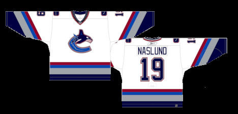 Vancouver Canucks Orca Home Jersey: The white home jersey featuring the Orca logo, worn from 1997 to 2007, a familiar uniform for many Canucks fans.
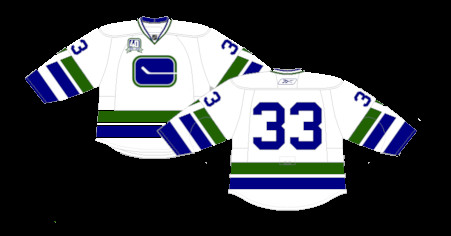
Number 6: Original Away Jersey (1970-1978) & Throwback (2006-07)
The Vancouver Canucks current uniforms bear a strong resemblance to their original jerseys from their inaugural NHL season. Interestingly, the original design featured the “stick-in-rink” crest. A subtle detail, often overlooked, is that the stick breaking through the right side of the rink logo cleverly forms a “C” for Canucks. This design element, once pointed out, becomes undeniably apparent and adds a layer of thoughtful design to this classic Vancouver Canucks uniform.
 Vancouver Canucks Original Away Jersey: The white away jersey from the inaugural 1970-1978 era, also worn as a throwback in 2006-07, featuring the Stick-in-Rink logo.
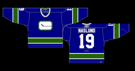
Number 5: Original Home Jersey (1970-1978)
While visually similar to the current home jerseys, the original Vancouver Canucks home uniform from the 1970s featured a slightly different striping pattern on the sleeves and waist. Many argue that this original striping pattern is superior to the current iteration, lending a more balanced and aesthetically pleasing look to an otherwise very similar uniform design. This subtle difference places the original home jersey slightly higher in the rankings for some discerning Canucks uniform enthusiasts.
 Vancouver Canucks Original Home Jersey: The blue home jersey from the 1970-1978 inaugural era, featuring a slightly different striping pattern compared to the current home uniform.
Number 4: White Skate Jersey (1989-1997)
It’s unusual for a white version of a jersey to be overshadowed by its darker counterpart, but in the case of the skate jerseys, the white version simply doesn’t possess the same visual impact as the black. Despite being a clean and straightforward design, the white skate jersey lacks the boldness and memorability of the black version. However, it remains a strong and iconic Vancouver Canucks uniform in its own right, just not quite as impactful as the top-ranked skate jersey.
Number 3: Current Away Jersey (2007-Present)
The current white Vancouver Canucks away jerseys are a masterclass in simplicity and clean design. The uncluttered aesthetic allows the secondary green color to truly stand out and breathe, creating a visually refreshing and balanced uniform. This modern Canucks away jersey demonstrates that sometimes, less is more, and that a well-executed minimalist design can be incredibly effective. It’s a testament to the enduring appeal of classic hockey jersey aesthetics.
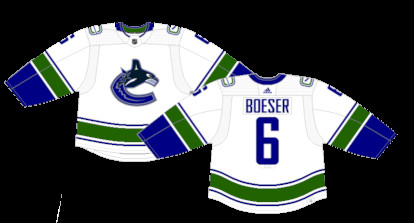 Vancouver Canucks Current Away Jersey: The modern white away jersey, worn from 2007 to present, featuring a clean and simple design that highlights the green accents.
Number 2: Heritage Classic Jersey (2014)
For their 2014 Heritage Classic appearance, the Vancouver Canucks paid a stunning homage to the Vancouver Millionaires, a team that existed from 1911 to 1926. The throwback color scheme, the vintage “V” logo enclosed in a maple leaf, and the overall design are arguably among the finest vintage-inspired one-off jerseys in NHL history. This Vancouver Canucks Heritage Classic uniform is a true masterpiece of retro hockey design, capturing the spirit of a bygone era while remaining incredibly stylish and relevant today.
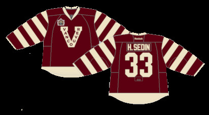 Vancouver Canucks Heritage Classic Jersey: The 2014 Heritage Classic jersey, a tribute to the Vancouver Millionaires, featuring a vintage design and color scheme.
Number 1: Black Skate Jersey (1989-1997) & Re-releases (2019-2020, 2022-Present)
Topping the list as the best Vancouver Canucks uniform is the iconic black skate jersey. Throughout its various iterations and minor tweaks over the years, the skate jersey has consistently remained a fan favorite and a symbol of Canucks hockey at its most exciting and memorable. The unique crest, the dynamic diagonal striping, and the distinctive color scheme combined to create a jersey that was truly one-of-a-kind. Its enduring popularity is undeniable; it won the fan vote for the Canucks’ 50th-anniversary jersey and has earned a permanent place in the regular uniform rotation since 2022. The black skate jersey is not just a uniform; it’s a cultural icon in Vancouver and the undisputed champion of Canucks jersey design.
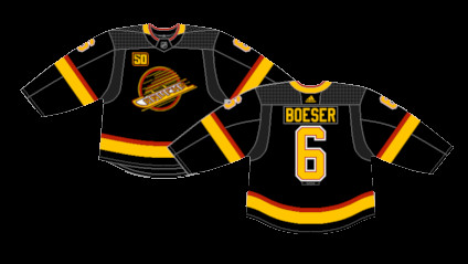 Vancouver Canucks Best Uniform: The iconic Black Skate jersey, worn from 1989-1997 and re-released in 2019-2020 and 2022-Present, a fan-favorite and symbol of Canucks hockey.
More Worst to First Jerseys
By: Dan Esche (@DanTheFlyeraFan)
photo credit: nhluniforms.com