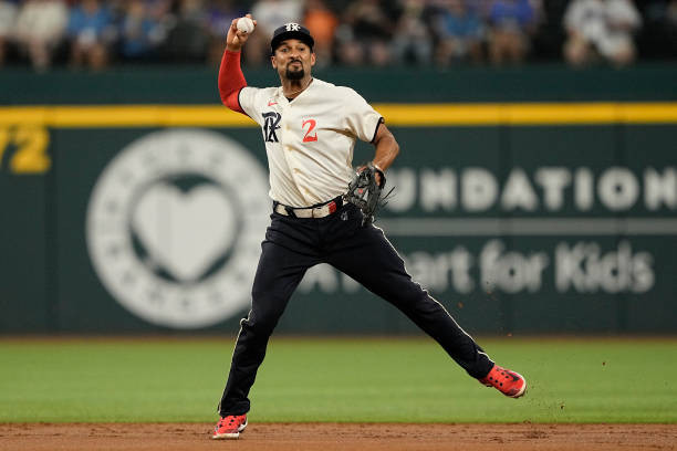
The Texas Rangers have a rich history in baseball, and their uniforms have evolved alongside their legacy. While some uniforms stand out more than others, even the less flashy designs contribute to the overall identity of the team. Let’s delve into a ranking perspective, focusing on two notable uniforms: the City Connect and the Alternate Blue.
City Connect Uniform: Celebrating Texas Heritage

The Texas Rangers City Connect uniform is a design that certainly sparks conversation. It’s evident that the Rangers aimed to deeply integrate Texas history into this jersey, and in many ways, they succeeded. From the distinctive lettering style to the subtle nod to April 21st, and the inclusion of the “Peagle” sleeve patch, the historical storytelling within this uniform is commendable. The gothic-style lettering of the logo offers a unique and sleek aesthetic, setting it apart from more traditional baseball fonts seen across MLB uniforms.
However, while the historical significance is undeniable and the base design is interesting, there’s a feeling that the City Connect uniform could have pushed the creative boundaries further. One area for potential enhancement, as many fans have pointed out, is the hat design. Instead of mirroring the jersey logo, incorporating the Peagle emblem from the sleeve onto the hat could have created a more dynamic and visually striking element for this Texas Rangers uniform. Imagine the Peagle taking center stage on the cap – a truly unique feature that could have elevated the entire City Connect concept.
Alternate Blue Uniform: A Study in Clean and Classic Design

When it comes to alternate uniforms, the Rangers’ Alternate Blue offering presents a strong case for simplicity and effectiveness. In comparing it to the City Connect, the Alternate Blue stands out for its straightforward and undeniably clean design. There are very few complaints to be made about this uniform; it simply works.
The lettering style is consistent with the Rangers’ standard road uniforms, utilizing white letters that create excellent contrast against the vibrant blue jersey. This choice ensures readability and maintains a cohesive brand identity across different Texas Rangers Uniforms. A particularly appealing detail is how the pant stripes interact with the blue jersey. The stripes seem to “pop” even more against the blue backdrop compared to other uniform variations, adding a subtle yet impactful visual element. Furthermore, this uniform seems perfectly suited for a classic baseball look, especially when worn with socks pulled high, as exemplified by Josh Jung in many games. The Alternate Blue uniform effectively blends tradition with a modern color twist, making it a solid addition to the Texas Rangers uniform collection.

