
As a content creator for onlineuniforms.net, I’ve spent considerable time analyzing the landscape of sports apparel, particularly college football uniforms. Recently, the designs from Under Armour have been on my mind, specifically in the context of teams like Texas Tech. While not a professional designer, my background in content creation and a keen interest in visual branding have led me to consider what makes a uniform truly effective. This isn’t a knee-jerk reaction, but rather a culmination of thoughtful observation and analysis over time, aiming to understand and articulate my perspective on Under Armour’s approach to uniform design in the competitive world of college athletics.
It’s time to address a crucial point: are Under Armour Uniforms consistently elevating the brands they represent, or is there room for significant improvement?
Design Elements and Principles: The Foundation of Great Uniforms
To properly evaluate any uniform, especially those from a major brand like Under Armour, it’s essential to understand the fundamental principles of design. Whether it’s logo creation, website aesthetics, or uniform design, certain elements and principles are universally recognized as crucial for success. According to design experts at j6design.com.au, the core idea is that design elements are the building blocks, and design principles are how we utilize those elements to create effective visuals.
Let’s break down these elements:
Elements of Design:
- LINE: The basic mark, defining shape and direction. Lines can convey different feelings – horizontal for calmness, vertical for formality, and oblique for action.
- SHAPE: Defined areas, either geometric or organic, creating positive and negative space.
- DIRECTION: The orientation of lines (horizontal, vertical, oblique), influencing the mood and dynamism of the design.
- SIZE: The relative scale of shapes, creating visual hierarchy and interest.
- TEXTURE: The surface quality – rough, smooth, etc. – adding depth and tactile appeal.
- COLOUR: Light reflection, with hue, value, and intensity as key characteristics, impacting emotion and brand recognition.
These elements are the raw materials. The principles of design are how we organize them:
Principles of Design:
- BALANCE: Visual equilibrium, distributing elements to create stability. A large element can be balanced by a smaller one placed strategically.
- PROXIMITY: Grouping related elements to create visual relationships and focal points. Connection, not just closeness, is key.
- ALIGNMENT: Creating order and organization by aligning elements, fostering visual connections.
- REPETITION: Strengthening design through consistent elements, building association and rhythm.
- CONTRAST: Using opposing elements (colors, values, directions) to emphasize key aspects and create visual interest.
- SPACE: The area around, between, and within elements, both positive and negative space are vital for clarity and impact.
When we apply these principles to Under Armour uniforms, we must ask: are these designs balanced? Do they utilize proximity effectively to highlight team identity? Is there alignment and order? Does repetition reinforce brand consistency? Is contrast used to emphasize key design features? And is space used effectively to prevent visual clutter? These questions form the basis for evaluating the effectiveness of Under Armour’s uniform designs.
The Power of Simplicity in Under Armour Uniform Design
In the realm of uniform design, simplicity is not just an aesthetic preference; it’s a strategic advantage. While some might associate brands like Oregon with complex and ever-changing designs, the underlying success of many iconic uniforms lies in their simplicity. Achieving simplicity, however, is far from simple. It requires deep thought and a clear understanding of brand identity.
Think about iconic brands like Apple, where Steve Jobs championed simplicity. As one of Jobs’ designers noted in a Smithsonian Magazine article, true simplicity isn’t about minimalism on the surface. It’s about “digging through the depth of the complexity” to remove anything non-essential. This philosophy applies directly to uniform design. A truly simple and effective Under Armour uniform isn’t necessarily one with fewer elements, but one where every element serves a purpose and contributes to a clear, unified brand message.
Jobs himself stated, “Simple can be harder than complex: You have to work hard to get your thinking clean to make it simple. But it’s worth it in the end because once you get there, you can move mountains.” This “clean thinking” is precisely what Under Armour needs to consistently deliver exceptional uniforms. It’s about distilling a team’s identity down to its core visual elements and executing them flawlessly.
Analyzing the Competition: Nike’s Approach with Oregon and Oklahoma State
To further understand the landscape of college football uniforms, let’s examine how Nike, a major competitor of Under Armour, approaches design with schools like Oregon and Oklahoma State. Oregon, often perceived as having “crazy” uniforms, actually built its brand on two simple design concepts: the wing/feather motif and the “O” logo, as detailed by Uniform Critics. Variations exist, but these core elements and a consistent color palette (green, yellow, grey, black, white) provide a recognizable and strong brand identity.
Similarly, Oklahoma State, another Nike school, utilizes a simple approach with the “OSU” logo and Pistol Pete, combined with a limited color palette of orange, black, white, and grey. While often joked about for copying, Oklahoma State’s uniform success stems from this disciplined approach to branding and consistent use of core design elements.
These examples highlight a crucial point for Under Armour: consistent branding through simple, recognizable logos and color schemes is more impactful than constant design variations. Instead of chasing novelty, focusing on refining and consistently applying core brand elements can build a stronger and more memorable uniform identity.
Texas Tech’s Uniform History and the Under Armour Challenge
Texas Tech, an Under Armour partner, presents a compelling case study in uniform design. While Uniform Critics’ database only goes up to 2013, and additional changes have occurred since, the trend is clear: Texas Tech has experimented with numerous helmet logos and color combinations under Under Armour. This includes standard Double-T, camouflage Double-T, state-of-Texas helmets, Lone Star Pride variations, and Masked Rider logos.
In recent years, the variety has continued, featuring standard Double-T, “old school” Double-T, ombré helmets, black helmets with red Masked Rider logos, and even tricolored Texas flag-inspired helmets. This proliferation of designs, totaling ten helmet designs in just a few years, dilutes brand identity. Similarly, the color palette has expanded to include red, white, black, camouflage, blue, dark grey, ombré, old school grey, and bi-colored jerseys.
Texas Tech’s uniform variation raises questions about brand consistency.
This lack of consistent design direction contrasts sharply with the simplicity and focused branding of Oregon and Oklahoma State. The question for Under Armour becomes: is this constant variation strengthening Texas Tech’s brand, or is it creating confusion and diluting the impact of their visual identity? The sheer number of designs suggests a lack of a clear, unifying vision for Texas Tech’s uniforms.
What Makes a “Best” Uniform? Lessons from Top Ranked Programs
To understand what constitutes a truly great uniform, we can look to rankings from reputable sources like USA Today. Their list of top college football uniforms often includes: Oregon, Michigan, Texas, Notre Dame, Auburn, Georgia, USC, Alabama, Boise State, and Ohio State. Uni Watch, another respected voice in uniform analysis, also consistently ranks programs like Auburn, Alabama, Texas, and others highly.
A key takeaway from these lists is that the top-ranked uniforms are often iconic and timeless. They represent consistent branding and instantly recognizable visual identities. While some of these teams might have occasional alternate uniforms, their primary uniforms are deeply rooted in tradition and brand consistency. Notably, in the USA Today list, only one Under Armour school, Auburn, makes the top 10. Uni Watch’s top 25 includes Auburn and Northwestern as Under Armour representatives, but the majority are Nike or Adidas schools with long-established uniform identities.
This isn’t to say Under Armour uniforms are inherently inferior, but it raises the question: why aren’t more Under Armour schools consistently ranked among the best-dressed in college football? The answer may lie in design philosophy and brand strategy. While Under Armour produces high-quality apparel, the uniform designs for some schools might be lacking the consistent, iconic branding that defines the very best.
Throwback Uniforms: A Glimpse of Under Armour’s Potential
While critiquing some of Under Armour’s more recent designs, it’s important to acknowledge successes. Texas Tech’s throwback uniforms, particularly those reminiscent of the 1993 era, demonstrate Under Armour’s capability for excellent design. These uniforms, featuring a focus on the Double-T logo and classic striping elements, showcase a refined and effective approach to branding.
Texas Tech’s throwback uniforms highlight the iconic Double-T logo.
Key design decisions in these throwbacks, such as removing sleeve stripes and focusing on a smaller, classic Double-T logo on the sleeves, were impactful. The updated throwbacks maintained the Double-T focus while subtly incorporating stripes in the undershirt, demonstrating a thoughtful blend of classic and modern elements. The “Texas Tech” lettering on the jersey was also improved for better visibility and a more balanced aesthetic.
These throwback uniforms succeed because they prioritize the iconic Double-T logo and build a design around it, adhering to principles of simplicity and brand consistency. They prove that Under Armour can create exceptional uniforms when focusing on core brand elements and thoughtful design principles.
The Iconic Double-T Logo: Under Armour’s Untapped Asset
Texas Tech possesses a truly iconic logo in the Double-T. It’s recognizable, visually appealing, and has stood the test of time. The non-beveled version, in particular, is clean and impactful, as seen in its effective redesign for Arkansas. This logo is a powerful asset for Under Armour to leverage in uniform design.
However, recent helmet designs, such as those featuring the Masked Rider logo, demonstrate a departure from this iconic branding. Placing oversized and less recognizable logos on the helmet dilutes the impact of the Double-T and creates visual confusion. As seen in photos from USA Today Sports, the Masked Rider logo, especially from a distance, becomes indistinguishable and lacks the clarity of the Double-T.
Oversized logos like the Masked Rider can obscure brand identity.
This approach risks “Affliction-izing” Texas Tech’s uniforms, creating a busy, logo-heavy aesthetic that detracts from the team’s core brand. Instead of maximizing the impact of the iconic Double-T, these designs dilute its presence and contribute to a less cohesive visual identity. Under Armour should recognize the strength of the Double-T logo and prioritize its consistent and prominent use across all Texas Tech uniforms.
News vs. Iconic Uniforms: Focusing on Lasting Design
Under Armour needs to understand that generating buzz with uniform variations doesn’t automatically equate to creating iconic uniforms. While novelty can attract attention, lasting brand recognition and respect come from consistent, well-designed uniforms that stand the test of time. Many of the special or “one-off” uniform designs, across various brands, are often met with criticism from design purists and fans alike.
The example of using a design originally created for a high school All-American game for Texas Tech’s Oklahoma game uniform further illustrates this point. Repurposing designs intended for other events diminishes the sense of exclusivity and brand value for Texas Tech. It suggests a lack of dedicated design effort and reinforces the idea of “leftover” designs, rather than bespoke creations.
Using generic designs diminishes the brand value of team uniforms.
Contrast this with successful Under Armour uniforms like those for Navy, Notre Dame, and Northwestern. Navy’s uniforms, with their classic nautical themes and distinctive chest stripes, are meticulously designed and highly regarded. Notre Dame’s uniforms, while traditional, are executed with precision and subtle modern updates under Under Armour. Northwestern’s bold stripe design is unique and consistently applied, creating a recognizable brand element.
These examples demonstrate that Under Armour is capable of creating truly exceptional uniforms when design is approached thoughtfully and strategically. The key is to move beyond novelty and focus on creating meaningful, consistent designs that elevate team brands for the long term.
Creating Meaningful Uniforms: Anchoring Design in Brand Identity
The central issue with some Under Armour uniform designs seems to be a lack of clear direction and a consistent design anchor. For Texas Tech, the Double-T logo should be that anchor. Every uniform design should, in some way, relate back to and emphasize this iconic logo. Instead of chasing disparate themes like military appreciation or Lone Star Pride with visually inconsistent designs, Under Armour should integrate these themes in a way that complements and enhances the core brand identity, centered around the Double-T.
Under Armour has shown glimpses of this potential, as seen in a throwback-inspired t-shirt design featuring a subtly beveled Double-T logo and weathered stripes. This design demonstrates an understanding of nuanced detailing and the power of understated branding. The weathered stripes, while perhaps not intended for game jerseys, suggest a unique design element that could be further explored and integrated into Under Armour uniforms across different teams. Imagine bold stripes, perhaps in team colors, used consistently as a signature Under Armour design element – a unique visual identifier that sets their uniforms apart.
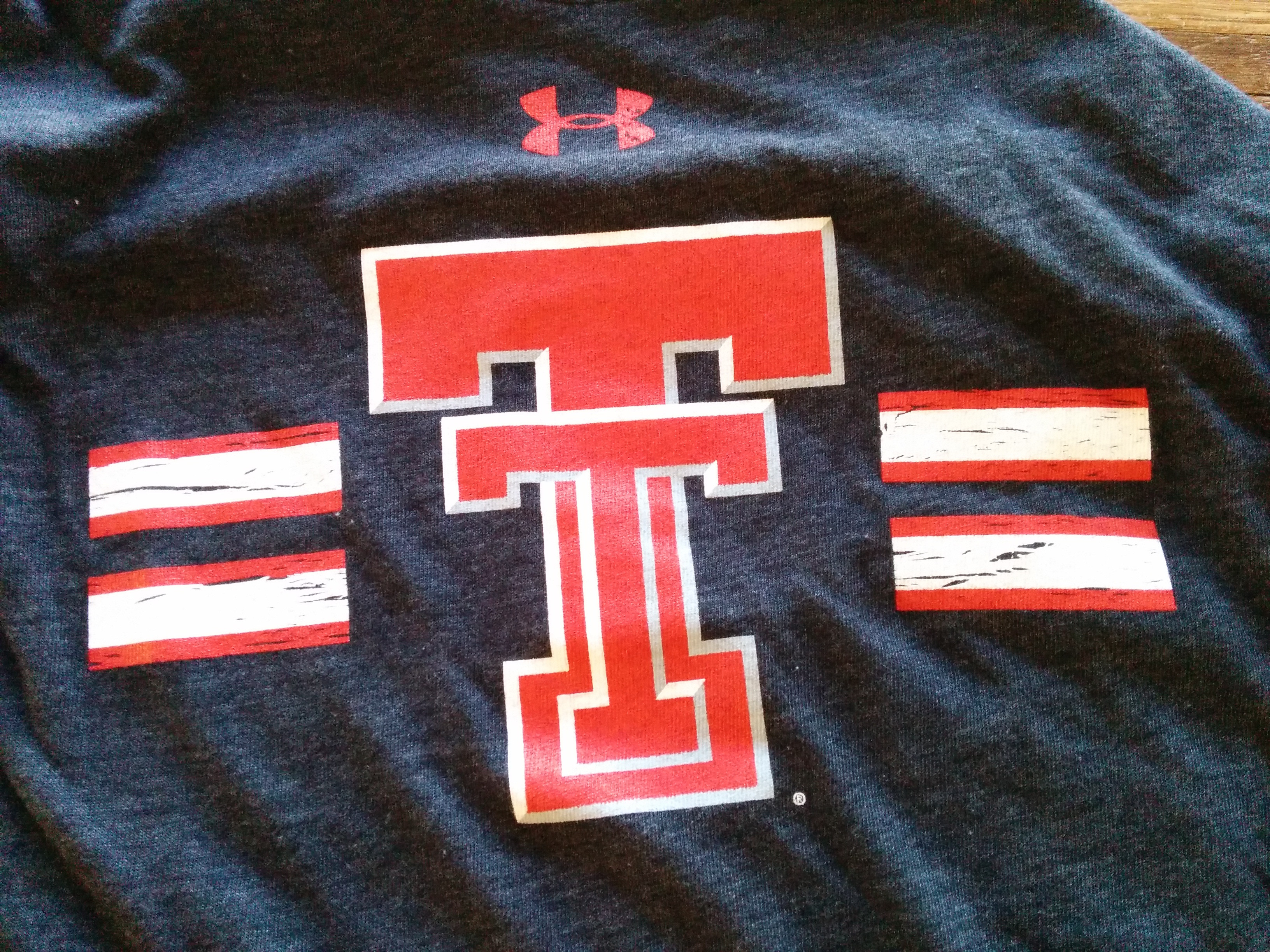 Under Armour Throwback T-Shirt
The most encouraging aspect is that thoughtful design details are present in some Under Armour products. The challenge is to apply this level of thoughtfulness and strategic brand focus consistently across all uniform designs. Under Armour has the potential to create not just news-making uniforms, but truly iconic uniforms that resonate with fans, athletes, and the broader sports world. To achieve this, a shift towards a more consistent, brand-anchored design philosophy is essential.
A Plea for Thoughtful Under Armour Uniform Design
This analysis is intended as constructive criticism, born out of a passion for good design and a belief in Under Armour’s potential. The quality of Under Armour products is generally excellent, often surpassing competitors in terms of feel and durability. However, the uniform designs, particularly for teams like Texas Tech, have at times fallen short of their potential.
The plea to Under Armour is simple: prioritize thoughtful, brand-focused design over novelty and fleeting trends. Oversized, indistinct logos and inconsistent branding dilute team identity and miss opportunities to build lasting brand recognition. By focusing on core brand elements, like the Double-T for Texas Tech, and applying sound design principles of simplicity, balance, and consistency, Under Armour can elevate their uniforms from simply being apparel to becoming iconic symbols of team pride and athletic excellence. It’s time for Under Armour to fully realize its design potential and create uniforms that are as high-performing and impactful as their apparel is renowned to be.